
The previous online presence lacked visual impact and did not fully represent the salon’s premium atmosphere. Service information was not clearly structured, booking actions were not emphasized, and the overall design felt outdated compared to the brand’s in-store experience
The main challenge was creating a design that feels masculine, modern, and premium without appearing cluttered or overly dramatic. It was also important to balance strong visuals with usability, ensuring that booking an appointment remained quick and intuitive. Additionally, the layout needed to highlight services, pricing, and brand personality while staying responsive across devices.
We developed a bold yet clean layout with a strong visual hierarchy. Dark tones paired with sharp typography create a premium and confident look. Service sections were organized clearly, allowing visitors to scan offerings effortlessly.
Call-to-action buttons for booking appointments were made highly visible, ensuring users can take action at any stage of their journey. Strategic use of imagery helps convey the salon’s atmosphere, craftsmanship, and attention to detail.
We analyzed modern barbershop and men’s grooming websites to understand design trends, user expectations, and common usability gaps. The research emphasized visual storytelling and simplified booking flows.
Initial wireframes focused on structuring content clearly — prioritizing service highlights, pricing transparency, and booking access.
User flows related to service browsing and appointment booking were reviewed to ensure they were intuitive and responsive across both desktop and mobile screens.
Feedback during the review phase led to adjustments in spacing, priority of actions, and visual balance to enhance clarity and emphasize key conversion points.
A consistent design system was created to maintain cohesion throughout the website. Typography, button styles, color usage, and spacing rules were standardized. Reusable components allow future updates or service additions without disrupting the visual balance.
The final experience feels polished, confident, and easy to navigate. Visitors can quickly browse services, understand pricing, and book appointments without friction. The structured flow guides users naturally from discovery to confirmation, enhancing both usability and brand perception.
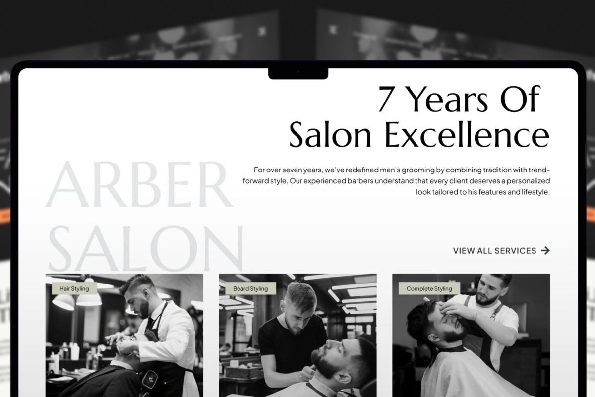
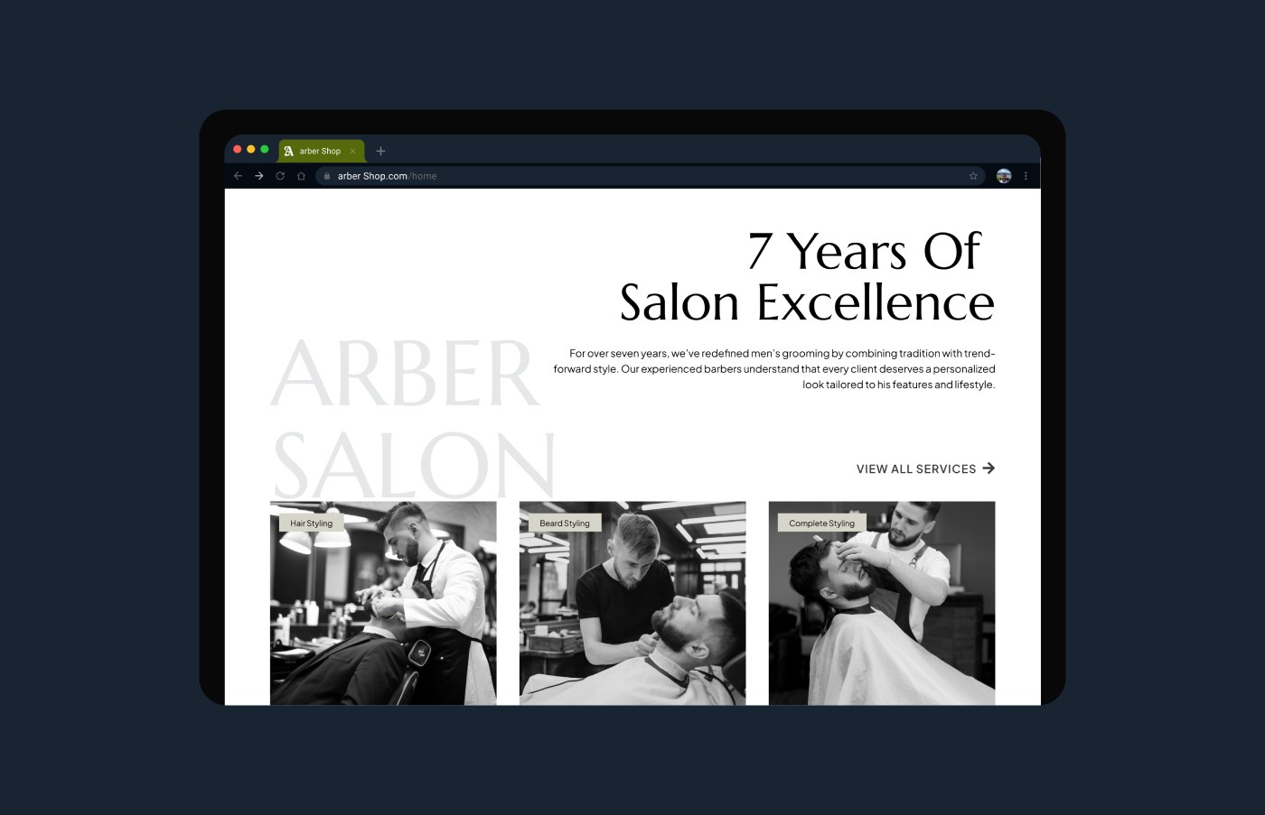
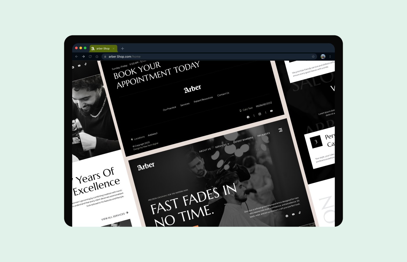
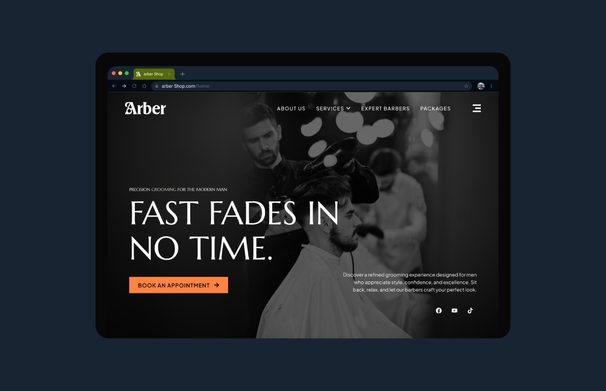
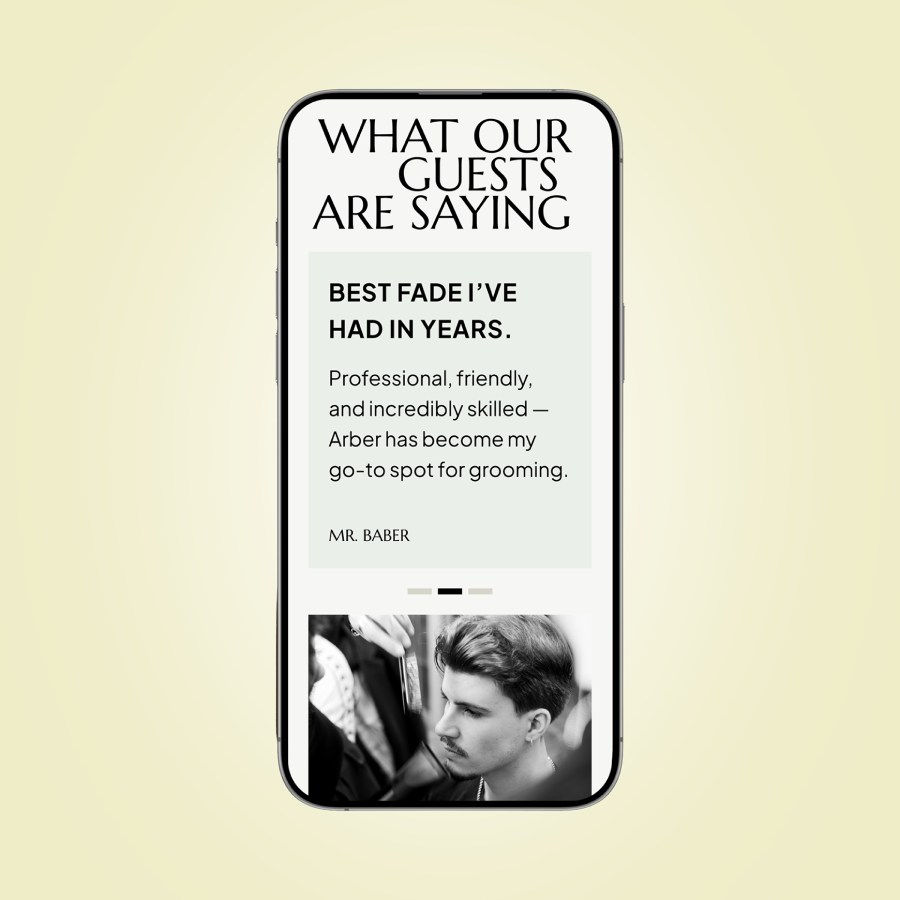
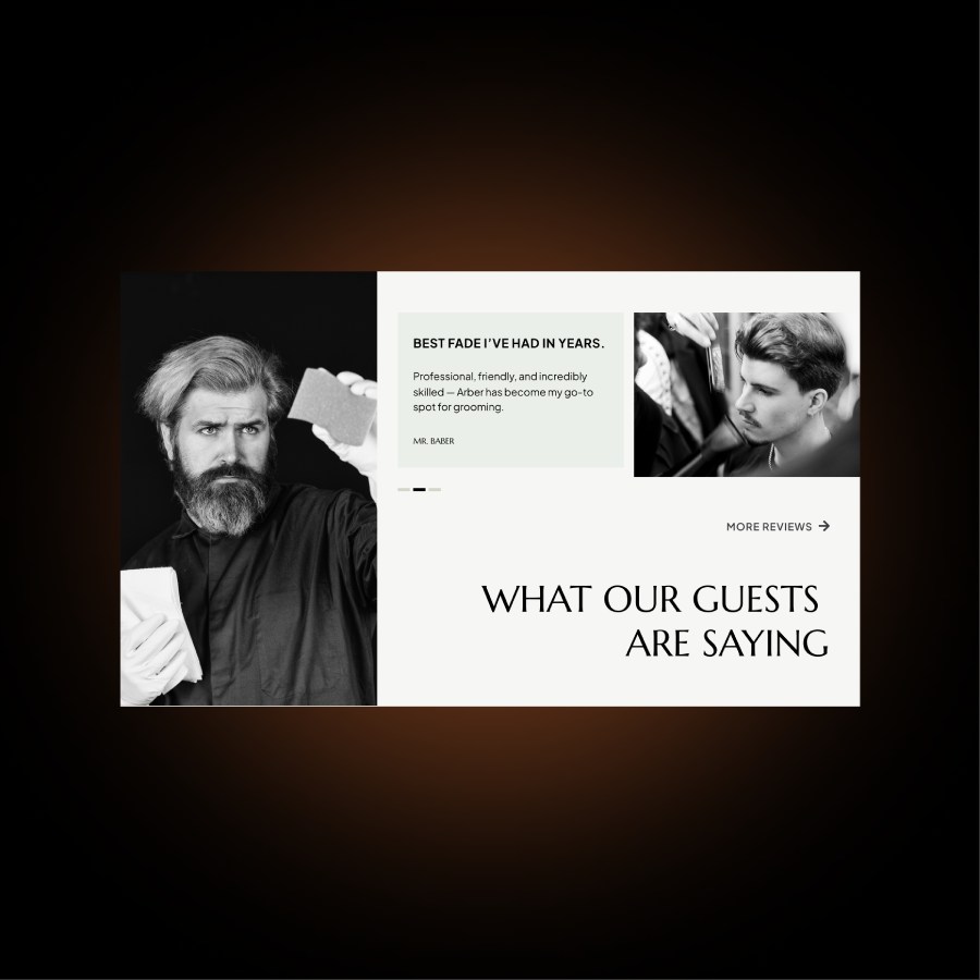
“The redesign captures the essence of our salon — stylish, confident, and easy to navigate. Our clients now find what they need quickly, and the booking process feels much more intuitive.”


From fragmentation to fusion: Breaking down the complexities of data management