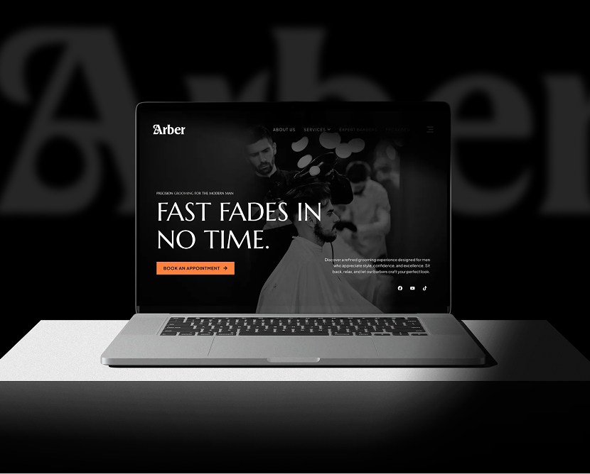
Birdcast Podcast Studio - Modern Website Redesign

A clean, engaging podcast studio website redesign focused on storytelling, clarity, and helping creators discover, listen, and connect with ease.

Category

Technology

Timeline

4 weeks

Live view

project intro

Birdcast is a modern podcast studio that needed a refreshed digital presence to better reflect its creative energy and professional production quality. The purpose of this redesign was to create a website that highlights podcasts clearly, supports content discovery, and presents the brand as a reliable and modern media platform. The design focuses on simplicity, personality, and smooth content flow.

PROBLEM

The previous website struggled to showcase podcast content effectively. Episodes were not easy to discover, navigation felt unclear, and the overall visual style did not fully represent the studio’s creative identity. This reduced engagement and made it harder for users to explore or connect with the brand.

CHALLENGES

  • Organizing podcast episodes and content in a clear, intuitive way
  • Balancing creativity with readability and structure
  • Designing for both listeners and potential collaborators
  • Creating a modern media-focused layout without visual clutter
  • Ensuring a smooth experience across desktop and mobile devices

OUR SOLUTION

We redesigned the website with a content-first approach. Podcast episodes are clearly structured, visuals are clean and expressive, and navigation is simple and predictable.

Strong typography, thoughtful spacing, and focused sections help users explore shows, understand the brand, and take action—whether that’s listening, subscribing, or getting in touch.

Design Process

Research

We studied modern podcast platforms and media websites, focusing on how users browse, listen, and engage with audio content. The goal was to improve discovery and reduce friction.

Design

High-fidelity UI screens were created with a modern, friendly visual style. Layouts prioritize episode visibility, clear navigation, and strong brand personality.

Testing

User flows such as browsing episodes, viewing show details, and accessing contact information were reviewed for clarity and ease across devices.

Feedback

Design feedback helped refine spacing, content hierarchy, and visual balance to ensure the site felt engaging but easy to use.

Style guide & components

Consistency: Typography, colors, spacing, and UI patterns are consistent across all pages

Design System: Figma libraries and reusable components keep the design unified

Updates: Component-based structure allows easy updates without breaking layouts

Collaboration: Designs were prepared for smooth developer handoff and accurate implementation

Visual presentation

Consistency: Typography, colors, spacing, and UI patterns are consistent across all pages

Design System: Figma libraries and reusable components keep the design unified

Updates: Component-based structure allows easy updates without breaking layouts

Collaboration: Designs were prepared for smooth developer handoff and accurate implementation

user experience

The project includes polished mockups featuring the homepage, podcast listings, episode detail pages, and contact sections. Desktop and mobile views show a responsive layout optimized for content browsing and listening.

what the client said about the project

Client review quotes icon

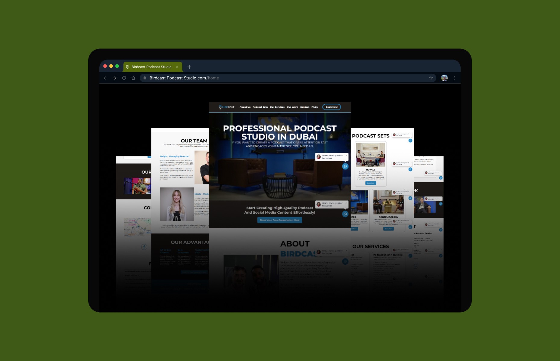
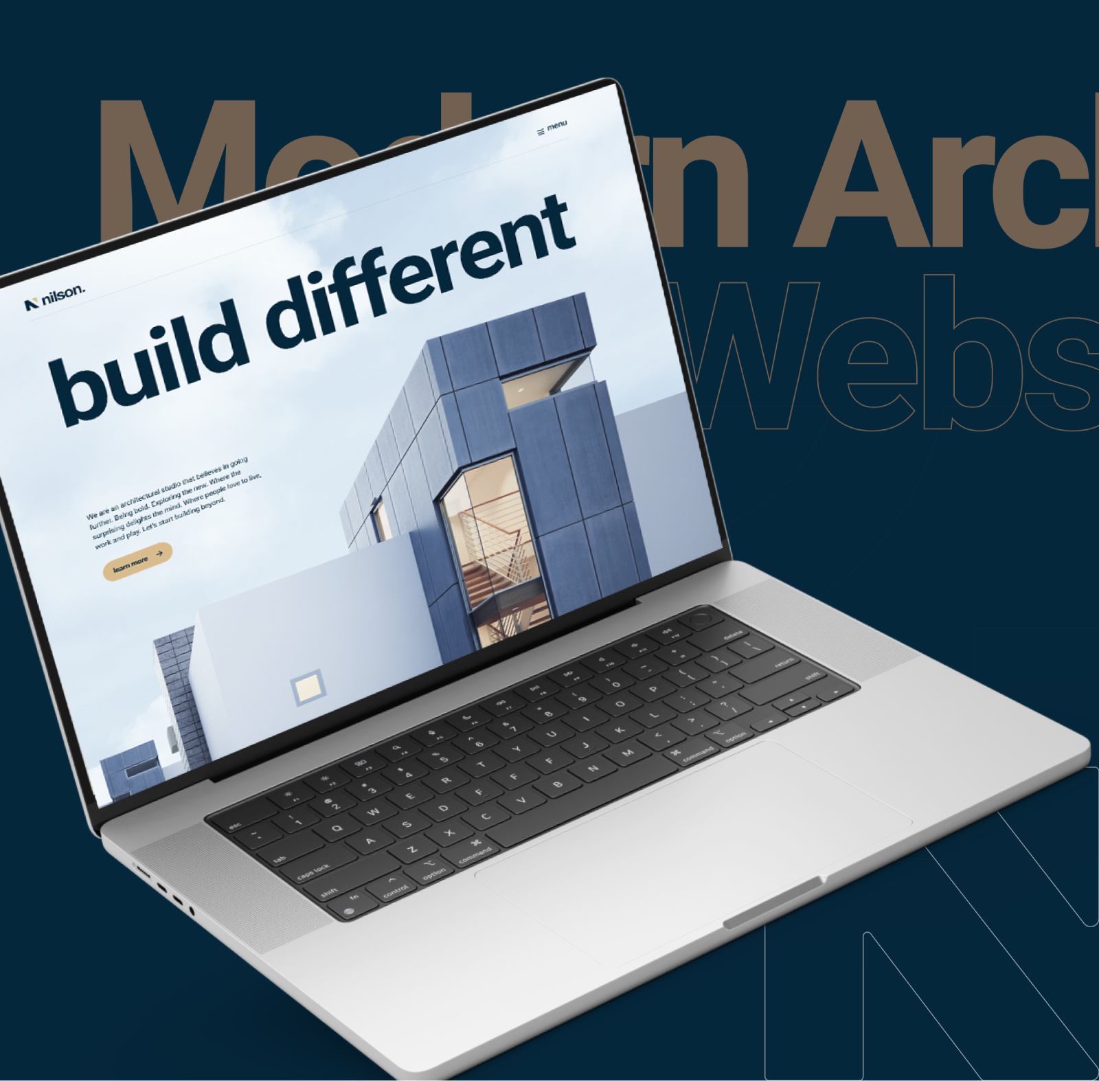
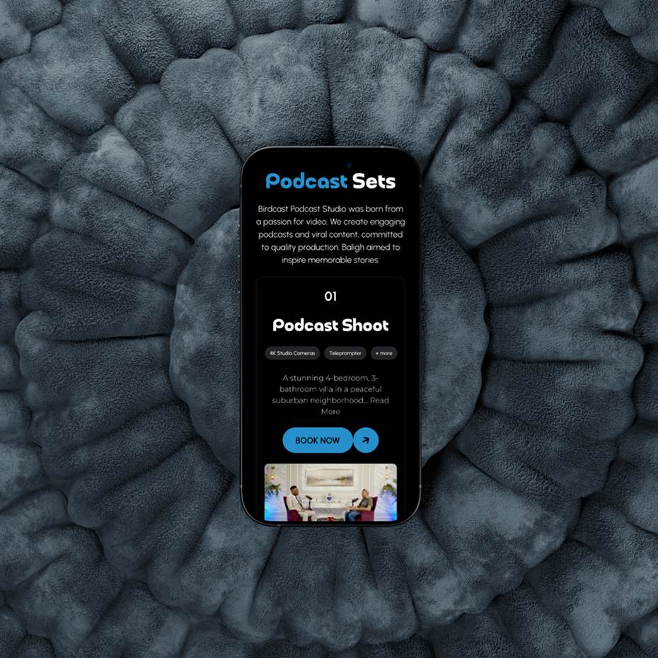
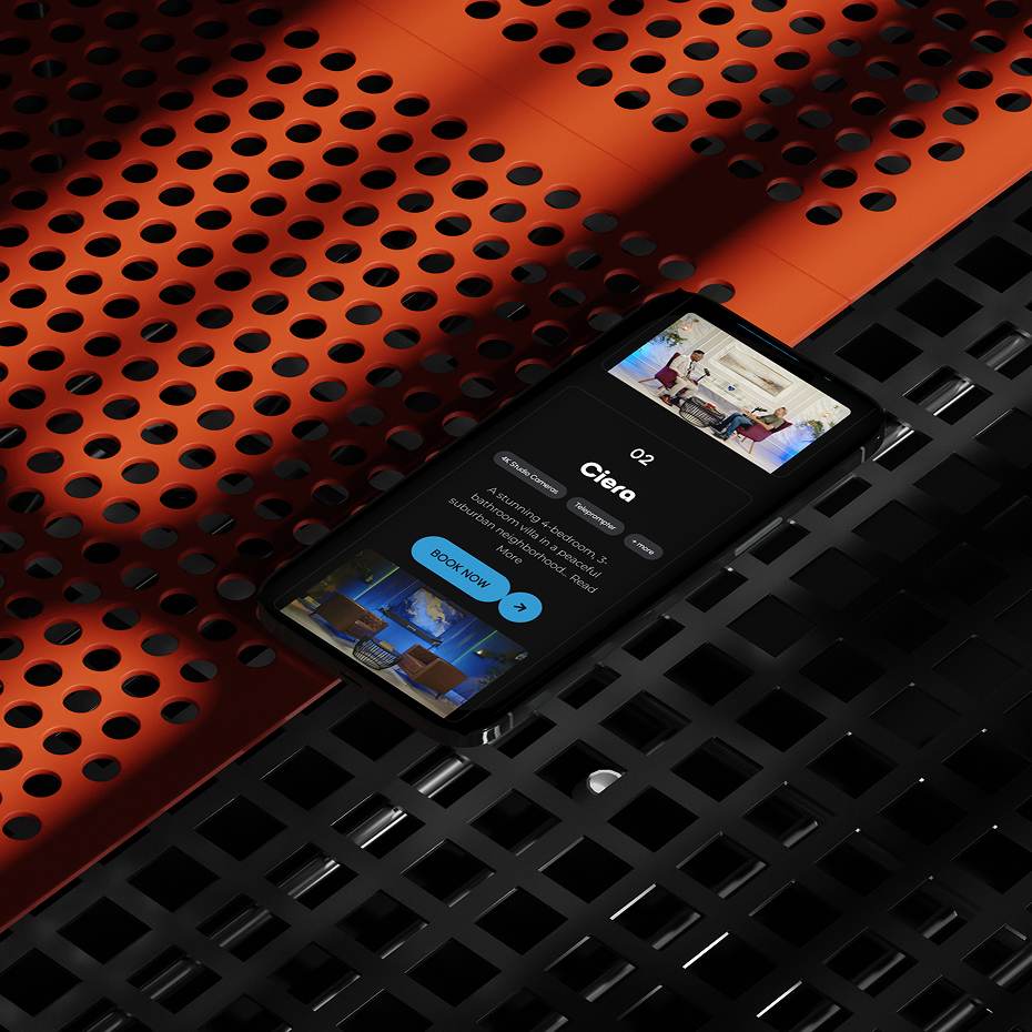
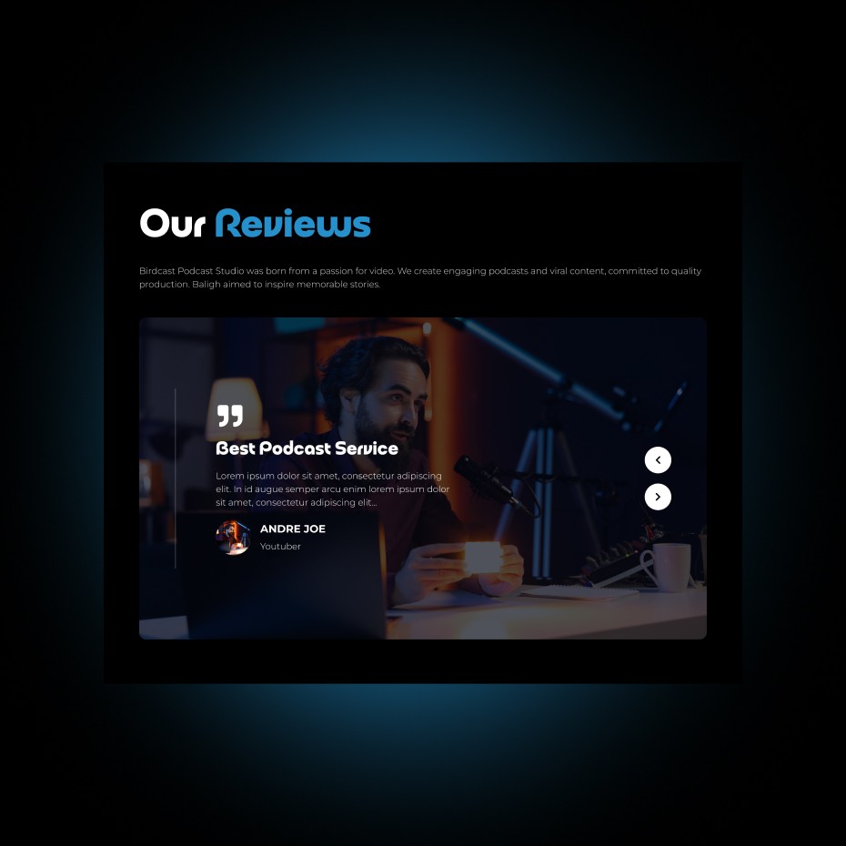
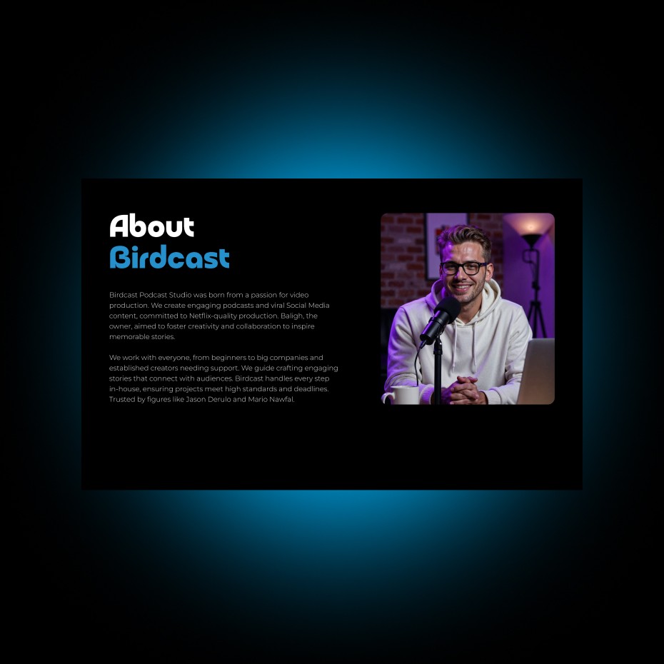
“The redesign brings our content to life. It feels modern, easy to navigate, and truly represents our studio’s creative energy.”

Stuart Watkins
Stuart Watkins
CTO, Eddy
Get in touch