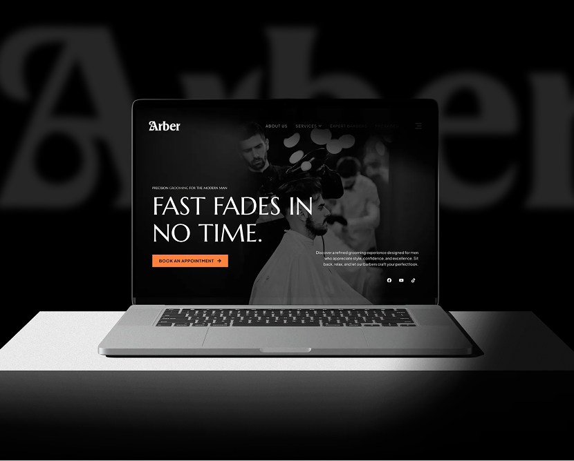
ClickDot Photography Website

A clean, modern photography website crafted to highlight visuals, tell stories through images, and create a smooth, immersive browsing experience.

Category

Technology

Timeline

4 weeks

Live view

project intro

ClickDot is a photography brand that needed a digital space where visuals take center stage. The purpose of this project was to design a website that showcases photography in a refined, distraction-free way while supporting brand storytelling and client inquiries. The design focuses on simplicity, elegance, and flow—allowing images to shine without unnecessary noise.

PROBLEM

Many photography websites feel cluttered or overly styled, which takes attention away from the actual work. Navigation can also be confusing, making it harder for visitors to explore galleries or reach out. ClickDot needed a clean and intuitive platform that puts photography first while remaining easy to navigate.

CHALLENGES

  • Creating a minimal layout that still feels premium and engaging
  • Showcasing large visual content without slowing usability
  • Organizing galleries in a way that feels natural and intuitive
  • Maintaining strong visual impact across desktop and mobile devices
  • Designing clear contact paths without disrupting the visual flow

OUR SOLUTION

We designed a visual-first website with clean layouts, generous spacing, and simple navigation. The structure allows users to move seamlessly between galleries while staying focused on the imagery.

Subtle typography, balanced composition, and clear CTAs help support the visuals without competing with them.

Design Process

Research

We reviewed modern photography portfolios and studied how users browse visual content online. The focus was on immersion, clarity, and effortless navigation.

Design

High-fidelity UI screens were created with minimal UI elements, large image areas, and refined typography. The design ensures that photography remains the focal point on every screen.

Testing

Gallery navigation, image scaling, and responsiveness were reviewed to ensure smooth performance across devices and screen sizes.

Feedback

Feedback was incorporated to refine spacing, transitions, and visual balance, ensuring the final experience felt calm, polished, and professional.

Style guide & components

Consistency: Typography, spacing, and layout patterns were reused across all pages

Design System: Figma components and shared styles ensured visual alignment

Updates: Component-based layouts allowed easy updates without affecting the overall look

Collaboration: Designs were structured for smooth handoff, ensuring visuals were implemented accurately

Visual presentation

Consistency: Typography, spacing, and layout patterns were reused across all pages

Design System: Figma components and shared styles ensured visual alignment

Updates: Component-based layouts allowed easy updates without affecting the overall look

Collaboration: Designs were structured for smooth handoff, ensuring visuals were implemented accurately

user experience

The project includes refined mockups showcasing the homepage, gallery layouts, project pages, and contact sections. Desktop and mobile views highlight a responsive design that adapts smoothly while preserving visual quality.

what the client said about the project

Client review quotes icon

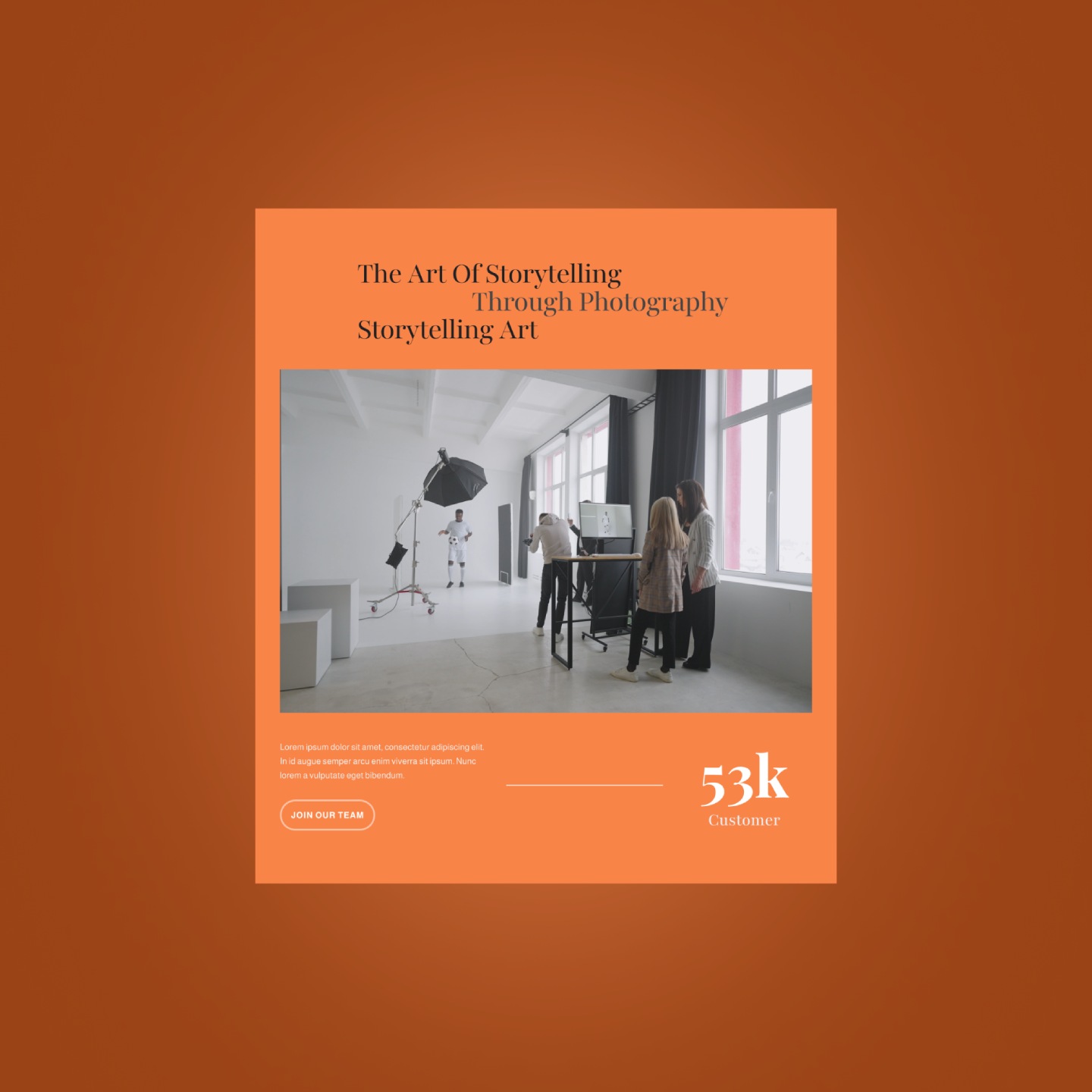
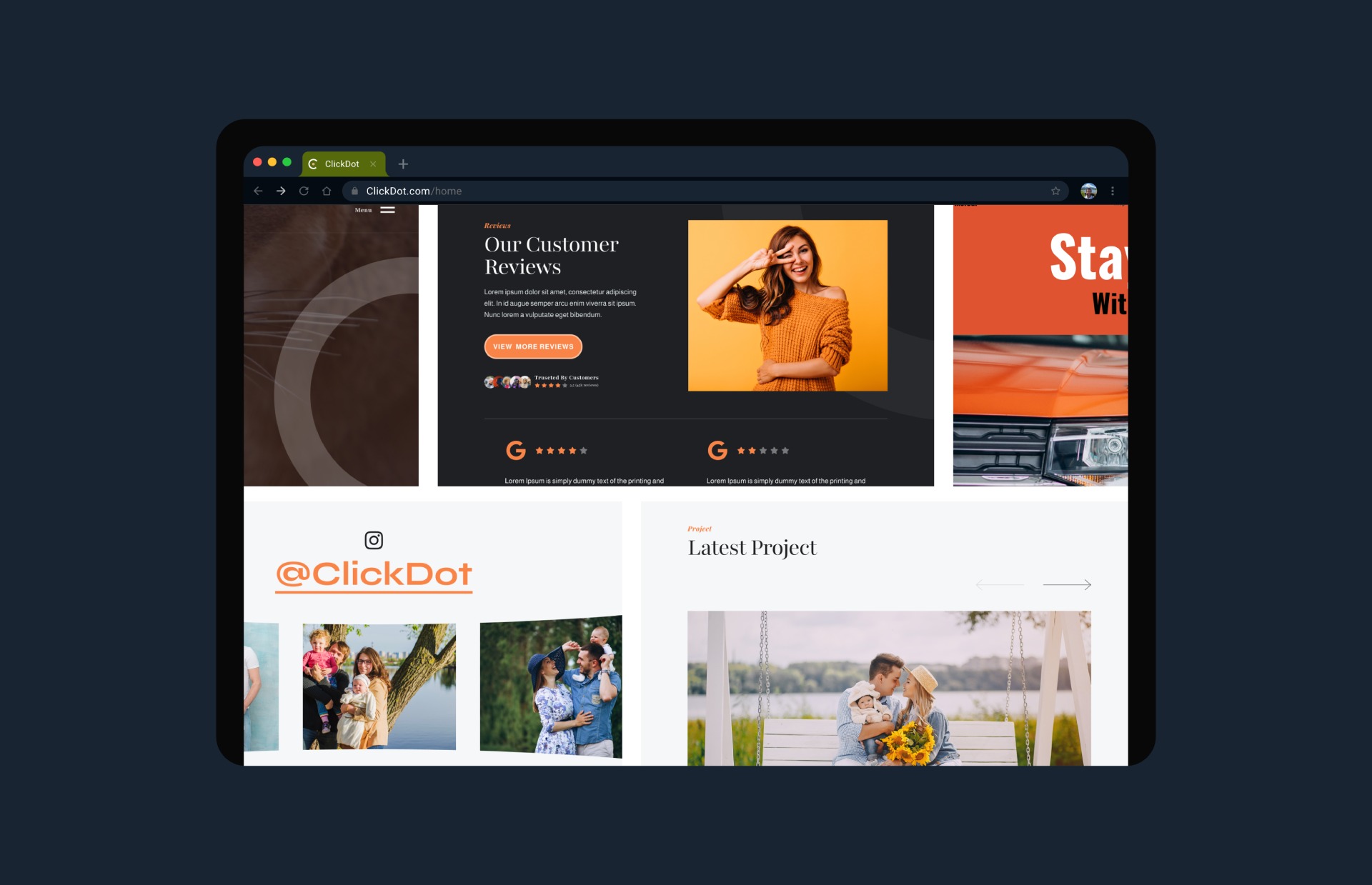
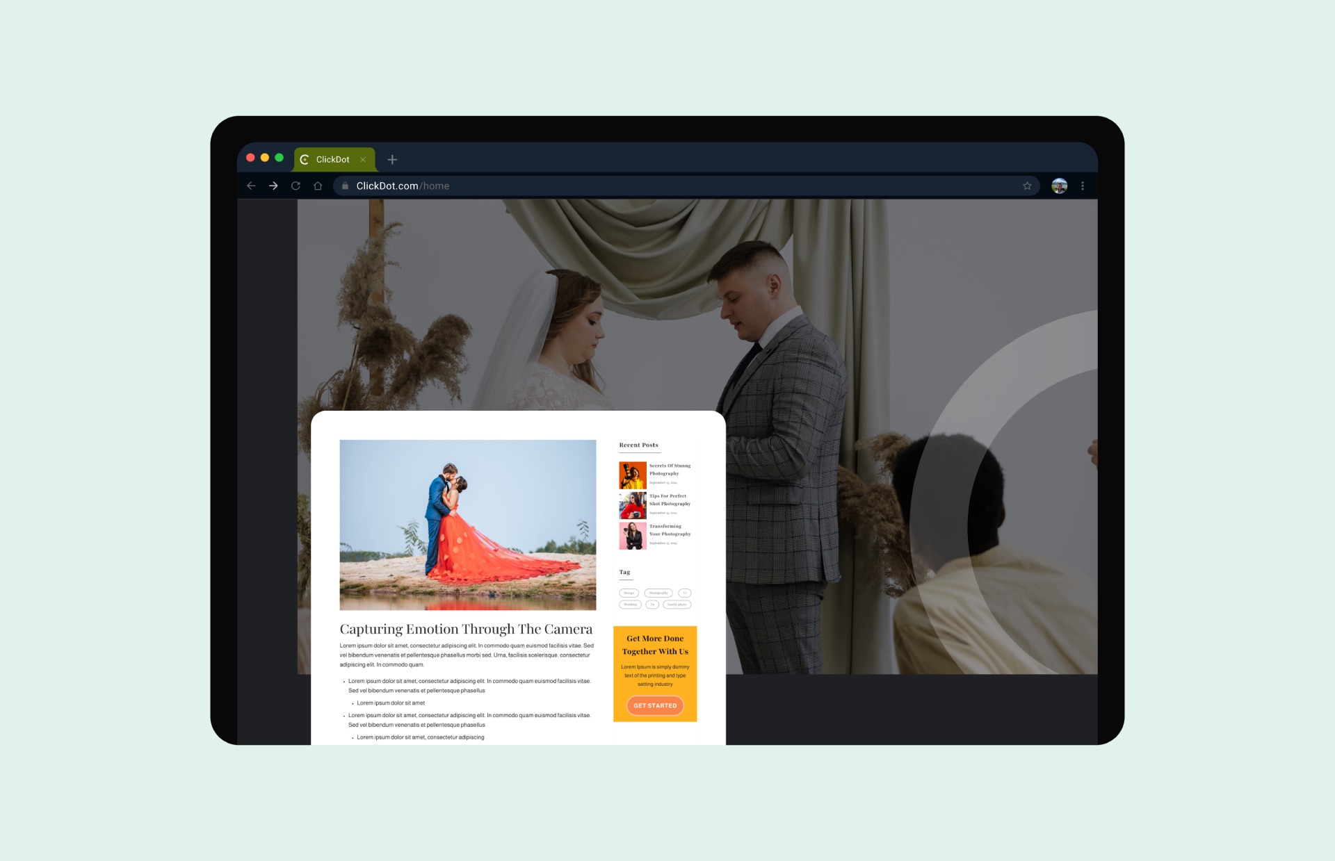
“The website perfectly showcases our work. It feels elegant, modern, and allows our photography to truly stand out without distractions.”

Stuart Watkins
Stuart Watkins
CTO, Eddy
Get in touch