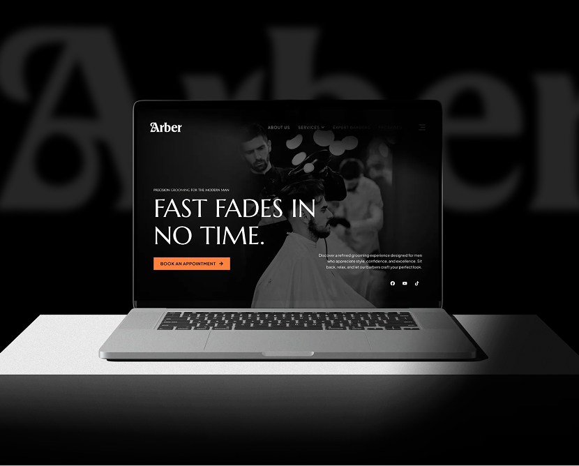
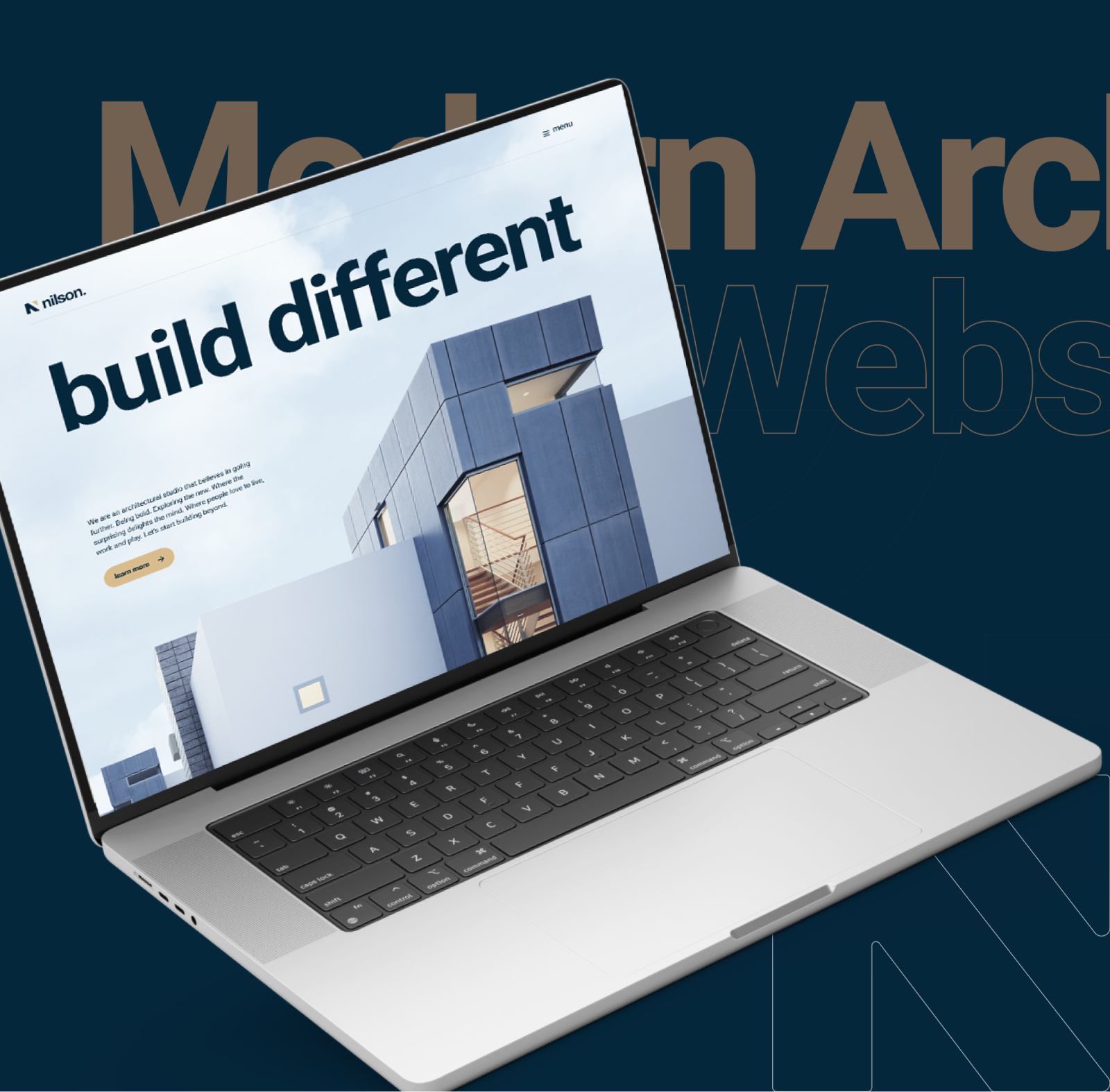
Farren McRae - Law Firm Website UI/UX Design

A professional law firm website designed to communicate trust, simplify legal information, and guide users toward confident decisions.

Category

Technology

Timeline

4 weeks

Live view

project intro

This project involved designing a modern, approachable website for a law firm that values clarity, professionalism, and client trust. The objective was to translate complex legal services into a structured, easy-to-navigate digital experience while maintaining a strong and credible brand presence. The final design supports both brand authority and client engagement across all devices.

PROBLEM

The previous digital experience lacked clarity and visual hierarchy. Legal services were difficult to scan, and the overall structure did not effectively guide users toward consultation or contact. This reduced user confidence and weakened the firm’s online credibility.

CHALLENGES

  • Explaining legal services clearly without oversimplifying
  • Establishing trust quickly through layout and typography
  • Designing a professional interface that still feels welcoming
  • Structuring multiple practice areas in a logical flow
  • Maintaining consistency across responsive breakpoints

OUR SOLUTION

We created a clean, well-organized website focused on clarity and confidence. Services are grouped logically, content is easy to scan, and key actions are clearly highlighted.

A restrained color palette, strong typography, and generous spacing work together to create a calm, trustworthy experience that supports user decision-making.

Design Process

Research

We reviewed contemporary law firm websites and studied user expectations within legal services. The focus was on trust-building, readability, and conversion clarity.

Design

High-fidelity UI screens were designed with a strong grid system, clear hierarchy, and minimal visual noise. Every section was crafted to feel deliberate and professional.

Testing

Navigation flow, service discovery, and contact actions were reviewed to ensure ease of use across desktop and mobile devices.

Feedback

Design refinements focused on improving content flow, spacing, and emphasis on key actions, ensuring the site remained clear and approachable.

Style guide & components

Consistency: Typography, color usage, spacing, and layout patterns remain uniform across all pages

Design System: Figma libraries and reusable components support efficient design updates

Change Management: Component-level updates ensure changes propagate across screens without rework

Collaboration: Designs were prepared with development constraints in mind to ensure smooth handoff This system keeps the design clean, scalable, and implementation-ready.

Visual presentation

Consistency: Typography, color usage, spacing, and layout patterns remain uniform across all pages

Design System: Figma libraries and reusable components support efficient design updates

Change Management: Component-level updates ensure changes propagate across screens without rework

Collaboration: Designs were prepared with development constraints in mind to ensure smooth handoff This system keeps the design clean, scalable, and implementation-ready.

user experience

The project includes polished UI mockups for the homepage, practice areas, and contact sections. Responsive layouts demonstrate clarity and balance across desktop and mobile views.

what the client said about the project

Client review quotes icon

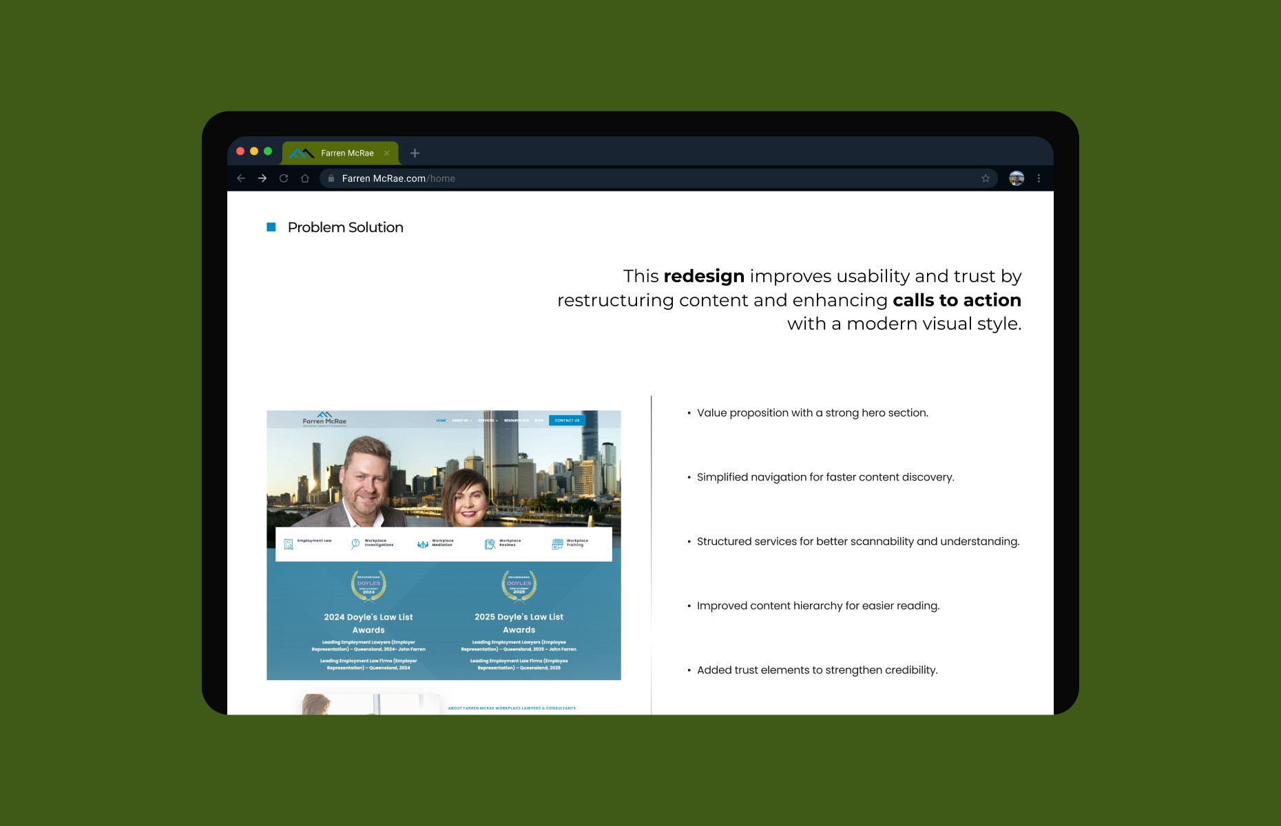
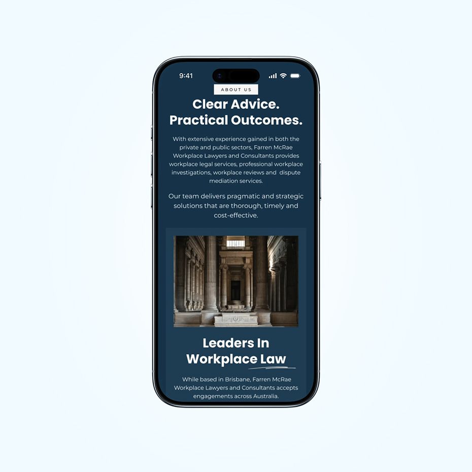
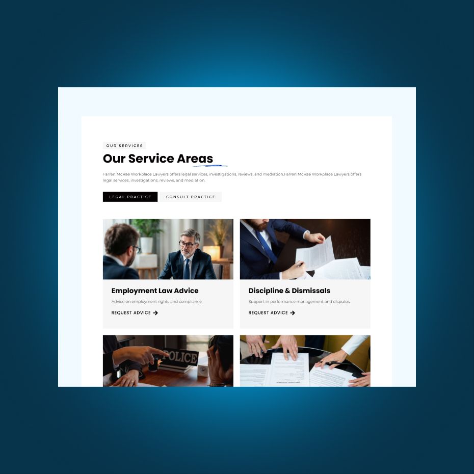
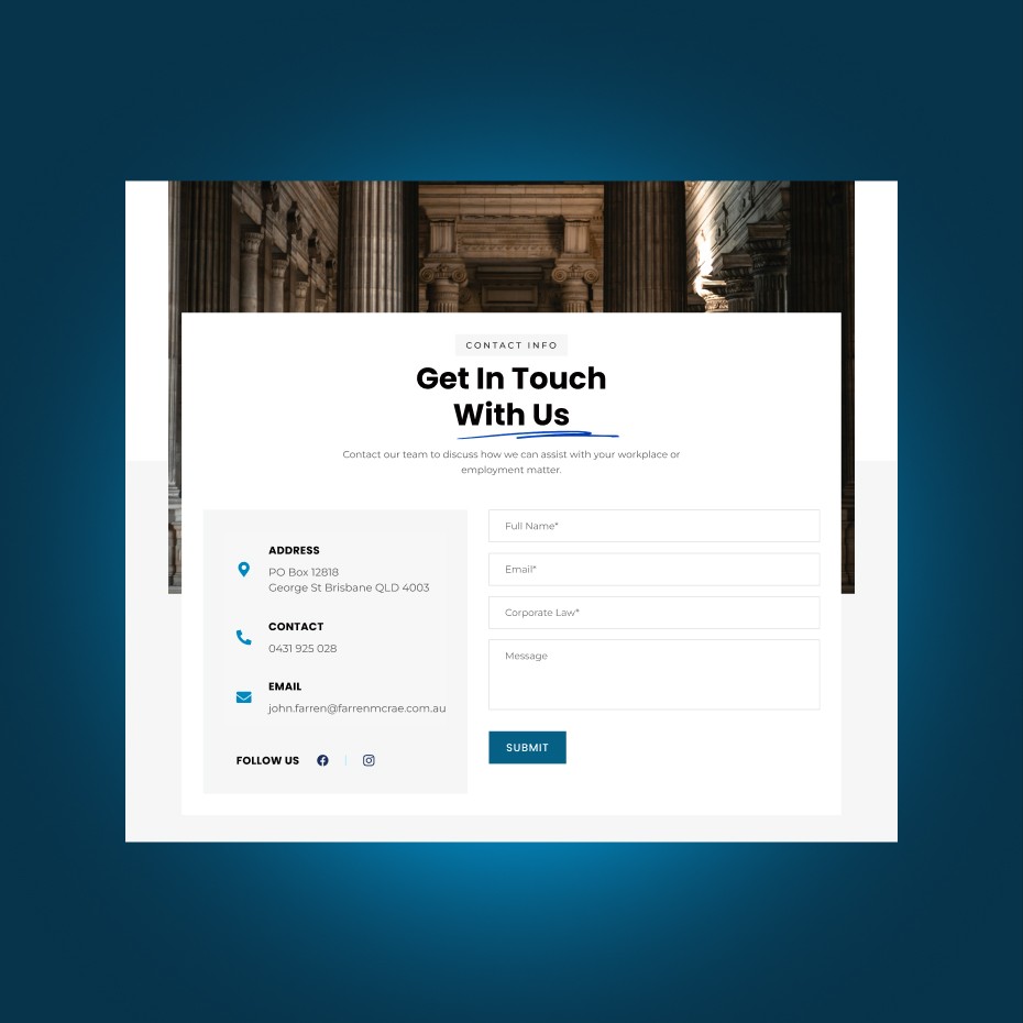
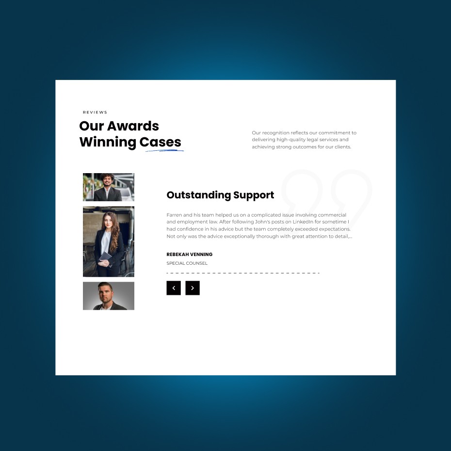
“The website feels professional, clear, and trustworthy. It reflects our firm perfectly and makes it easier for clients to understand our services and reach out.”

Stuart Watkins
CTO, Eddy
Get in touch