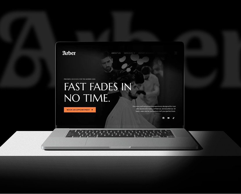
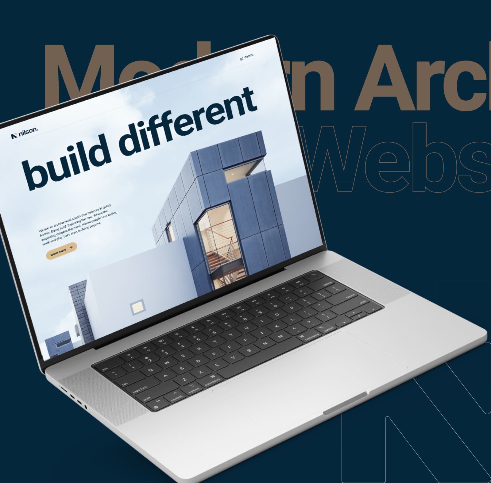
Glow Perfected – Soft, Clean & Modern Skincare Website

A soft, modern skincare website designed to highlight product benefits, build trust, and create a calm, premium browsing experience.

Category

Technology

Timeline

4 weeks

Live view

project intro

Glow Perfected is a skincare brand focused on clean beauty and gentle self-care. The purpose of this project was to design a website that reflects purity, confidence, and simplicity while clearly communicating product value and brand philosophy. The design aims to feel soothing and premium, helping users feel comfortable exploring products and learning about skincare routines.

PROBLEM

Many skincare websites feel either overly clinical or visually overwhelming. Important product details are often buried, making it harder for users to understand benefits and choose confidently. Glow Perfected needed a clean, approachable digital experience that feels trustworthy and easy to navigate.

CHALLENGES

  • Creating a soft, elegant visual style without losing clarity
  • Presenting skincare benefits in a simple, non-technical way
  • Maintaining a premium feel while keeping layouts minimal
  • Organizing product information clearly across pages
  • Ensuring consistency across desktop and mobile experiences

OUR SOLUTION

We designed a clean, minimal interface that emphasizes calm visuals and clear content hierarchy. Soft colors, generous spacing, and refined typography help create a relaxed browsing experience.

Product sections are structured to highlight benefits, ingredients, and usage clearly, while subtle calls-to-action guide users toward exploration and purchase without pressure.

Design Process

Research

We reviewed modern skincare and beauty websites and studied how users explore wellness-focused products online. The focus was on trust, clarity, and emotional comfort.

Design

High-fidelity UI screens were created with a soft color palette, clean layouts, and balanced typography. Visual elements were intentionally subtle to support a calm, premium brand presence.

Testing

Product flows, content readability, and responsiveness were reviewed to ensure ease of use across all devices.

Feedback

Iterative feedback helped refine spacing, visual balance, and content structure, ensuring the experience remained clean and intuitive.

Style guide & components

Consistency: Colors, typography, spacing, and UI elements were reused across all screens

Design System: Figma libraries and reusable components ensured alignment across pages

Updates: Component-based structure allowed easy updates without breaking consistency

Collaboration: Designs were prepared with developers in mind for smooth handoff and accurate implementation

Visual presentation

Consistency: Colors, typography, spacing, and UI elements were reused across all screens

Design System: Figma libraries and reusable components ensured alignment across pages

Updates: Component-based structure allowed easy updates without breaking consistency

Collaboration: Designs were prepared with developers in mind for smooth handoff and accurate implementation

user experience

The project features refined mockups showcasing the homepage, product pages, ingredient sections, and brand storytelling areas. Desktop and mobile views demonstrate a responsive layout that maintains softness and clarity across devices.

what the client said about the project

Client review quotes icon

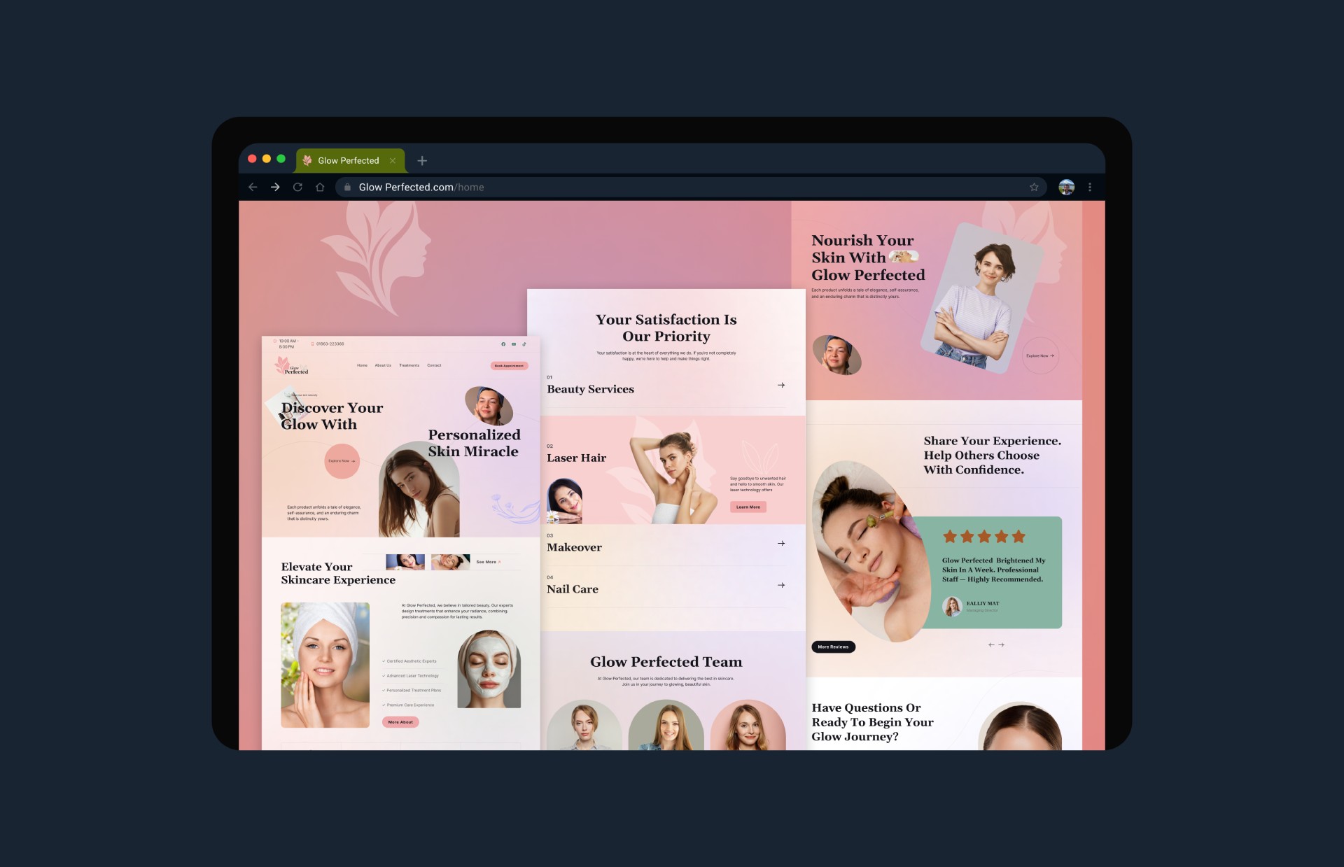
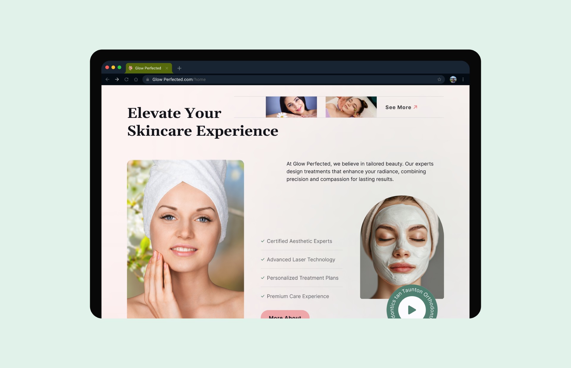
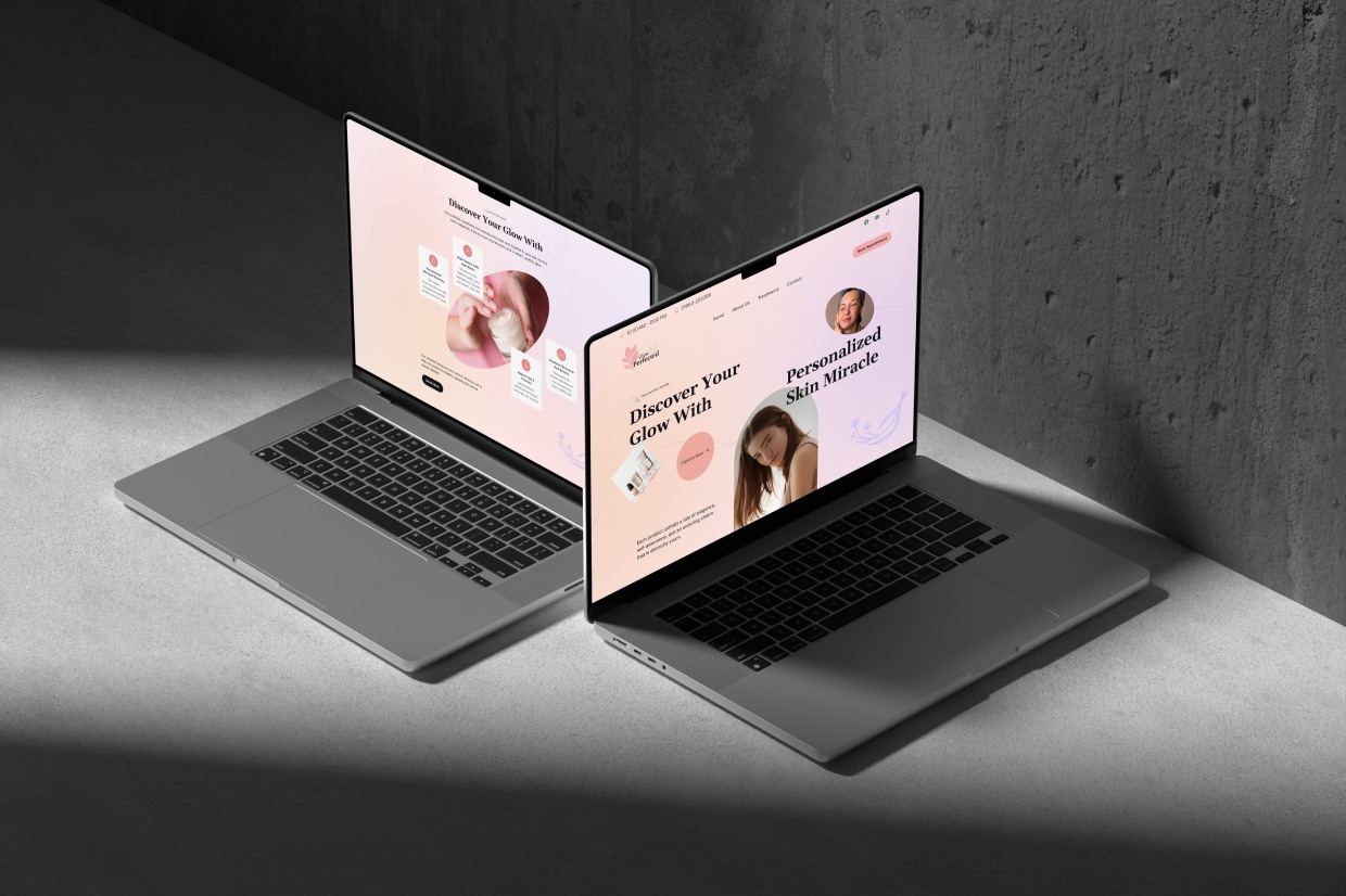
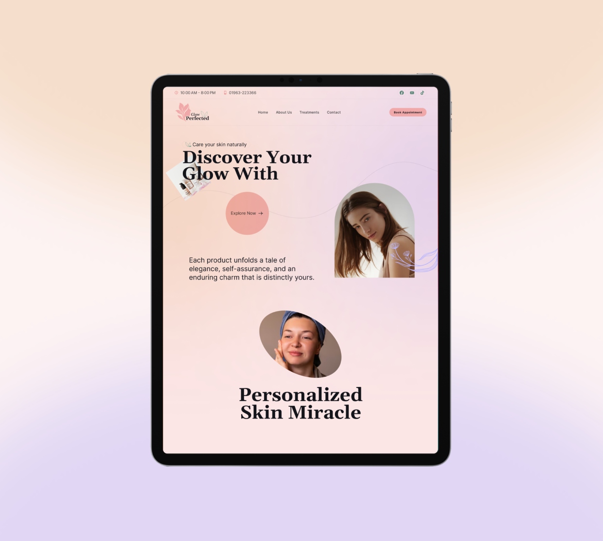
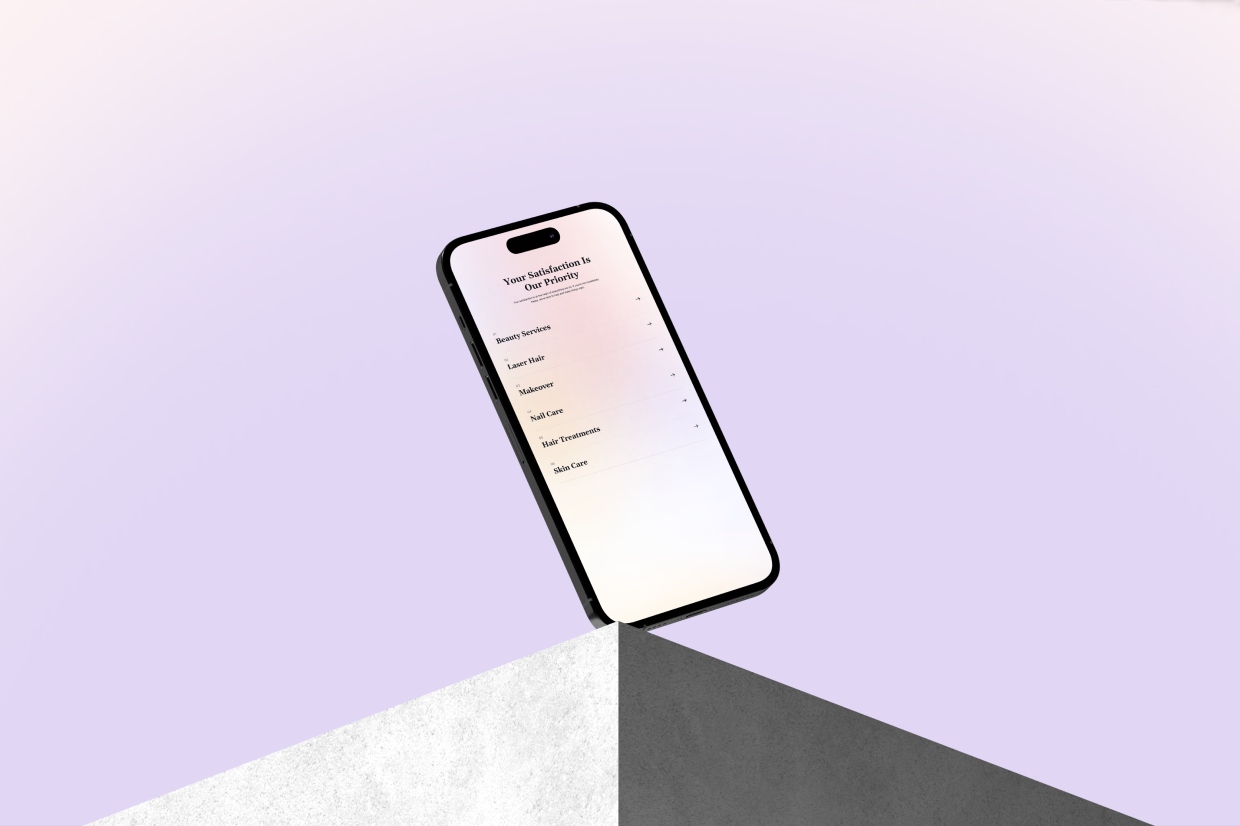
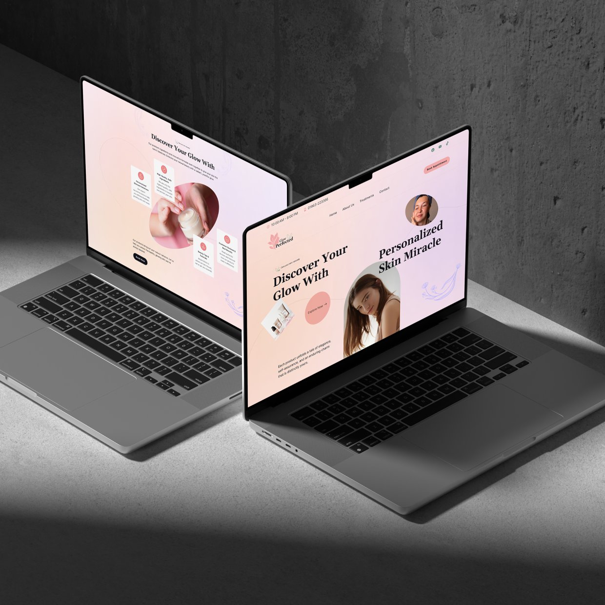
"The website captures our brand perfectly. It feels clean, modern, and calming, and our products are now much easier for customers to understand and explore."

Stuart Watkins
Stuart Watkins
CTO, Eddy
Get in touch