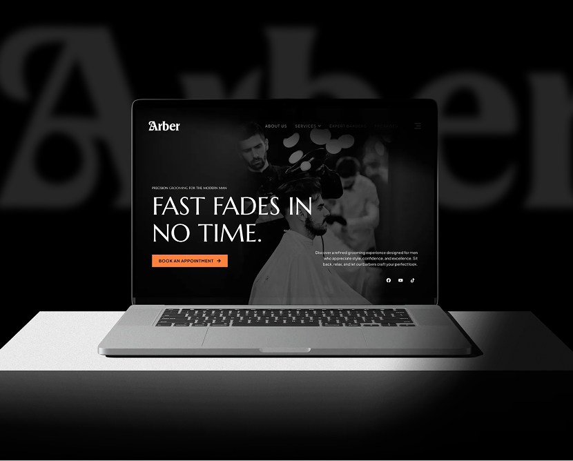
NexusPay Digital Wallet App Redesign – UX/UI Case Study

A modern redesign of a digital wallet app focused on speed, clarity, and user confidence across everyday financial actions.

Category

Technology

Timeline

4 weeks

Live view

project intro

NexusPay is a digital wallet application designed to help users manage payments, transfers, and balances with ease. This project focused on redesigning the app experience to improve usability, reduce friction, and modernize the visual interface while maintaining trust and security. The goal was to create an intuitive financial product that feels simple for new users and efficient for frequent users.

PROBLEM

The previous app experience felt cluttered and difficult to navigate. Core actions such as sending money, checking balances, or viewing transactions required too many steps, leading to confusion and drop-offs. The visual design also lacked clarity, making the app feel outdated in a competitive fintech market.

CHALLENGES

  •  Presenting complex construction services in a simple, structured way
  • Balancing technical credibility with a clean, modern design
  • Showcasing large project visuals without overwhelming the layout
  • Creating clear navigation for services, projects, and company information
  • Ensuring consistency across desktop, tablet, and mobile devices

OUR SOLUTION

We redesigned NexusPay with a user-first approach. Core actions were prioritized and placed front and center, while secondary features were organized more clearly.

A clean layout, improved visual hierarchy, and simplified flows helped reduce cognitive load. The redesign makes everyday actions—like payments and transfers—faster, clearer, and more reassuring.

Design Process

Research

We reviewed fintech app patterns, analyzed common user pain points, and studied how people interact with mobile payment platforms. The focus was on reducing friction and improving task completion speed.

Design

High-fidelity mobile UI screens were created with a modern, minimal style. Clear typography, spacing, and icon usage help guide users naturally through each action.

Testing

User flows such as sending money, checking transaction history, and managing wallets were reviewed to ensure clarity and ease of use. Screen transitions and interaction logic were refined for smooth navigation.

Feedback

Iterative feedback was used to improve layout balance, button placement, and screen hierarchy, resulting in a more confident and intuitive experience.

Style guide & components

Our style guide was thoughtfully created to uphold a unified visual identity. We embraced a clean and modern design, emphasizing user-friendly elements.

Visual presentation

Our style guide was thoughtfully created to uphold a unified visual identity. We embraced a clean and modern design, emphasizing user-friendly elements.

user experience

The project features detailed mobile mockups showcasing key screens such as onboarding, wallet overview, transactions, and payments. The visuals demonstrate a clean, modern interface optimized for mobile interaction.

what the client said about the project

Client review quotes icon

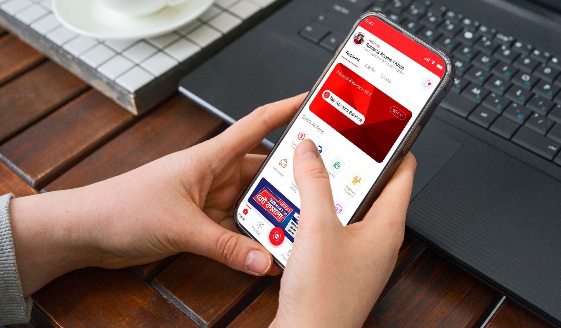
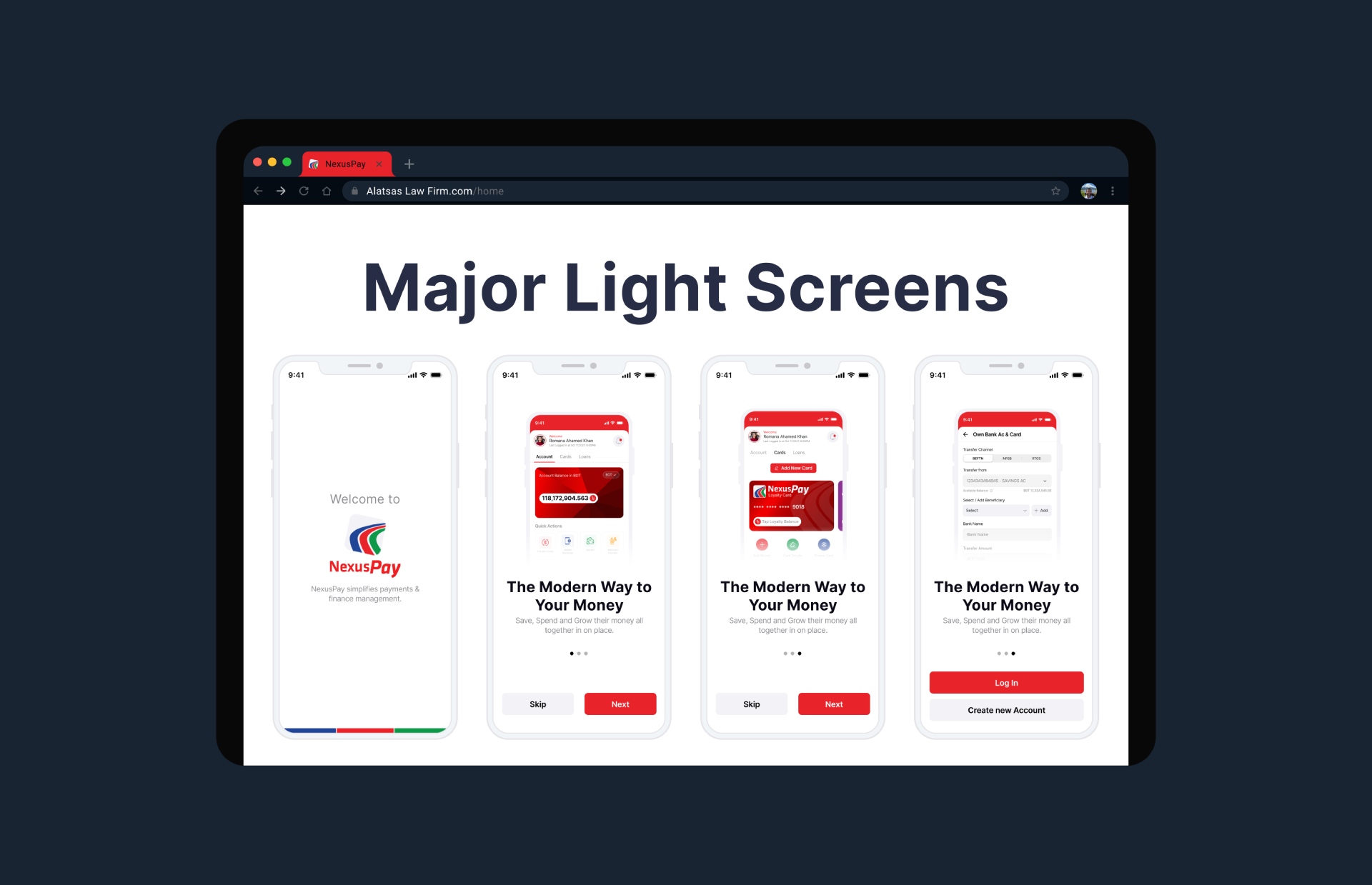
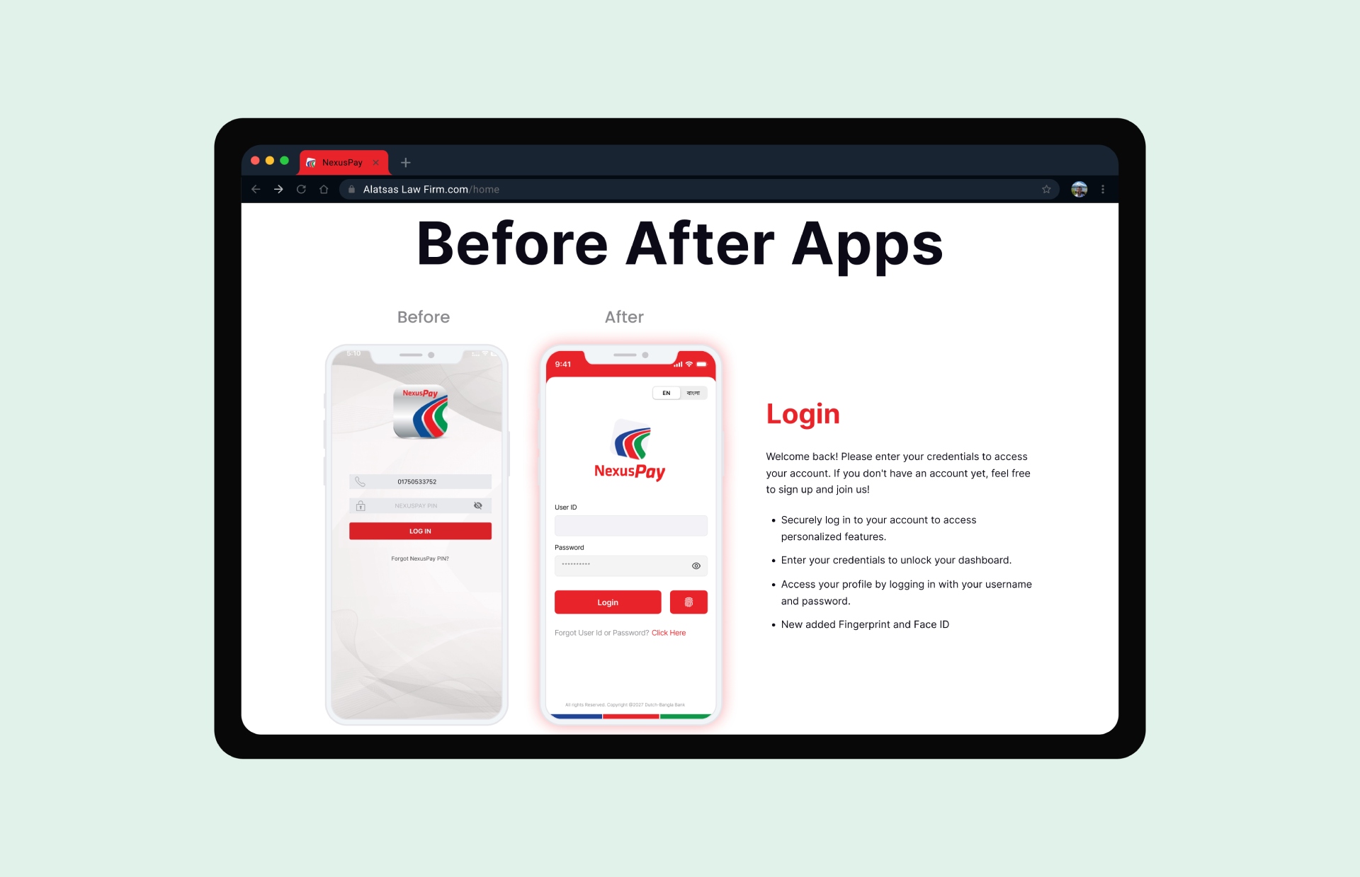
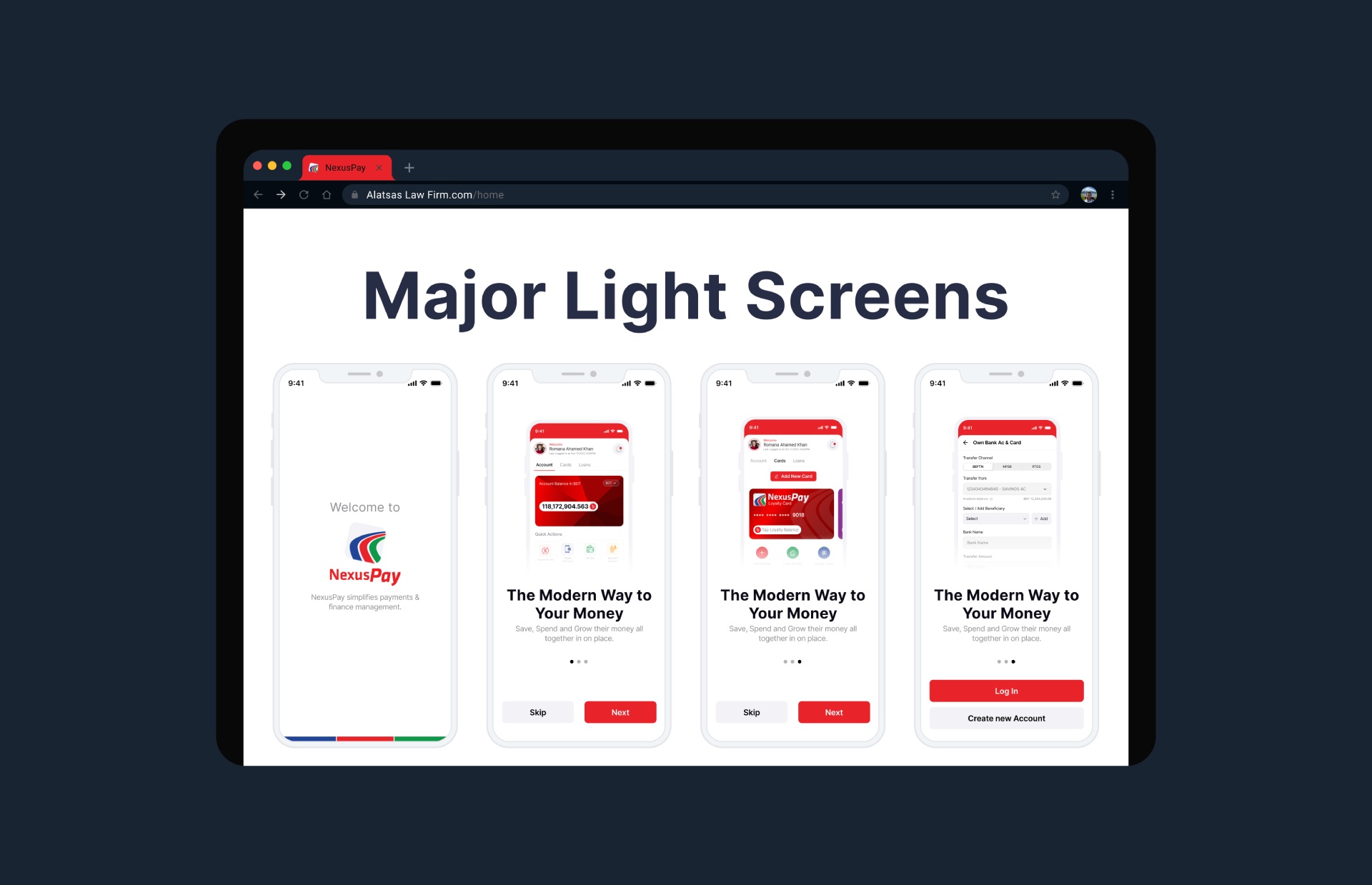
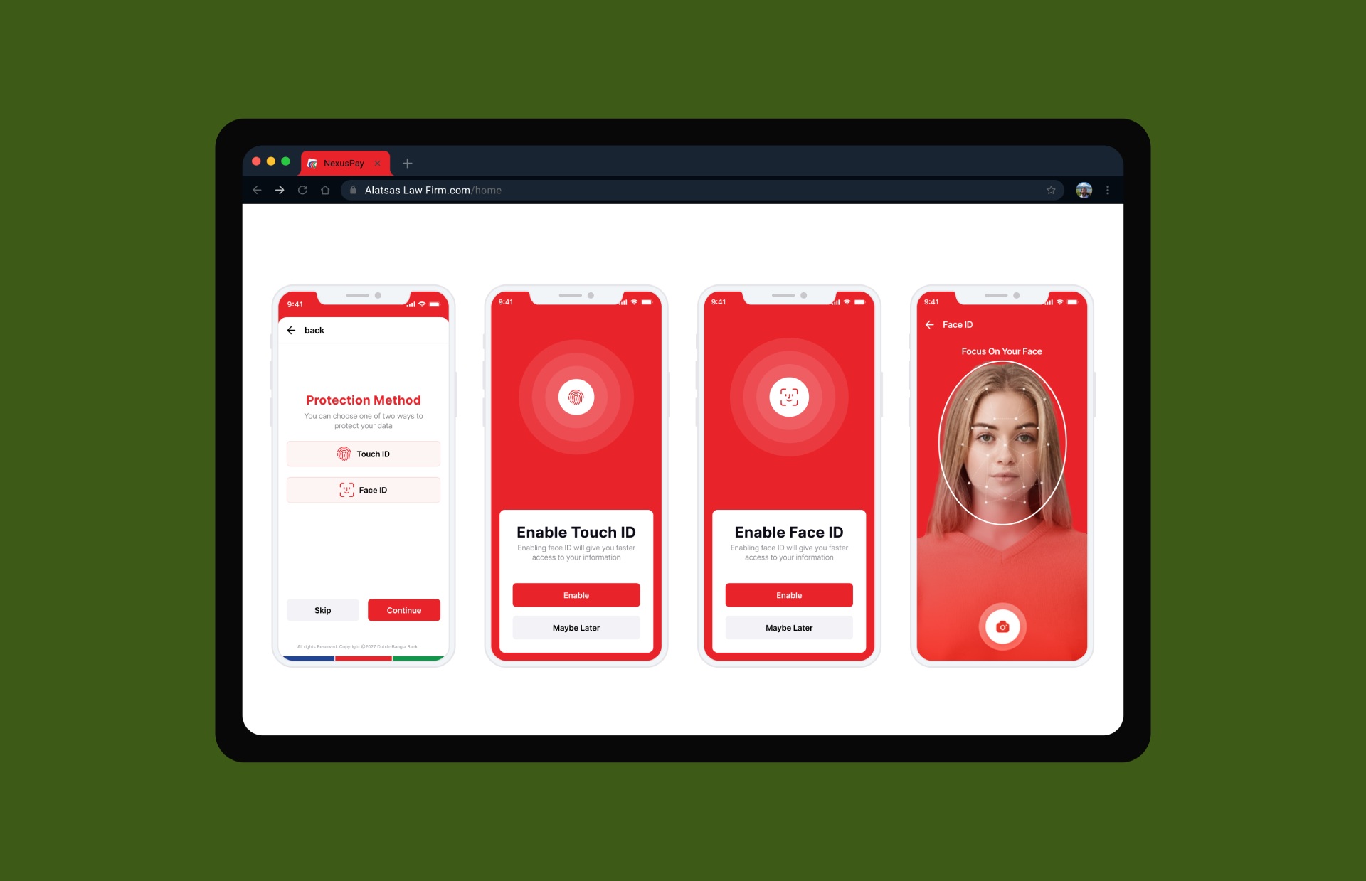
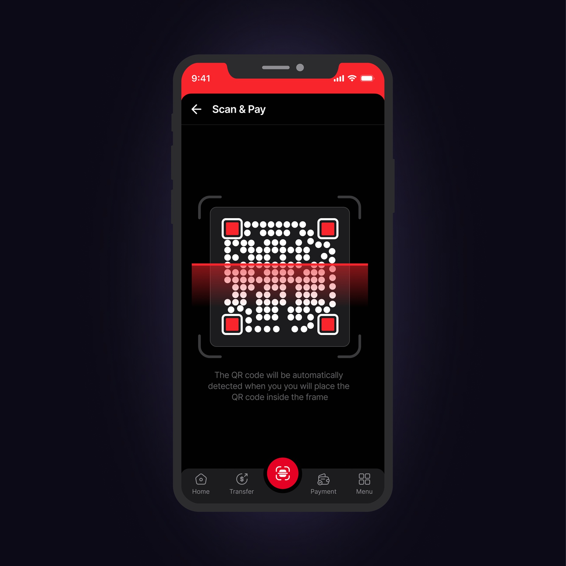
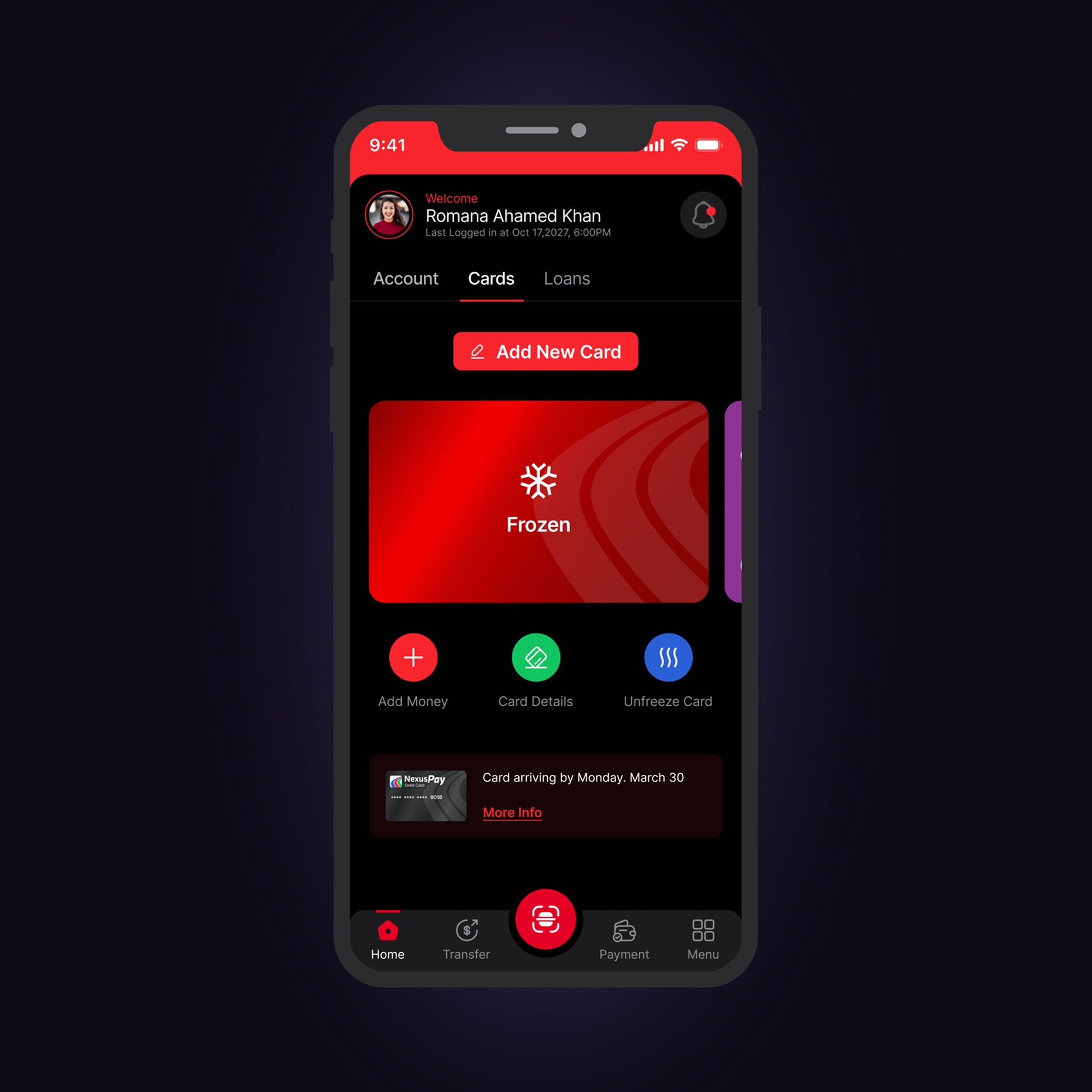
"The redesign completely transformed how our app feels. It’s cleaner, easier to use, and much more aligned with what modern users expect from a digital wallet."

Stuart Watkins
Stuart Watkins
CTO, Eddy
Get in touch