
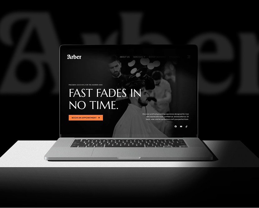
Arber Shop – Men’s Salon Website UI/UX Design
From fragmentation to fusion: Breaking down the complexities of data management
The previous site lacked clarity and structure, making it difficult for visitors to understand the full range of services offered. Medical terminology and practice explanations were buried in dense text, and key patient actions—like booking appointments or finding contact info—were hard to locate.
We redesigned the website with a patient-first focus. Medical services were broken down into simple, digestible segments with supportive language. Clear pathways for booking, inquiries, and treatment explanations help reduce anxiety and build confidence.
A calm aesthetic, balanced spacing, and intuitive navigation make meaningful information easy to find—helping patients take action when they’re ready.
We reviewed healthcare and rehabilitation websites, studied patient behavior online, and identified opportunities to make complex information more approachable. Accessibility and readability were prioritized.
High-fidelity UI screens were created with soothing visuals, clean layouts, and clear typography. Hierarchy and contrast were used strategically to guide attention toward key patient actions.
Core tasks—such as understanding services, finding contact information, and navigating treatment details—were tested for clarity, speed, and ease across desktop and mobile screens.
Iterative feedback from mock reviews helped refine content structure, spacing, and visual balance to ensure the experience felt supportive and easy to navigate.
Consistency: Colors, typography, spacing, and UI patterns were reused to maintain cohesion across all pages
Design System: Figma libraries and shared components kept UI behavior uniform
Updates: Component-level structure allowed fast changes without breaking layouts
Collaboration: Designs were organized for a smooth developer handoff and accurate implementation This ensured the final design was both scalable and easy to maintain.
The project features polished mockups of the homepage, services overview, educational sections, and contact areas. Desktop and mobile views demonstrate a responsive design that preserves clarity and comfort across screen sizes.
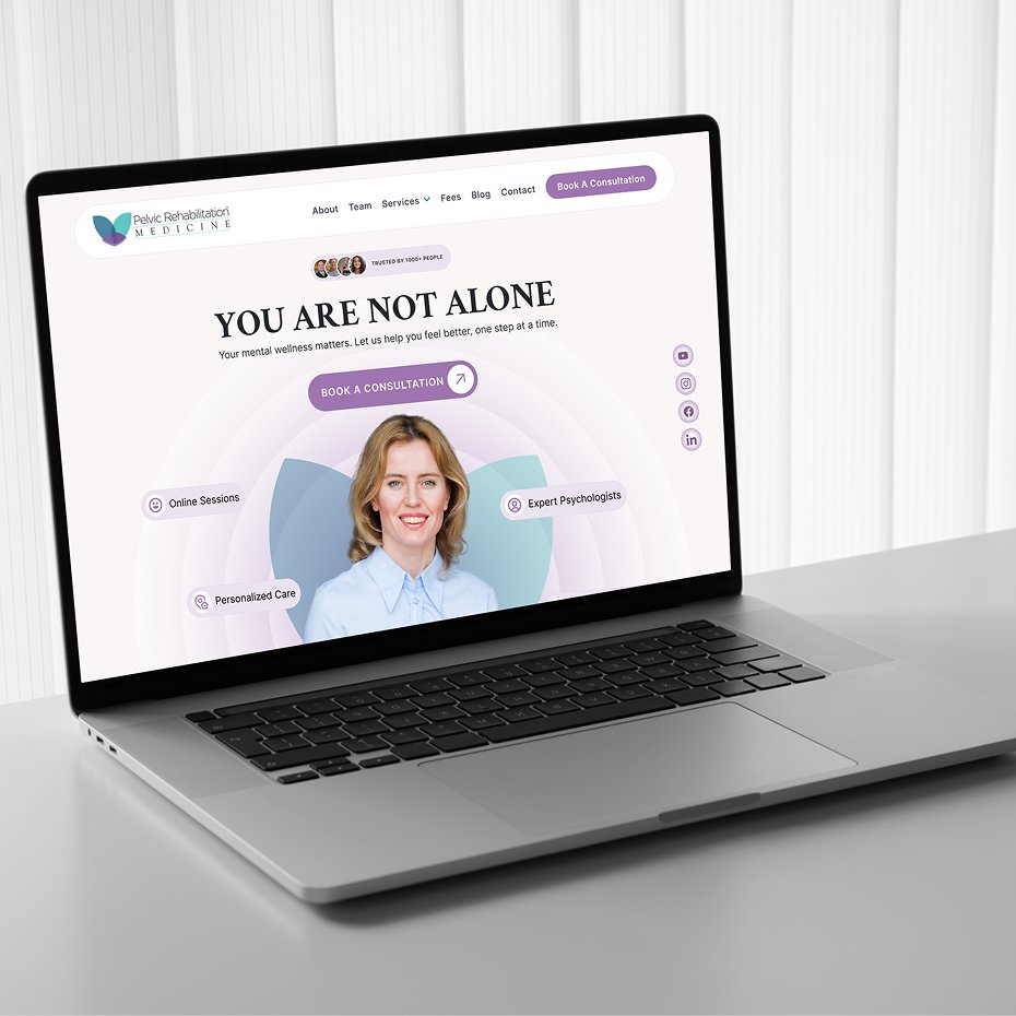
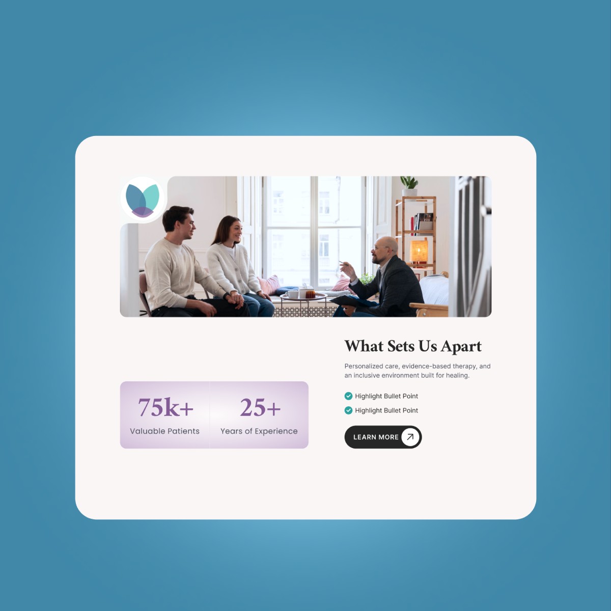
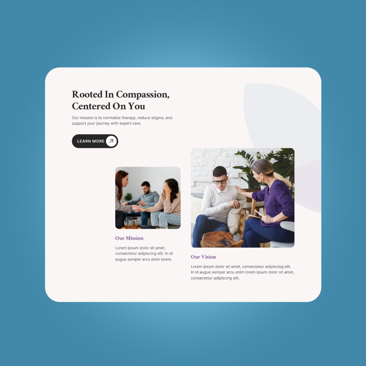
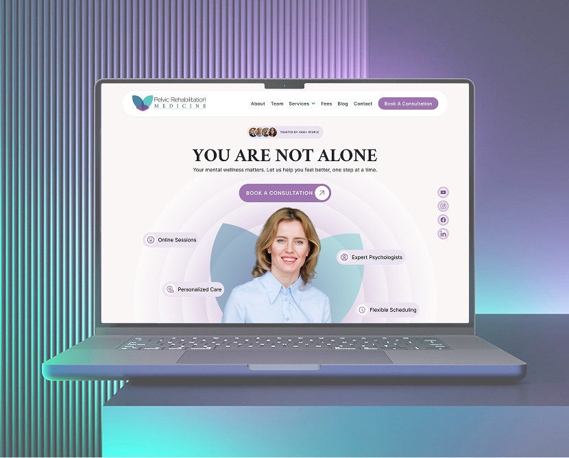
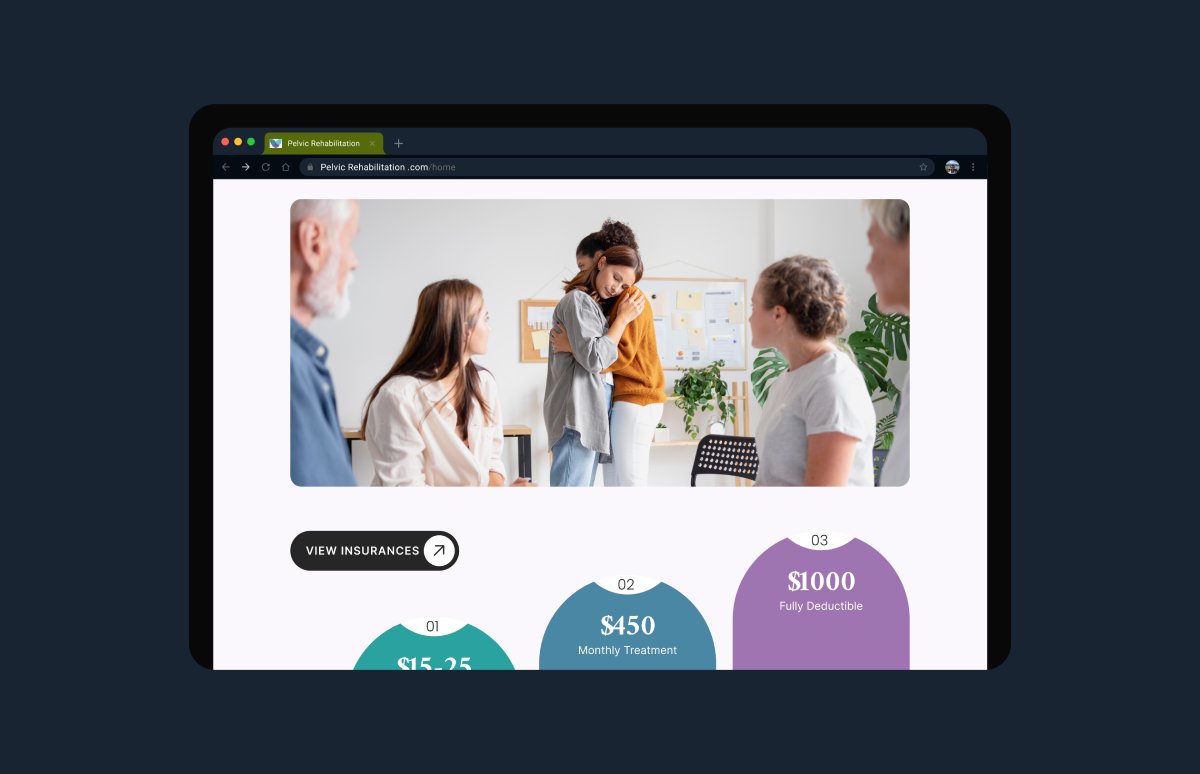
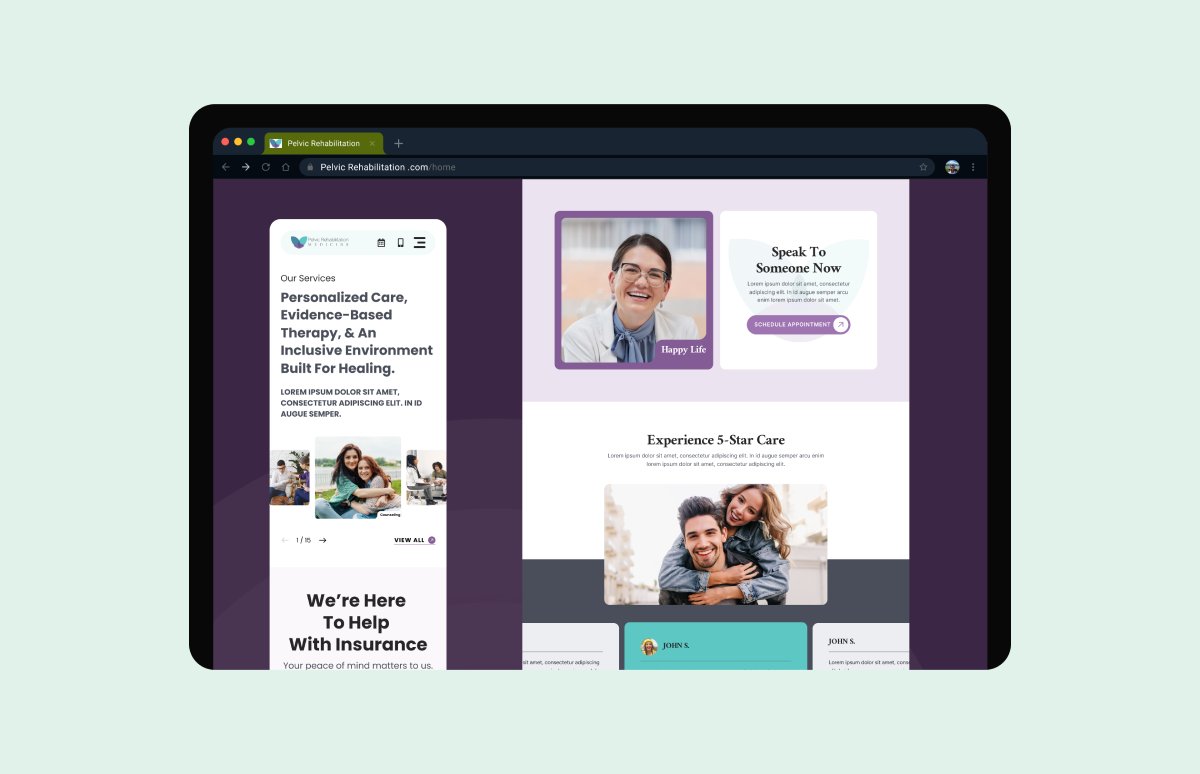
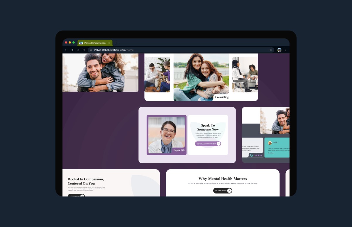
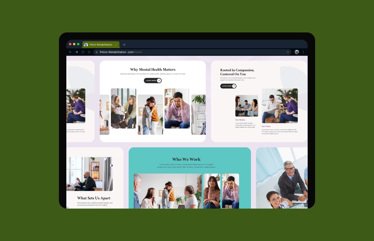
“The redesigned website truly reflects our patient-first philosophy. It feels supportive, clear, and accessible—and our patients tell us it’s much easier to understand their options and connect with our team.”

From fragmentation to fusion: Breaking down the complexities of data management

