
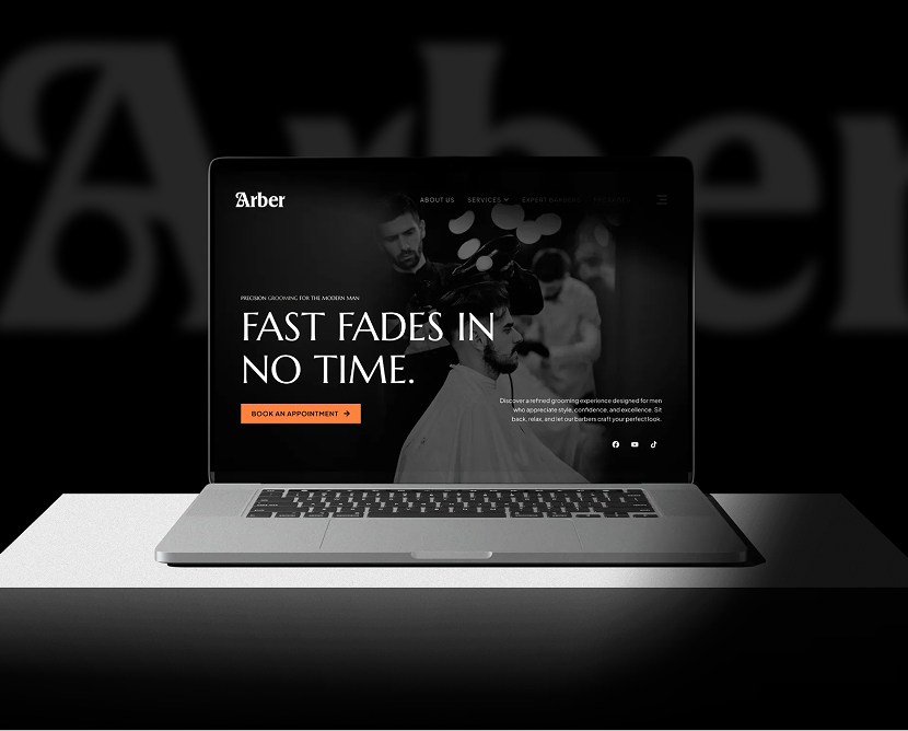
Arber Shop – Men’s Salon Website UI/UX Design
From fragmentation to fusion: Breaking down the complexities of data management
The previous website struggled with:
Organizing multiple technical services (clipping path, background removal, retouching, color correction, etc.) without overwhelming users
Creating strong visual comparisons (Before/After)
Designing for both individual freelancers and large eCommerce clients
Ensuring fast-loading, clean layouts for a media-heavy website
Building a structure that supports SEO growth
We analyzed competitor image editing platforms and identified common usability gaps. Special focus was placed on how agencies present pricing transparency and trust signals.
High-fidelity mockups were created with a minimal grid, balanced white space, and strong visual hierarchy. Key sections — such as services, comparisons, testimonials, and pricing — were emphasized to guide users naturally.
Navigation paths and interaction flows were reviewed to ensure clarity and ease of use. Testing focused on quote form visibility, service comparison clarity, and mobile responsiveness.
Iterative feedback helped refine spacing, label clarity, and CTA placement to improve overall usability and visual balance.
Consistency: Standardized typography, spacing, colors, and UI behaviors across all screens
Design System: Figma components and shared libraries for service cards, CTA blocks, forms, and visual preview modules
Updates: Centralized components allowed quick revisions without breaking layout patterns
Collaboration: Prepared developer-ready files with clear spacing, grid definitions, and component states This system ensures future growth and consistent visual language across the site.
Screens include desktop and mobile variants to ensure visual continuity.

From fragmentation to fusion: Breaking down the complexities of data management

