Many barber shop websites lean heavily on visuals but often lack structure and clarity. Users struggle to quickly find services, pricing, or booking options. The challenge was to create a design that feels bold and masculine without becoming cluttered or confusing.
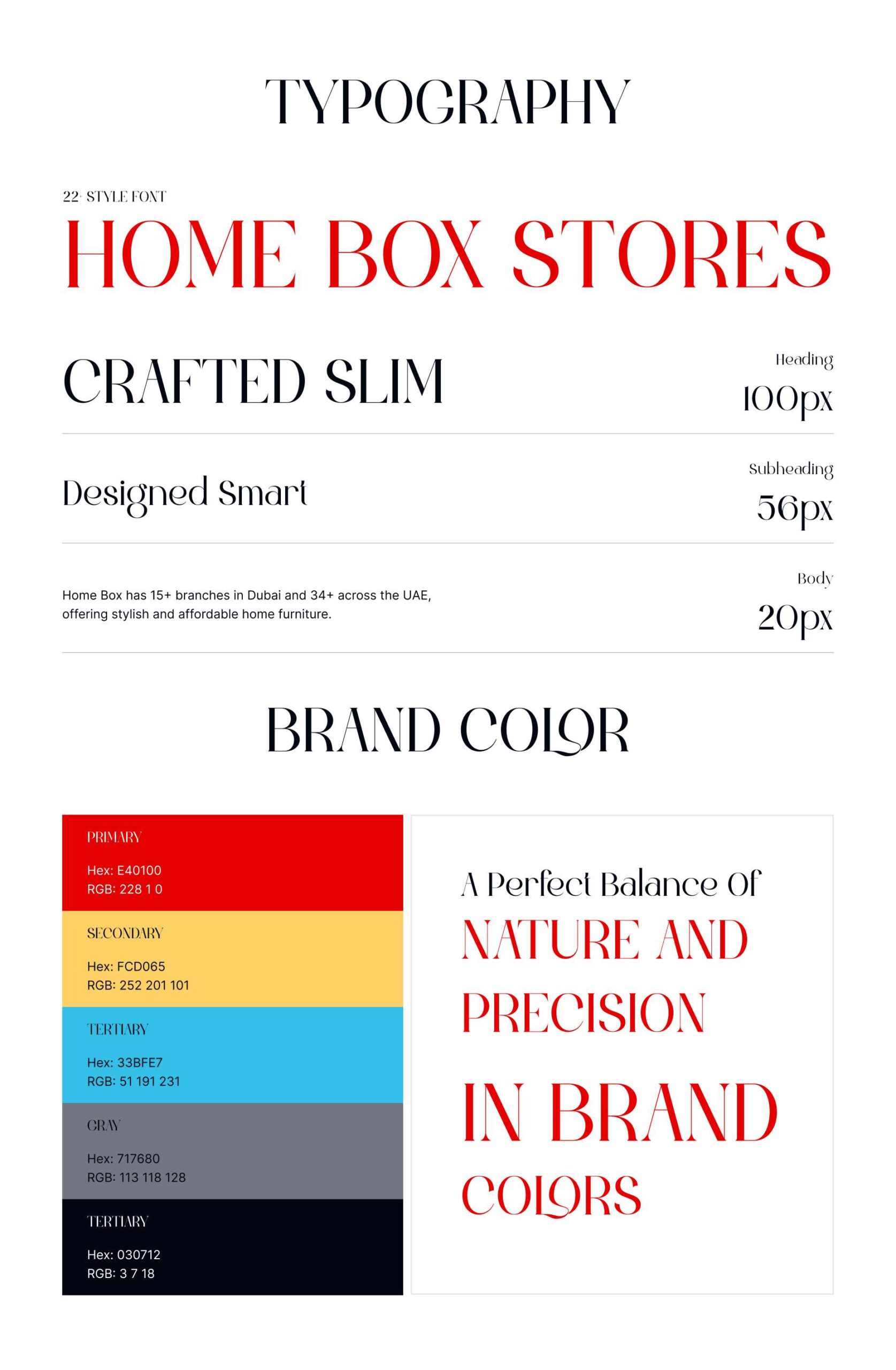
We designed a clean, well-structured interface that highlights craftsmanship and attention to detail. Strong typography, confident color usage, and balanced layouts create a premium feel while keeping content easy to scan.
Clear service sections, strategic CTAs, and thoughtful spacing guide users naturally toward booking or contacting the shop.
We analyzed modern barber shop and men’s lifestyle websites, focusing on how users explore services and make booking decisions. The emphasis was on trust, confidence, and simplicity.
We analyzed modern barber shop and men’s lifestyle websites, focusing on how users explore services and make booking decisions. The emphasis was on trust, confidence, and simplicity.
Key user flows such as browsing services and booking appointments were reviewed to ensure clarity, speed, and responsiveness across devices.
Design iterations refined spacing, section flow, and CTA visibility while preserving the brand’s strong visual identity.
Consistency: Typography, colors, spacing, and UI patterns were reused across all pages
Design System: Figma libraries and reusable components ensured visual alignment
Updates: Centralized components allowed quick changes without breaking layouts
Collaboration: Designs were structured for smooth developer handoff and accurate implementation
Consistency: Typography, colors, spacing, and UI patterns were reused across all pages
Design System: Figma libraries and reusable components ensured visual alignment
Updates: Centralized components allowed quick changes without breaking layouts
Collaboration: Designs were structured for smooth developer handoff and accurate implementation
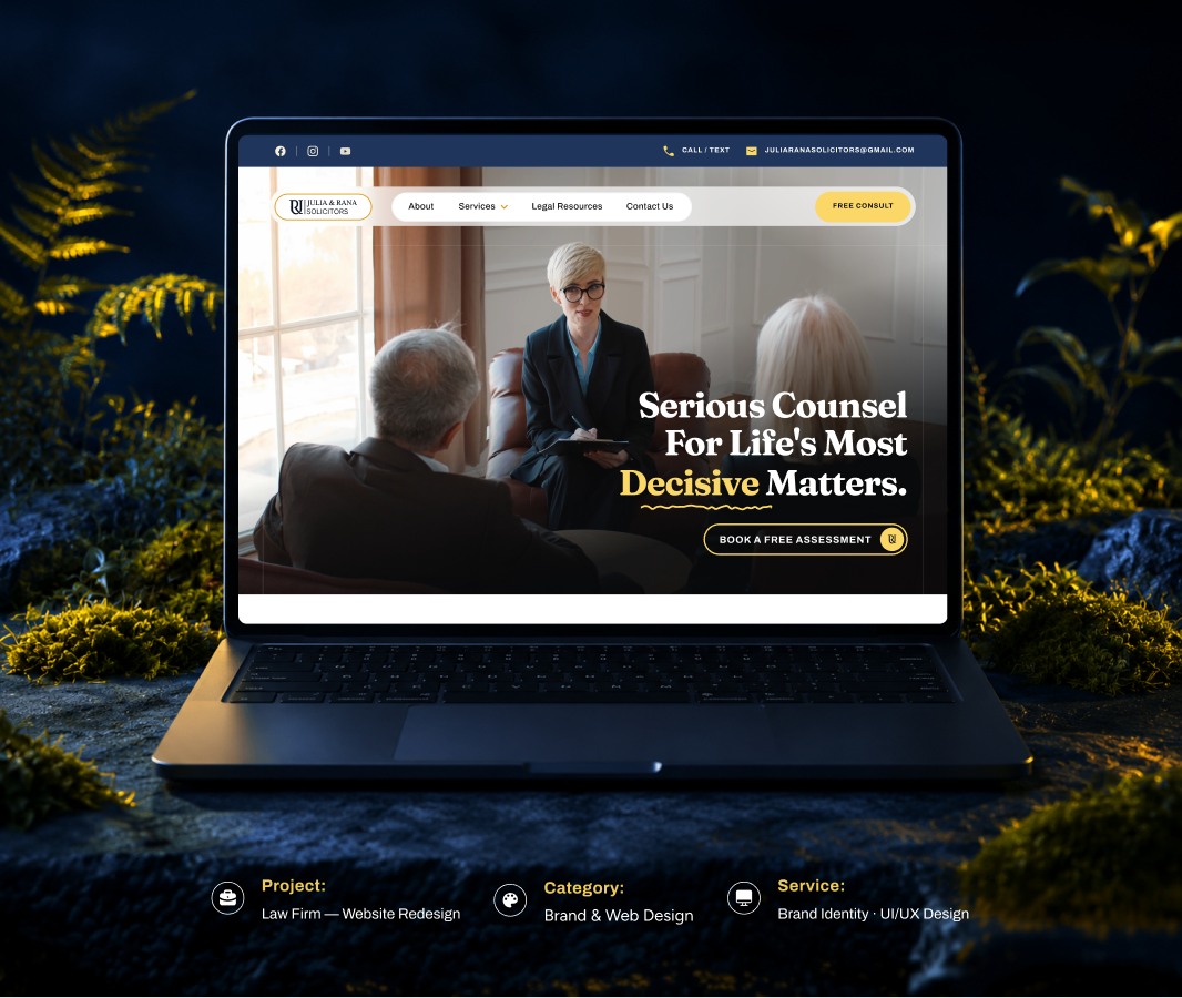
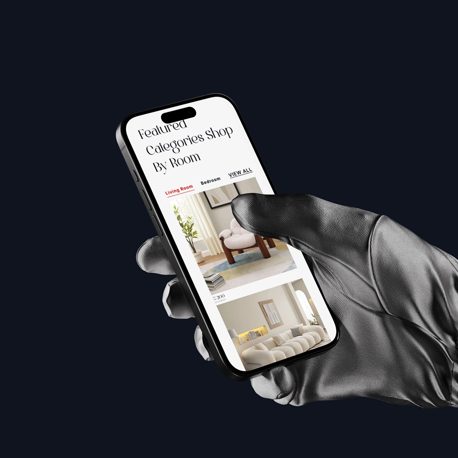
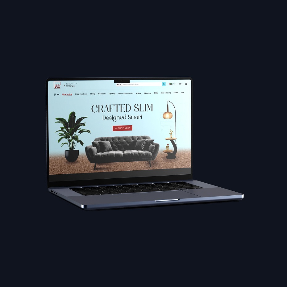
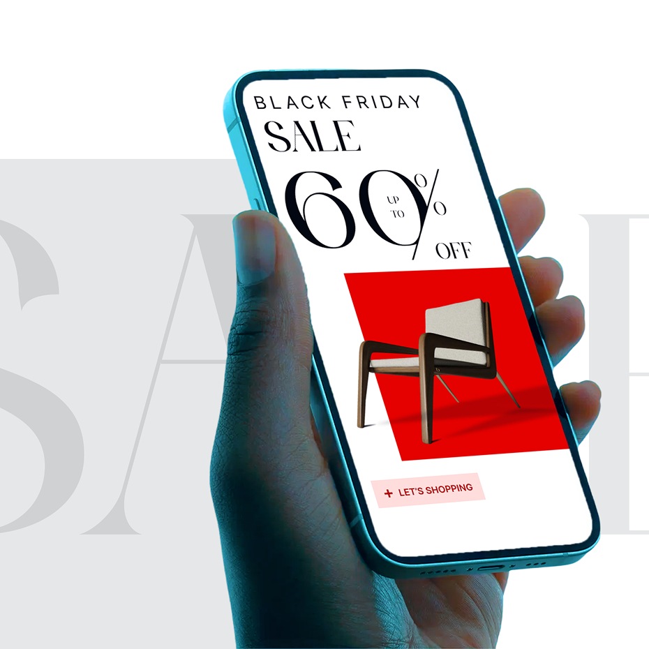
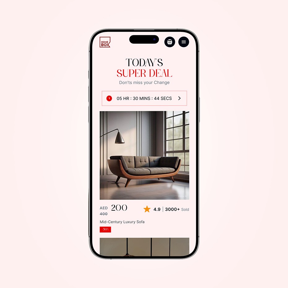
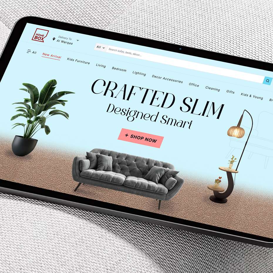
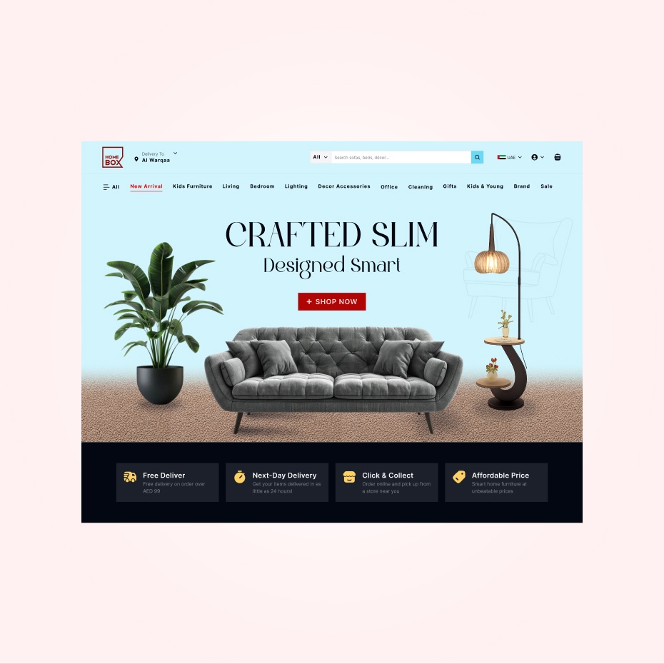
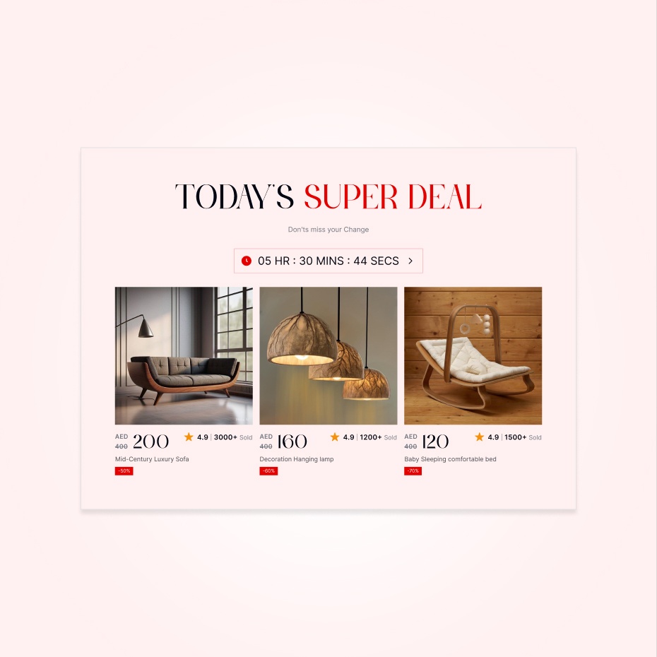
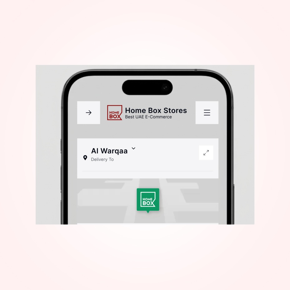
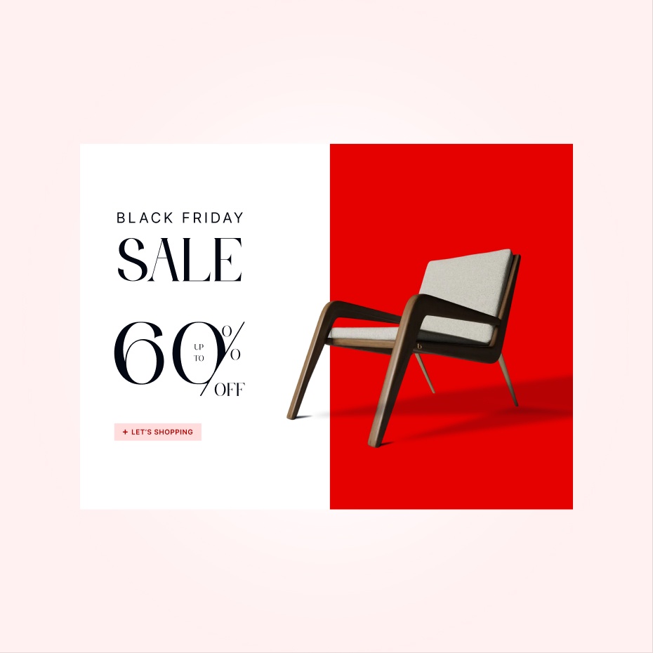
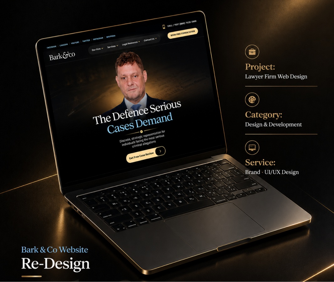
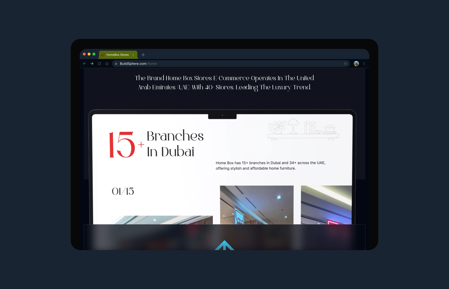
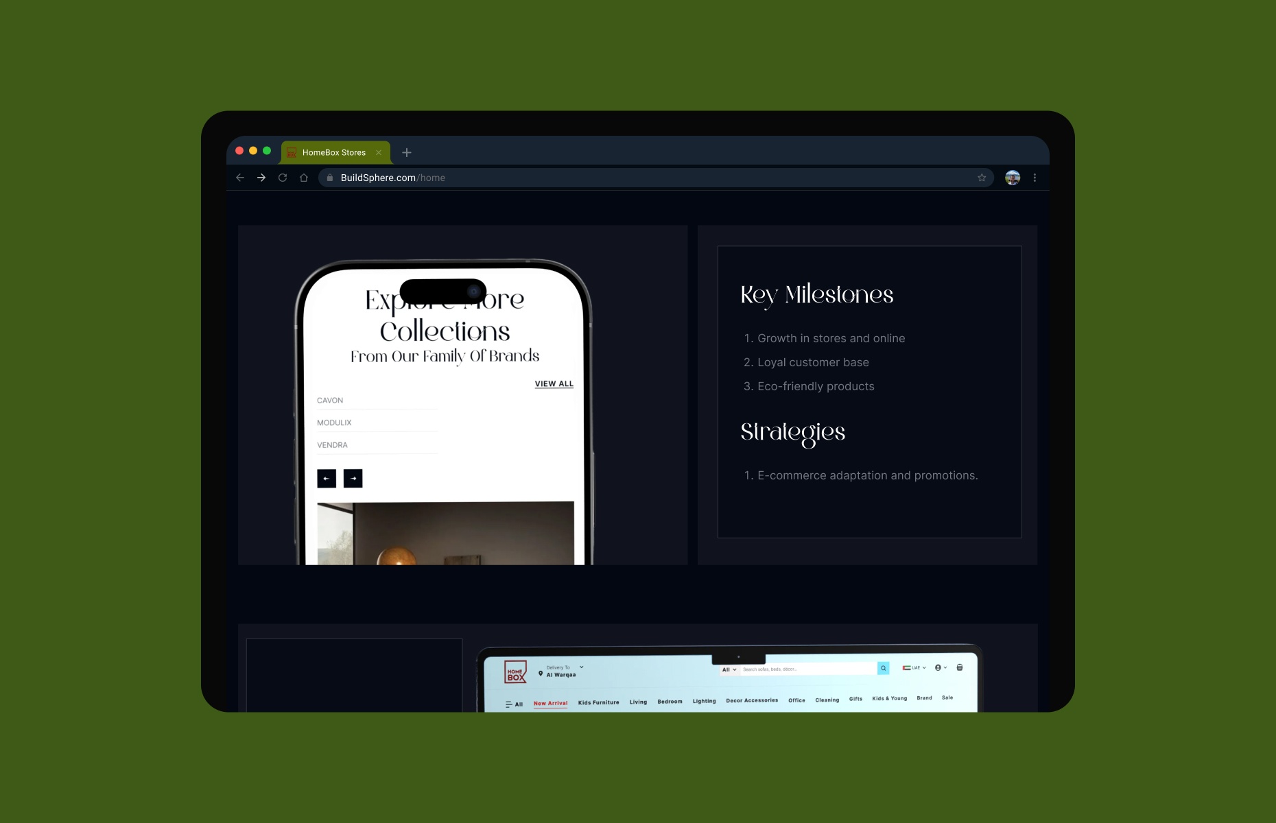
The project features polished mockups showcasing the homepage, service sections, team highlights, and booking areas. Desktop and mobile views demonstrate a responsive layout that maintains visual strength across all screen sizes.

“The website perfectly captures our brand’s identity. It feels classic yet modern, and our clients can now find services and book appointments with ease.”