
Many construction websites feel outdated, cluttered, or overly technical. Important information such as services, project portfolios, and company strengths is often hard to find. Buildsphere needed a modern, organized website that presents its work clearly while reinforcing trust and credibility.
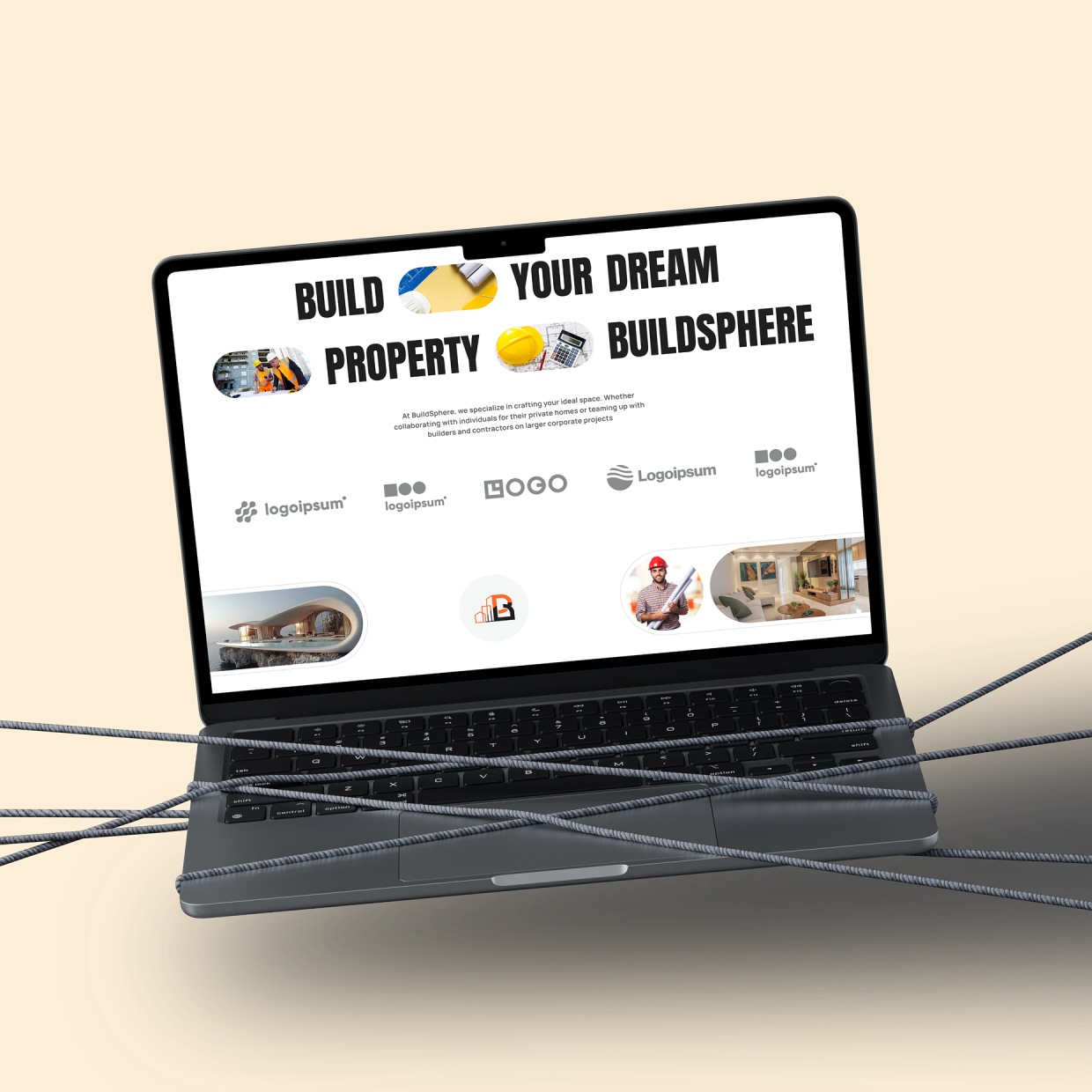
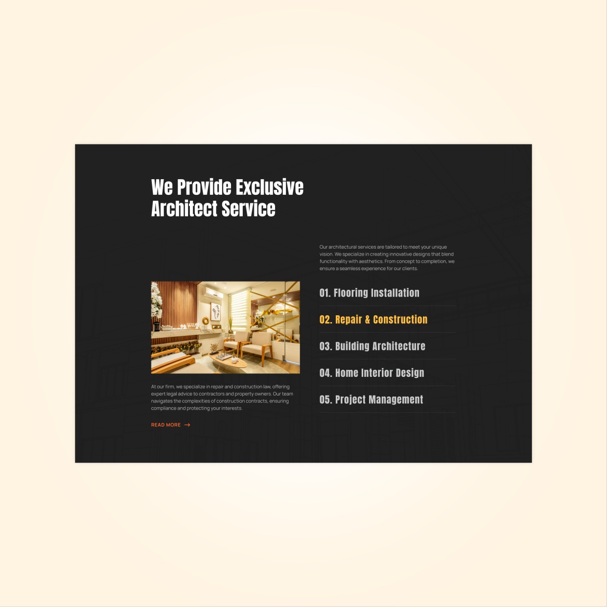
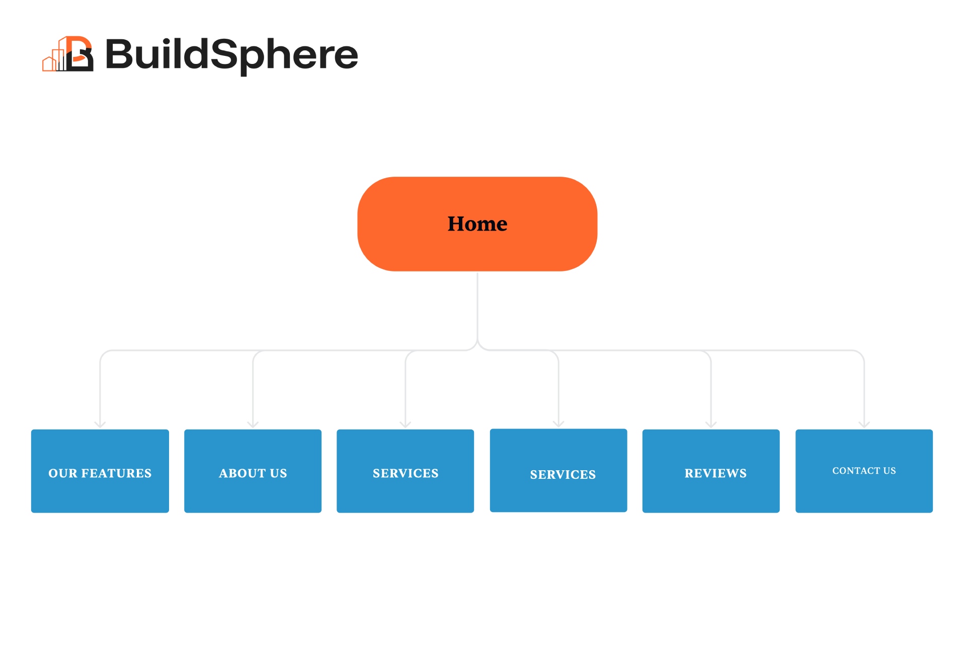
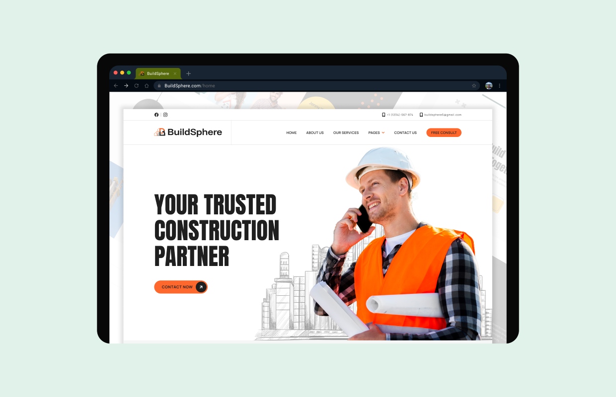
We designed a clean, grid-based layout that emphasizes structure and professionalism. Services and project categories are clearly defined, allowing users to understand offerings at a glance.
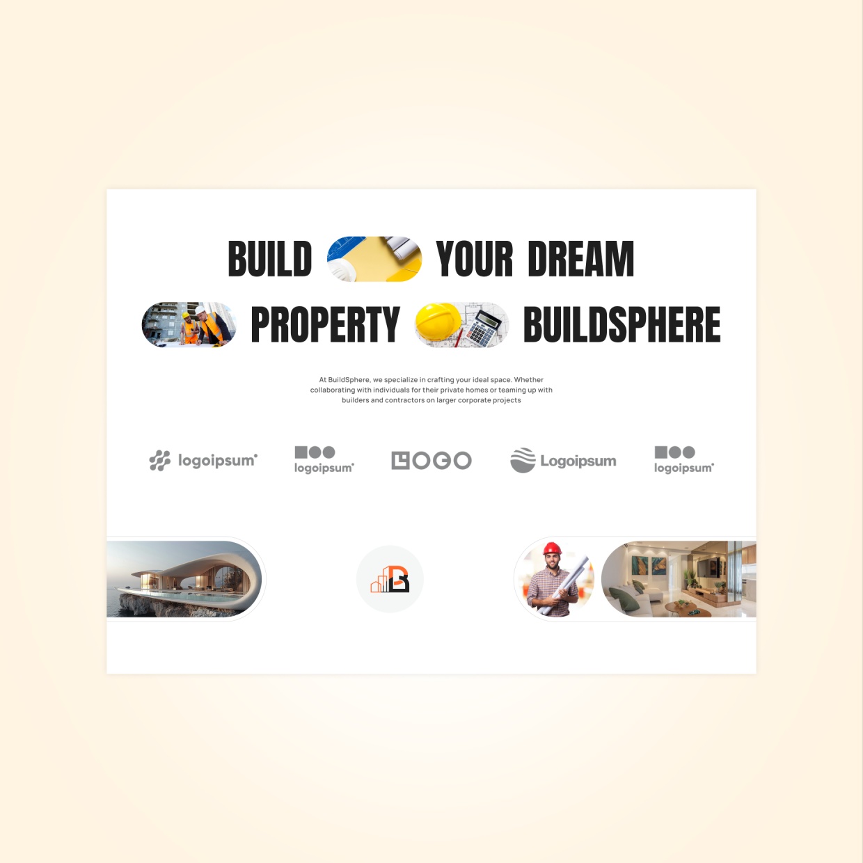
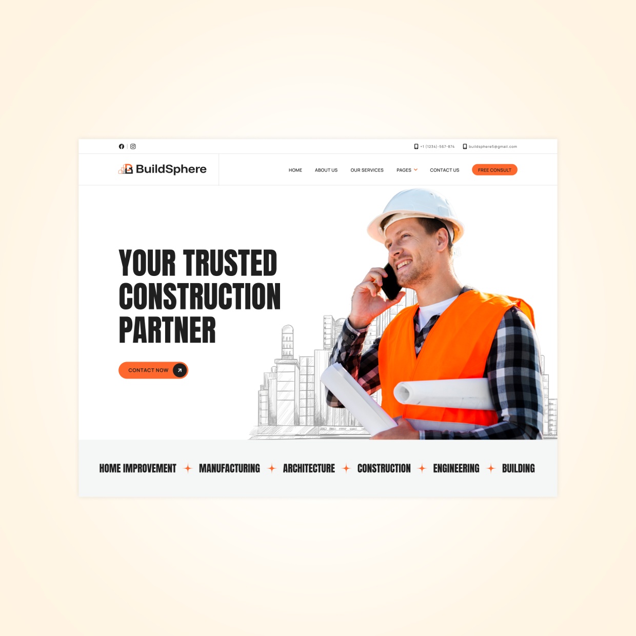
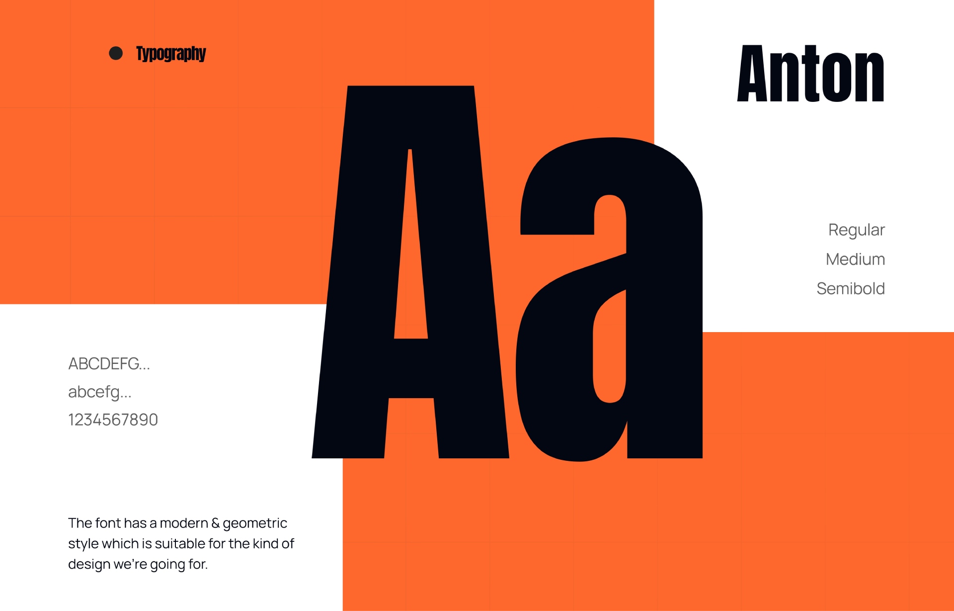
Strong typography, balanced spacing, and confident visuals work together to communicate reliability and expertise, while clear calls-to-action guide users toward inquiries and contact points.
We reviewed modern construction and architecture websites and analyzed how users explore project portfolios online. The focus was on clarity, trust-building, and logical content flow.
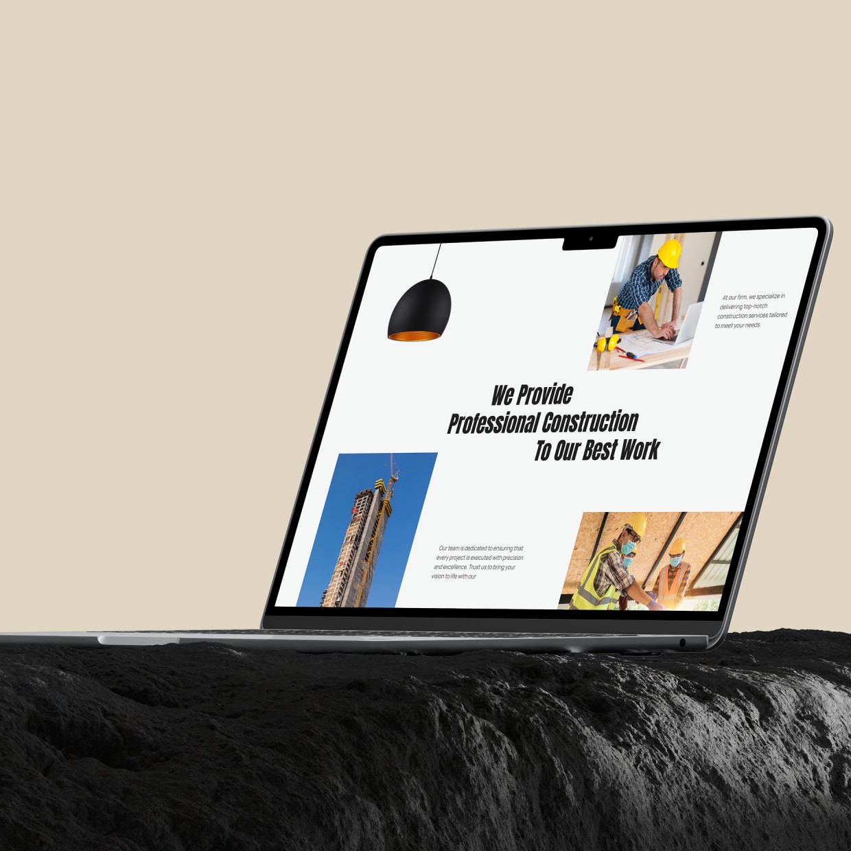
High-fidelity UI screens were created using a strong layout system, neutral color palette, and modern typography. The design highlights projects and services while maintaining a professional, minimal look.
Key user flows—such as browsing projects, exploring services, and contacting the company—were reviewed for clarity and ease of use across devices.
Iterative feedback helped refine spacing, hierarchy, and visual balance, ensuring the final design felt solid, clear, and business-focused.
Consistency: Typography, colors, spacing, and UI patterns were reused across all screens
Design System: Figma libraries and reusable components ensured visual alignment
Updates: Component-based design allowed easy updates without disrupting layouts
Collaboration: Designs were prepared with development in mind for smooth handoff and accurate implementation
Consistency: Typography, colors, spacing, and UI patterns were reused across all screens
Design System: Figma libraries and reusable components ensured visual alignment
Updates: Component-based design allowed easy updates without disrupting layouts
Collaboration: Designs were prepared with development in mind for smooth handoff and accurate implementation
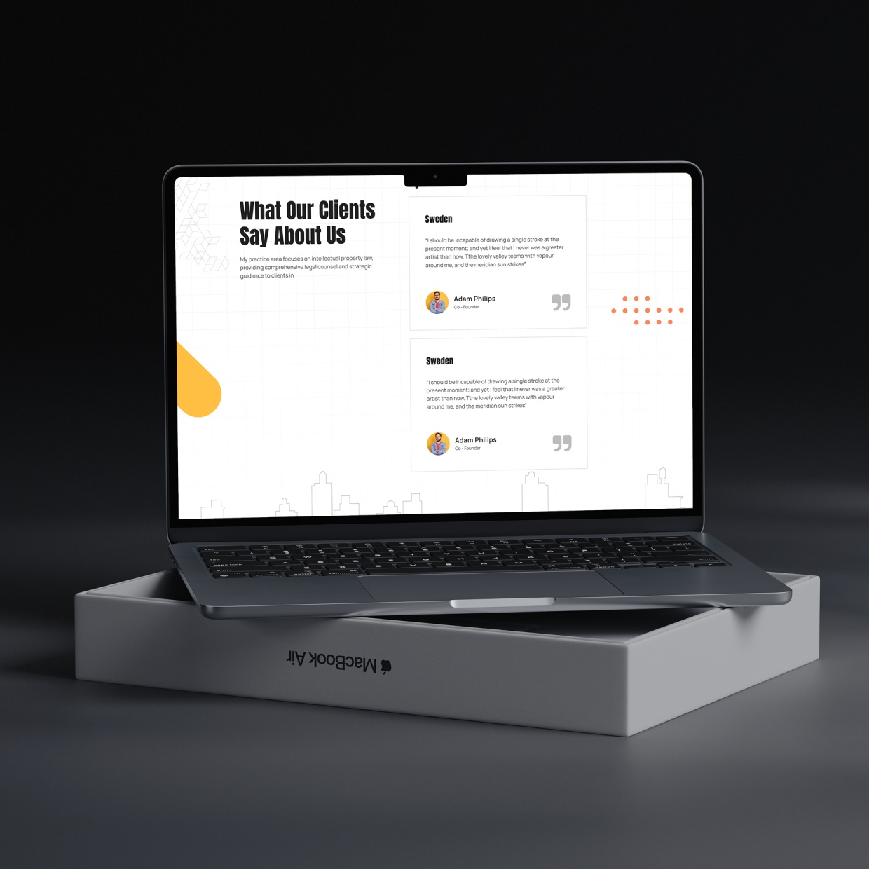
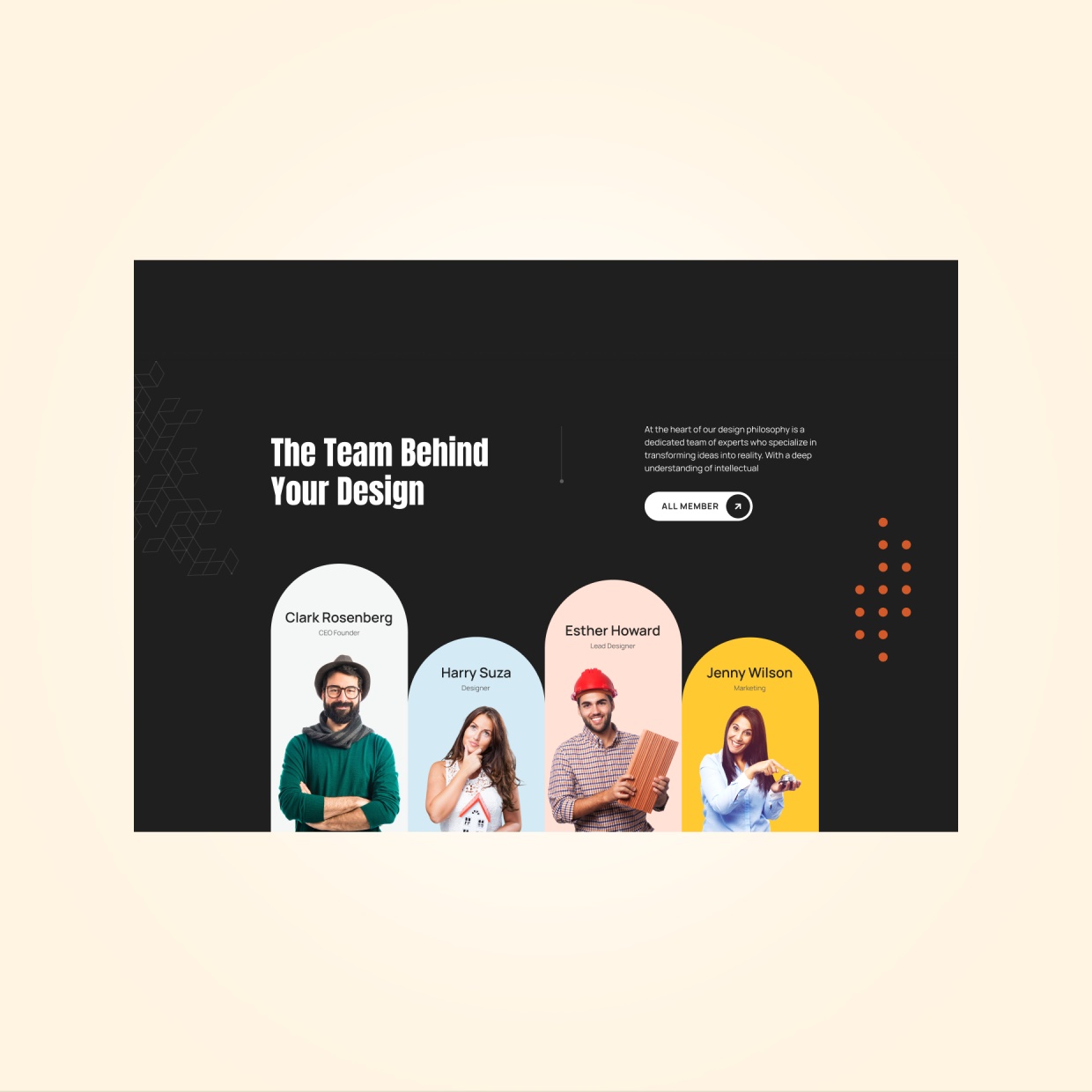
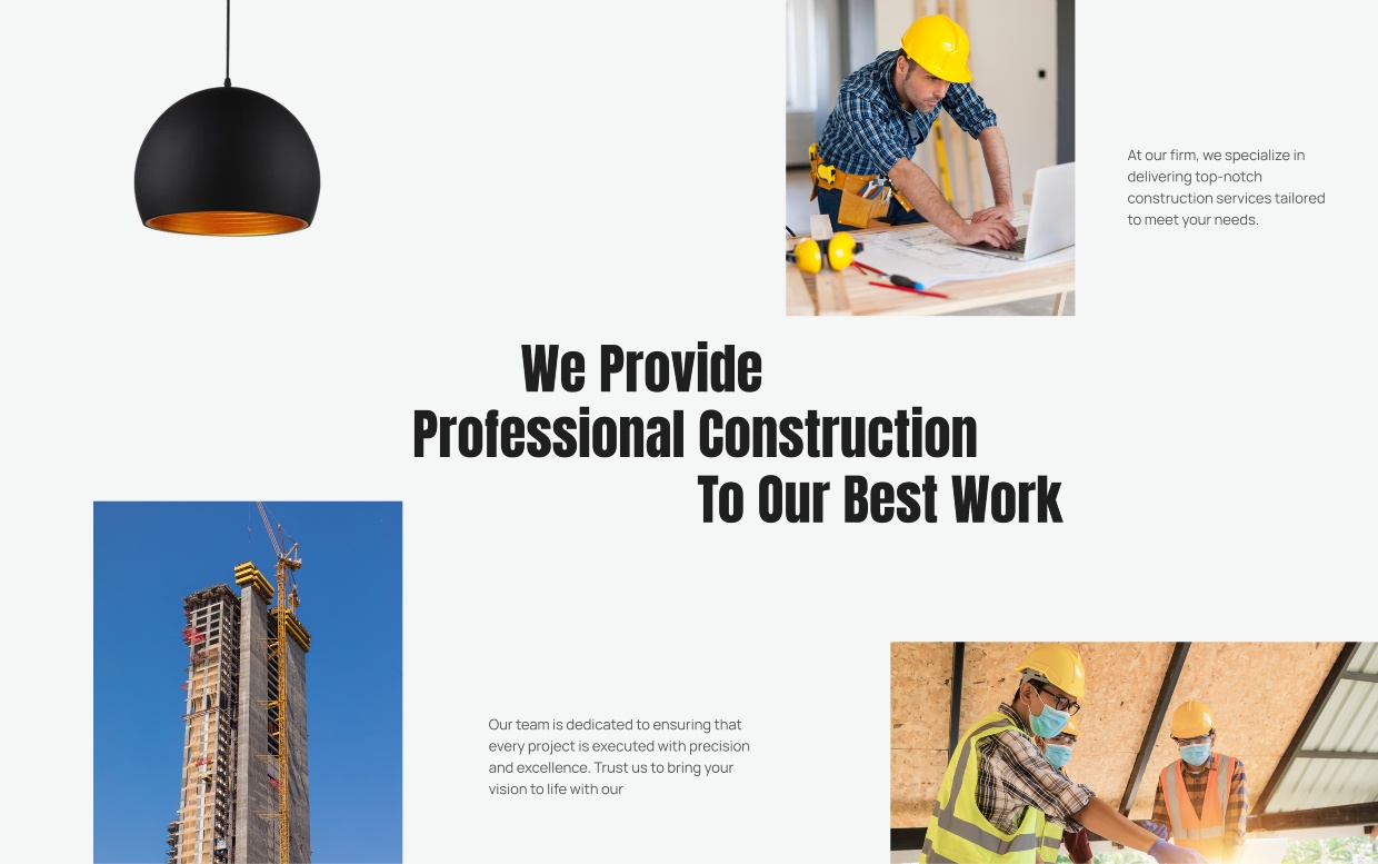
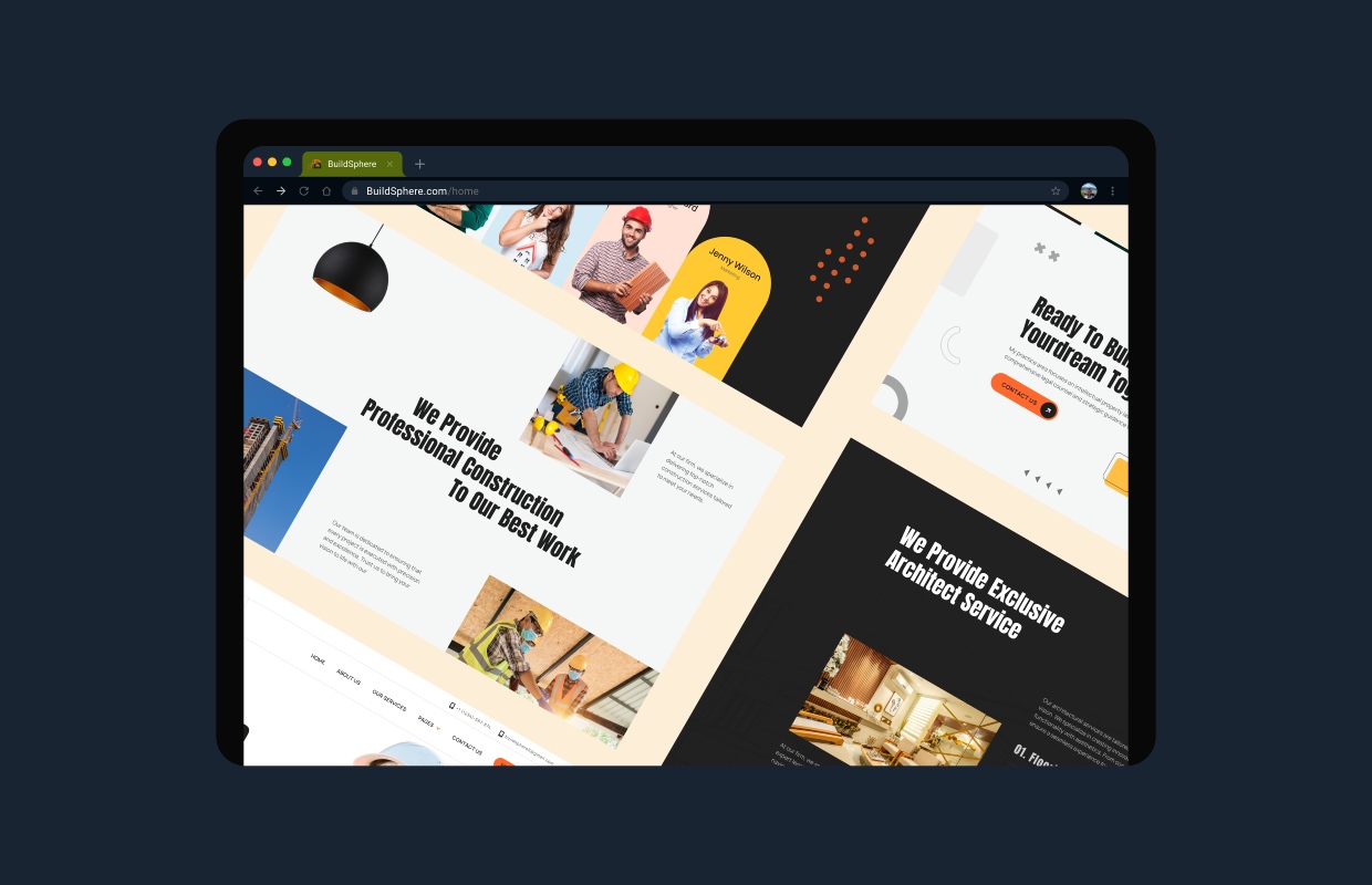
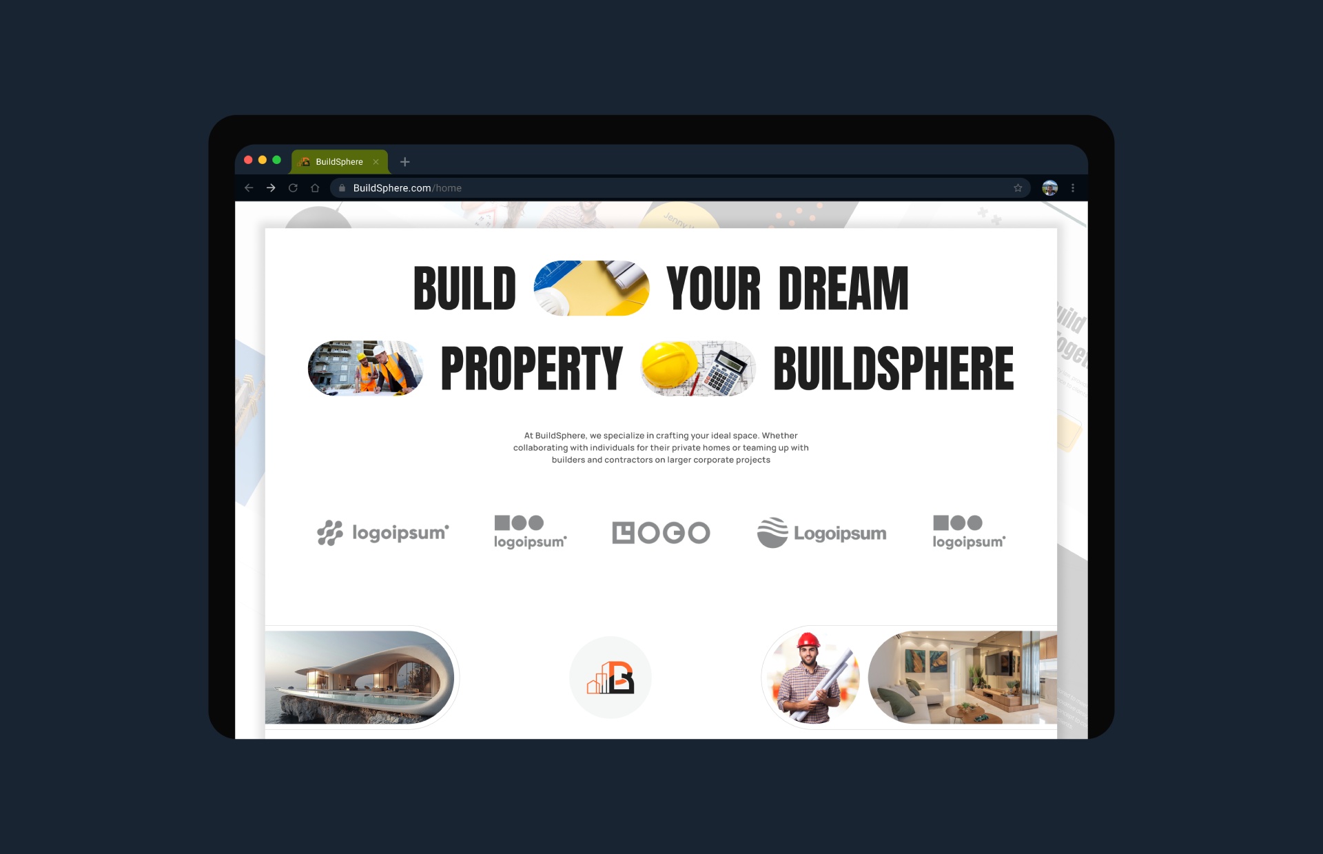
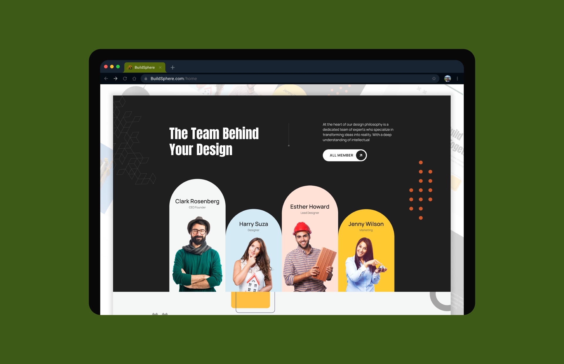
The project includes polished mockups showcasing the homepage, service sections, project galleries, and contact pages. Desktop and mobile views demonstrate a responsive layout that maintains clarity and impact across all screen sizes.

"The website reflects our company perfectly. It feels modern, professional, and clearly showcases our projects and services in a way that builds trust with potential clients."