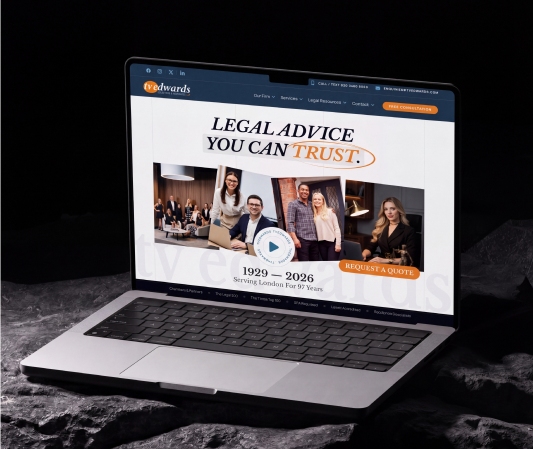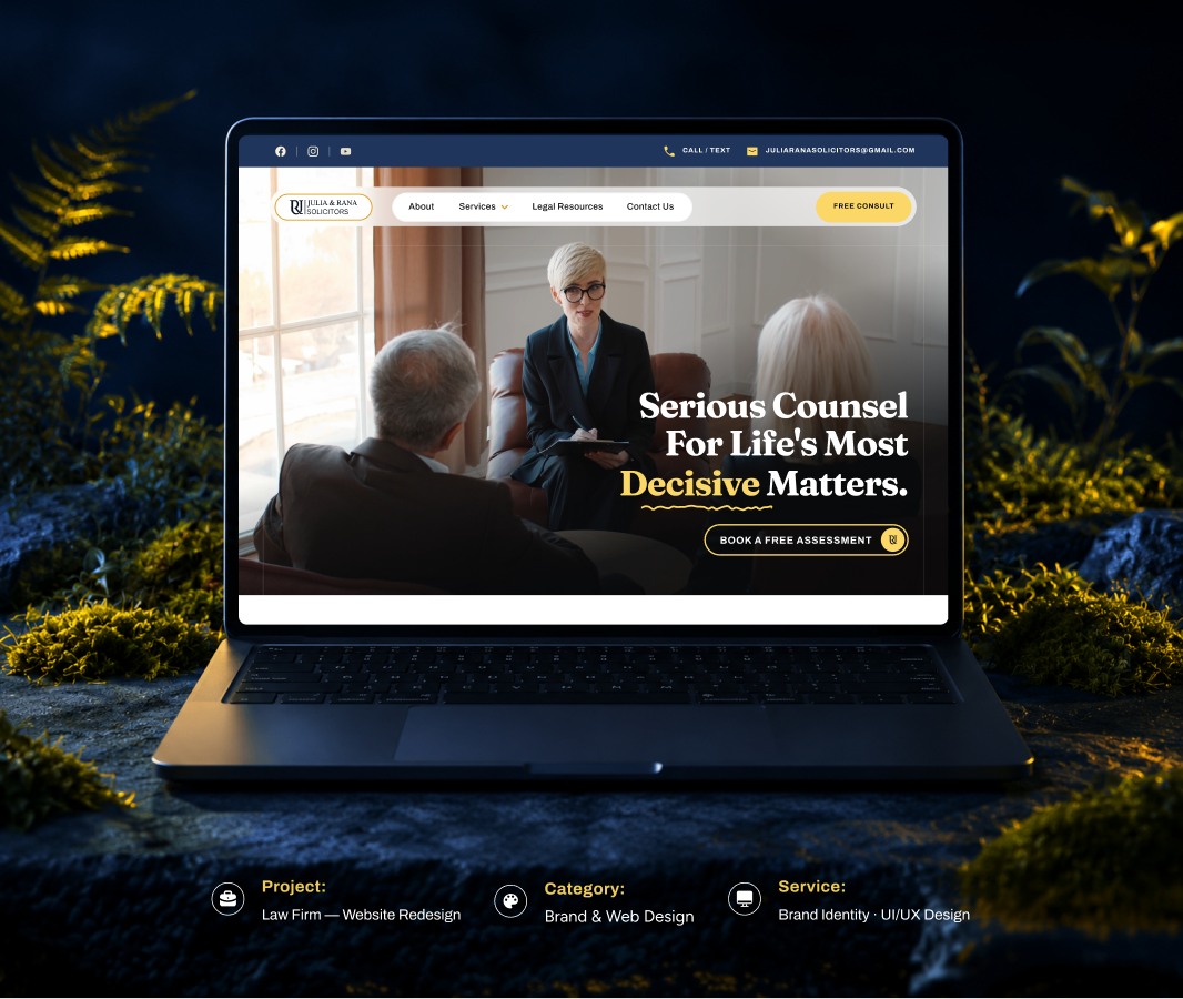
The client’s previous online presence lacked clarity and organization. Legal services were scattered, key contact points were not easily accessible, and the overall visual structure failed to convey trust or professionalism. As a result, visitors struggled to understand offerings and were less likely to engage.
One challenge was presenting multiple legal specialties without overwhelming users. It was also important to balance a professional tone with a welcoming user experience. Another difficulty was creating a layout that supports credibility — especially in a field where confidence and trust matter most — while keeping navigation intuitive on both desktop and mobile.
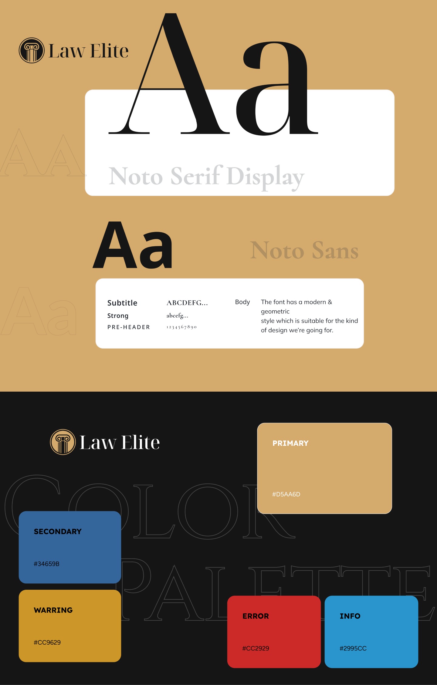
We redesigned the website around clear communication and structured hierarchy. Legal services were organized into logical sections with simplified explanations for each specialty. Strong visual hierarchy and consistent typography help visitors scan information naturally.
We began by studying current legal website trends and user expectations in the legal services space. This helped us understand how users typically explore attorney specialties and what trust elements are most effective.
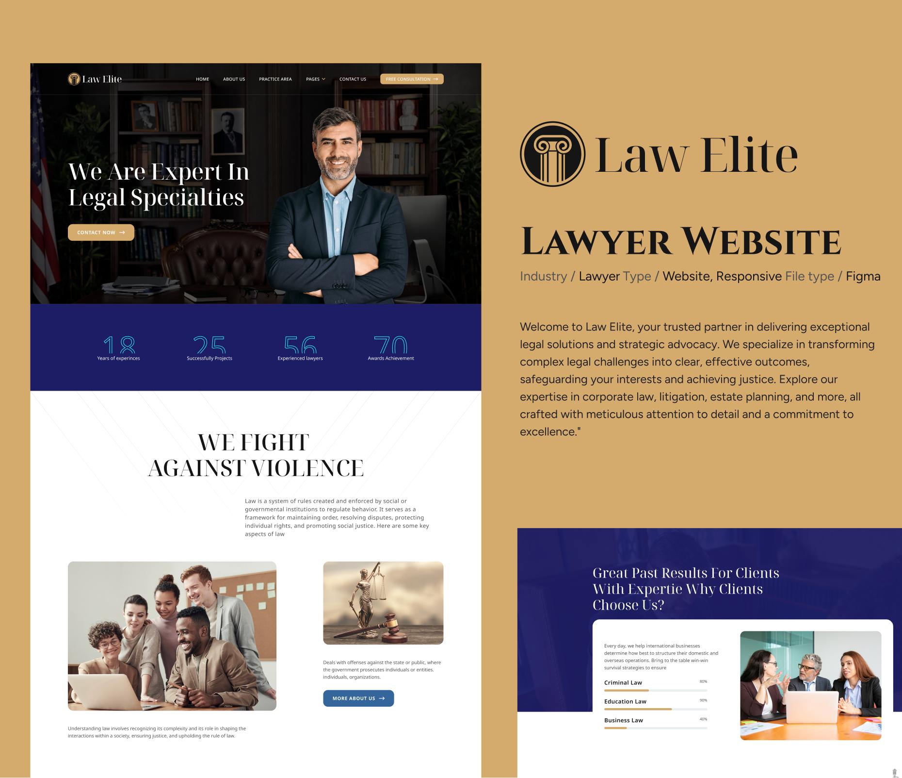
High-fidelity mockups were created with a clean grid layout, classic typography, and a balanced use of white space. Each section was designed to reinforce clarity and focus on the user’s goal.
We reviewed key flows such as service exploration and contact initiation to ensure they were intuitive and accessible. Particular attention was given to responsiveness across different screen sizes.
Iterative refinements were made to improve spacing, content visibility, and the overall visual balance based on review input.
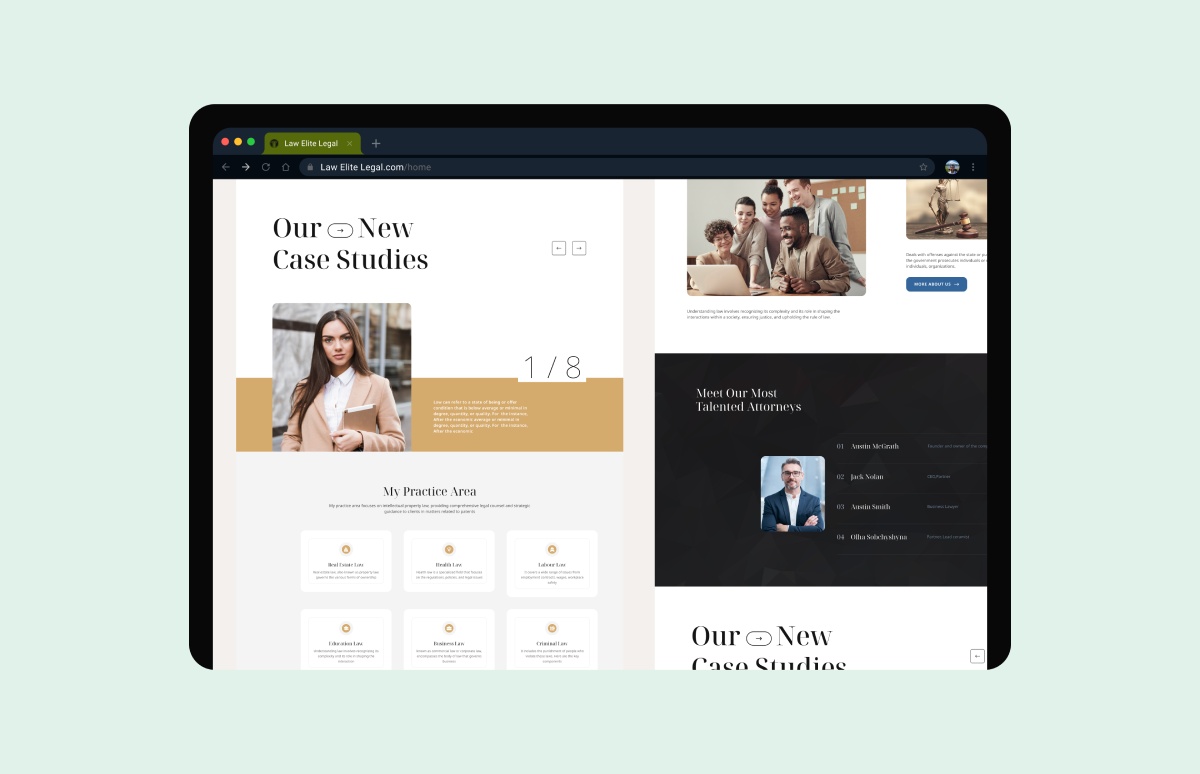
Visual Consistency: Standardized typography, spacing, and color usage across headers, service cards, and information blocks
Reusable Components: Buttons, forms, and service layouts were built as modular components for easy updating
System Updates: Centralized component control allowed design changes to propagate quickly and consistently
Team Collaboration: Organized design assets made handoff to developers smooth and implementation more efficient
Visual Consistency: Standardized typography, spacing, and color usage across headers, service cards, and information blocks
Reusable Components: Buttons, forms, and service layouts were built as modular components for easy updating
System Updates: Centralized component control allowed design changes to propagate quickly and consistently
Team Collaboration: Organized design assets made handoff to developers smooth and implementation more efficient
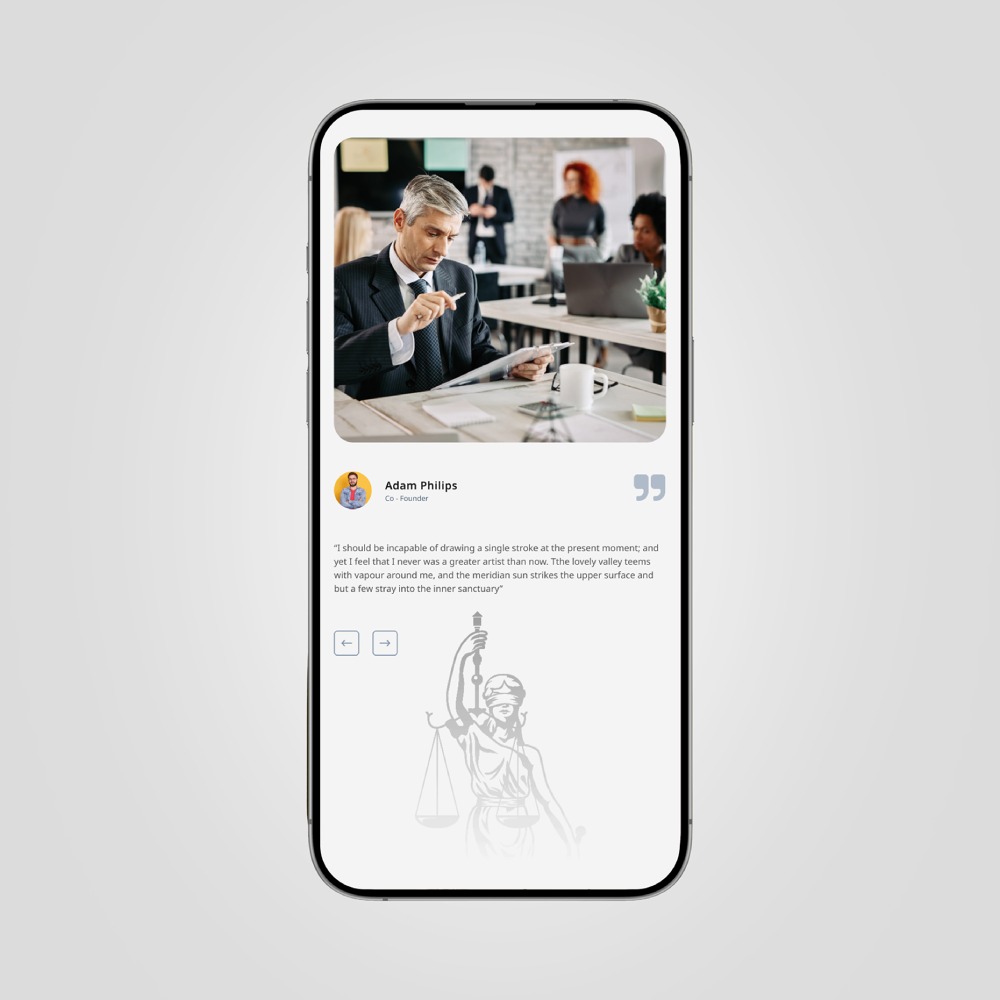
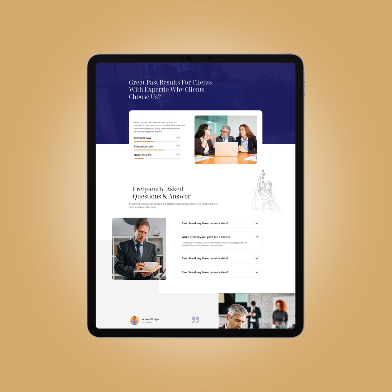
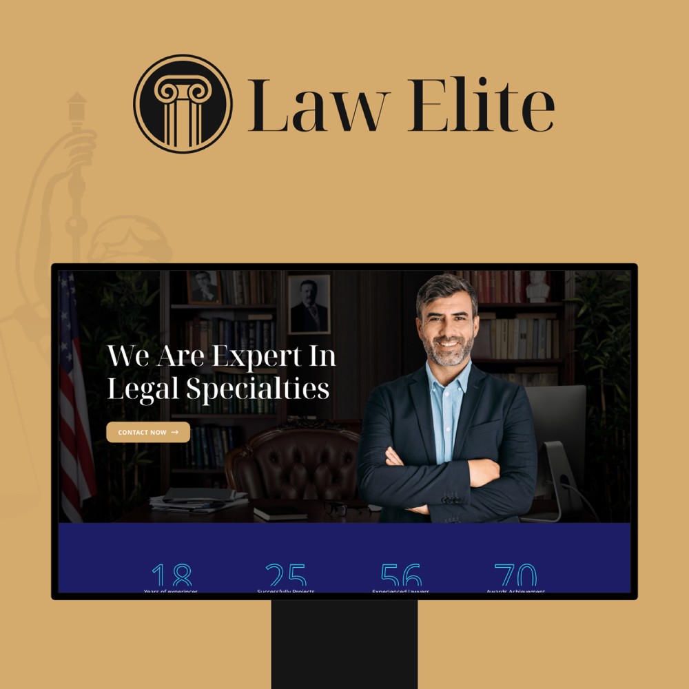
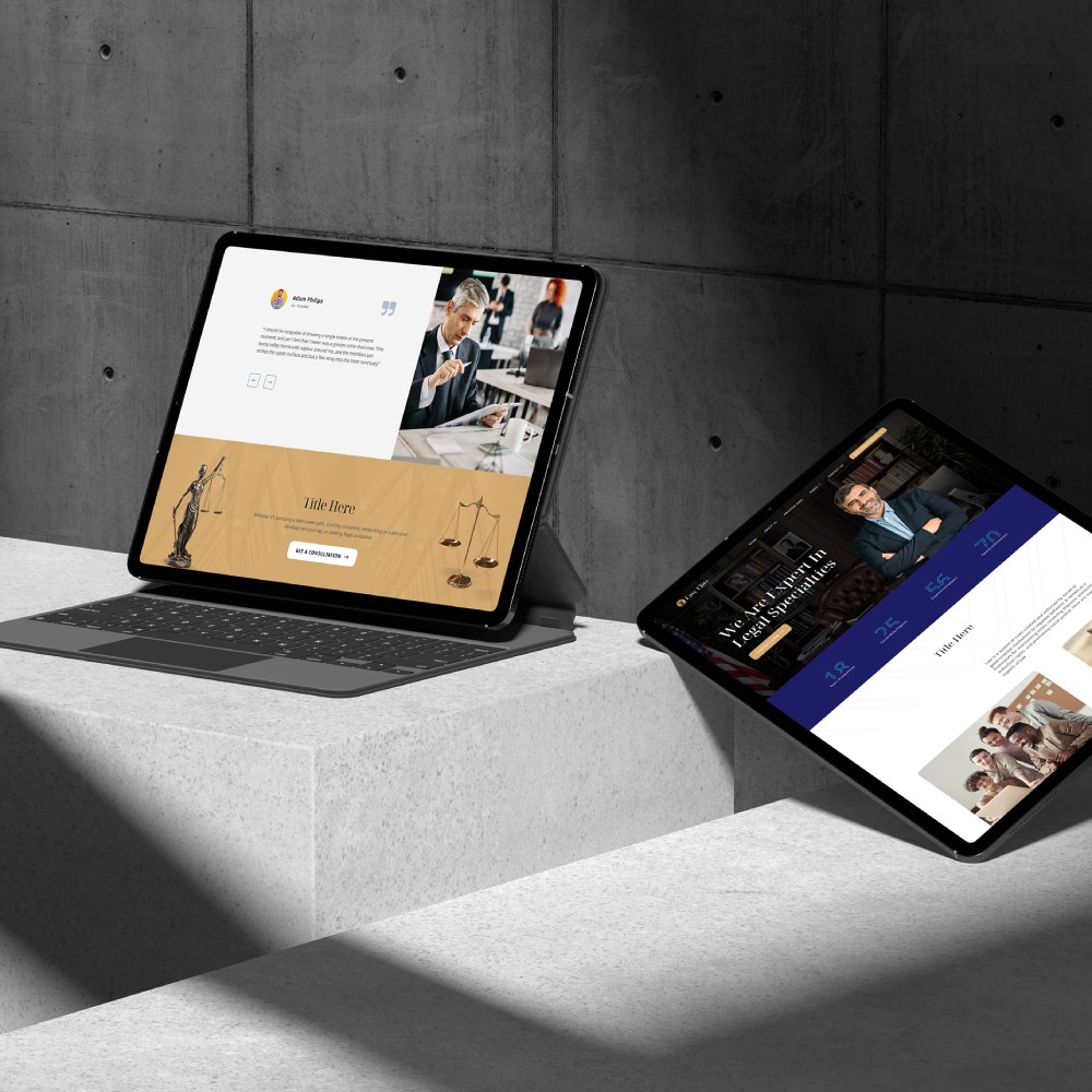
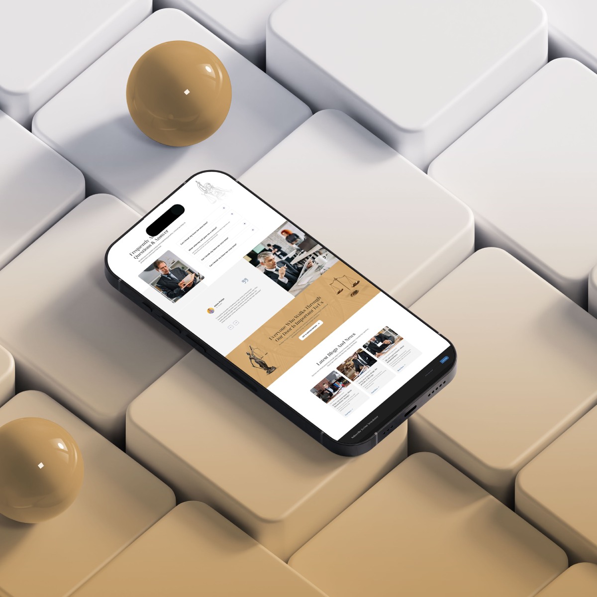
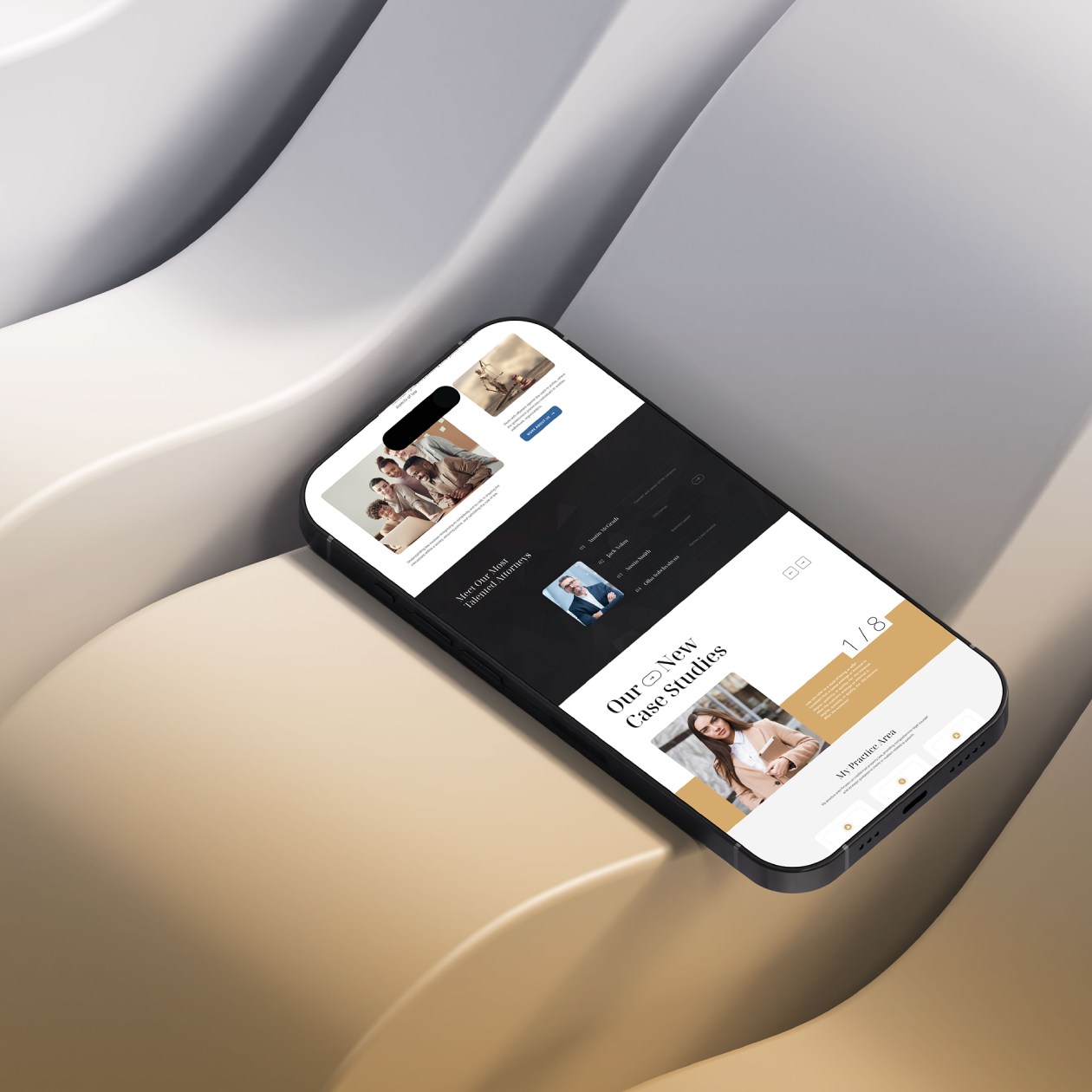
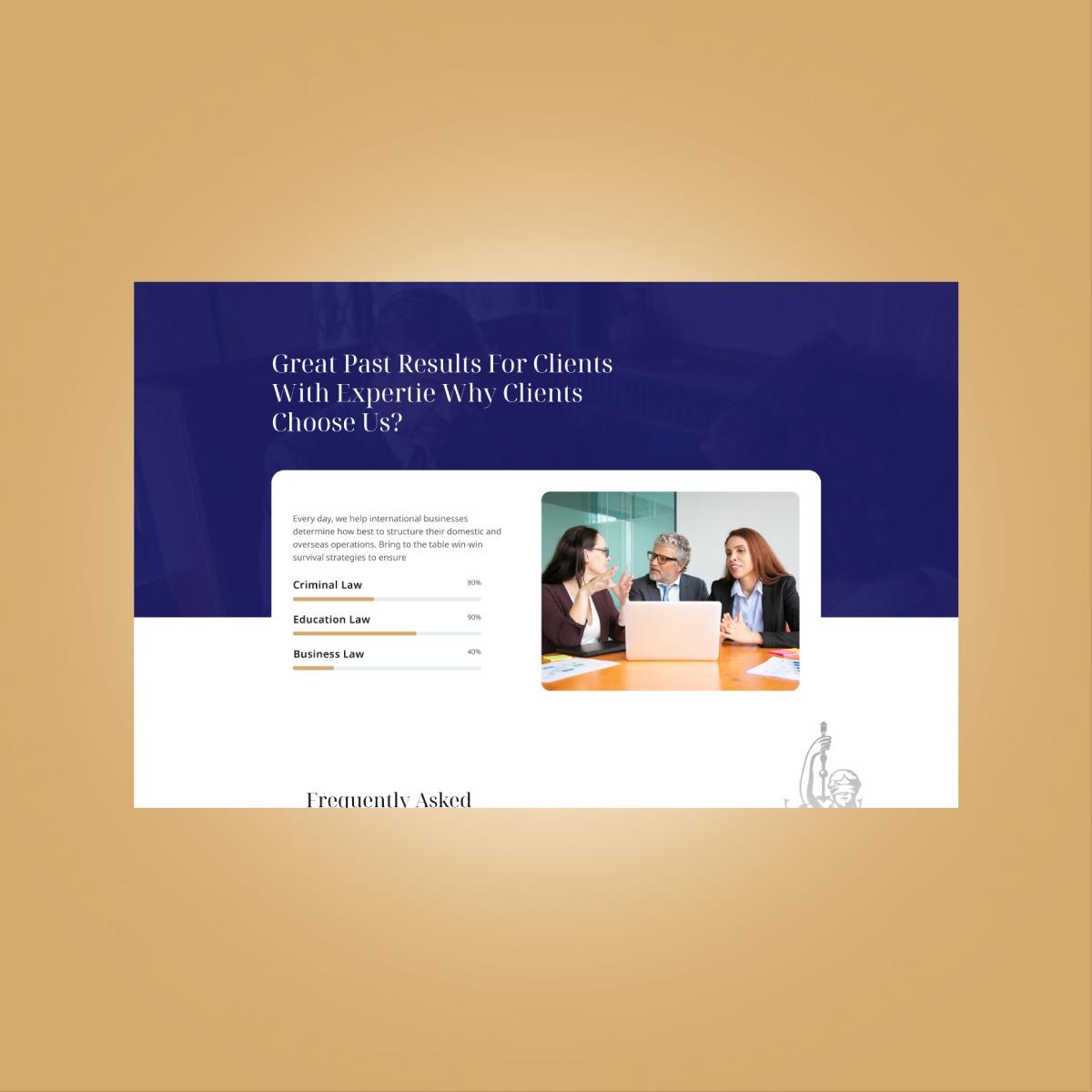
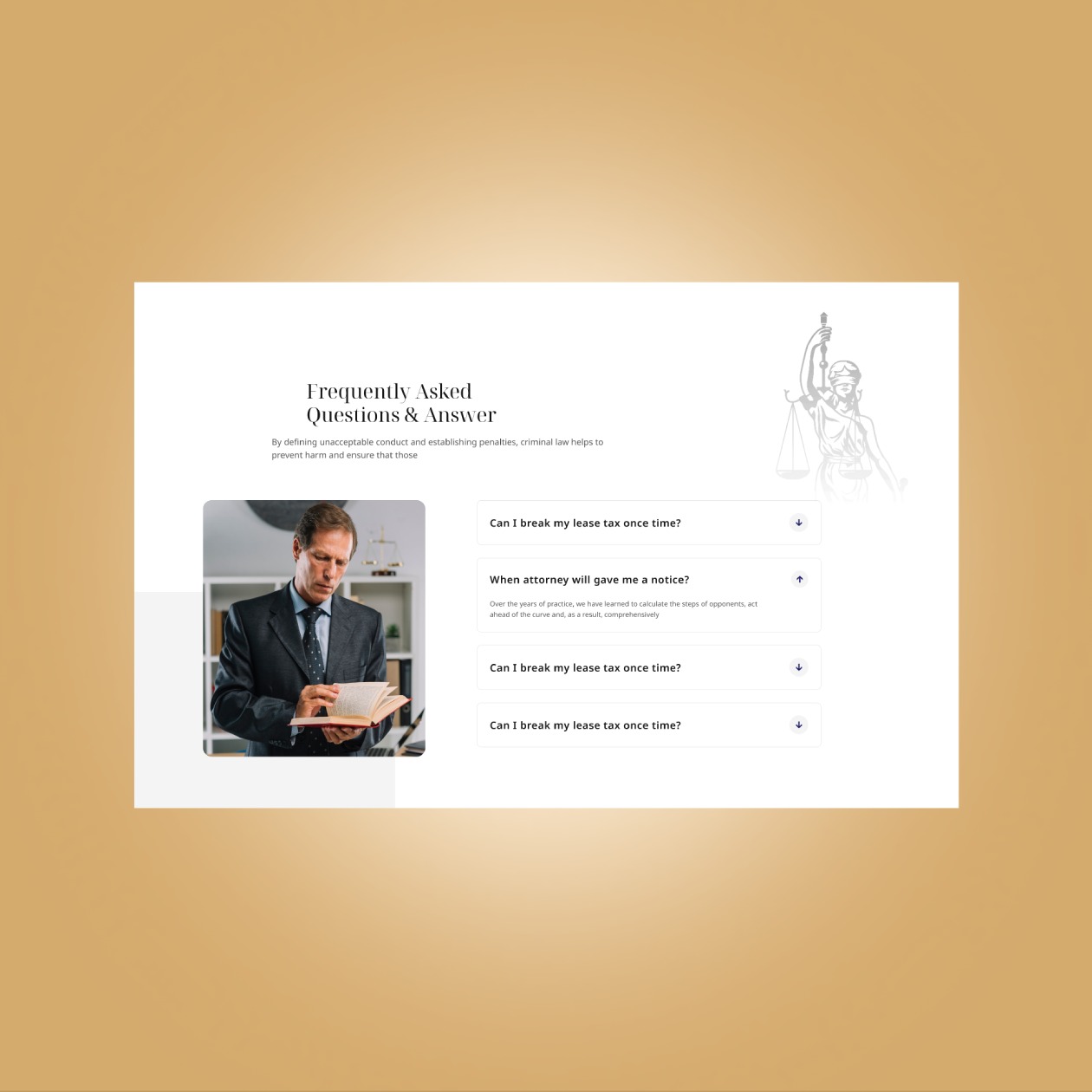
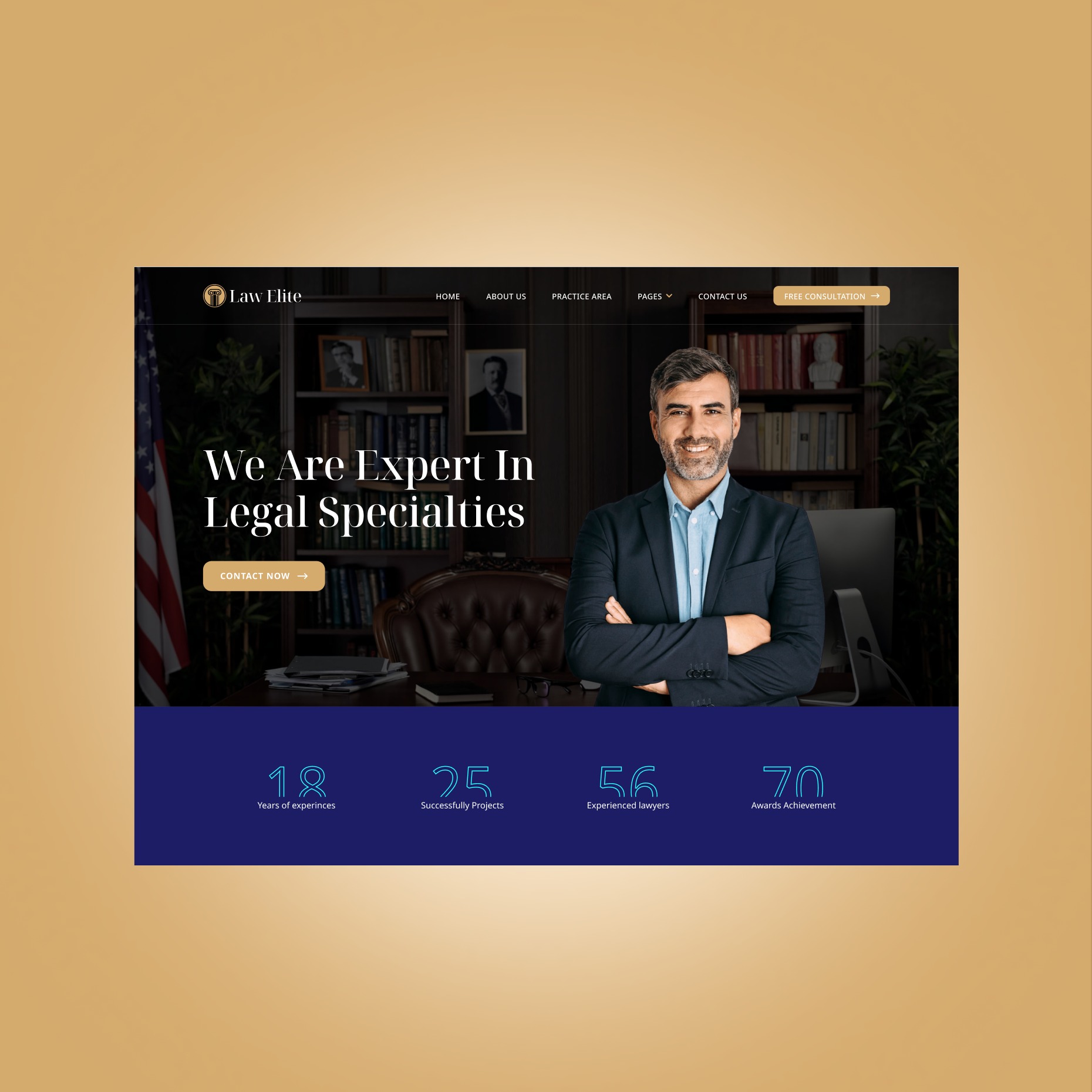
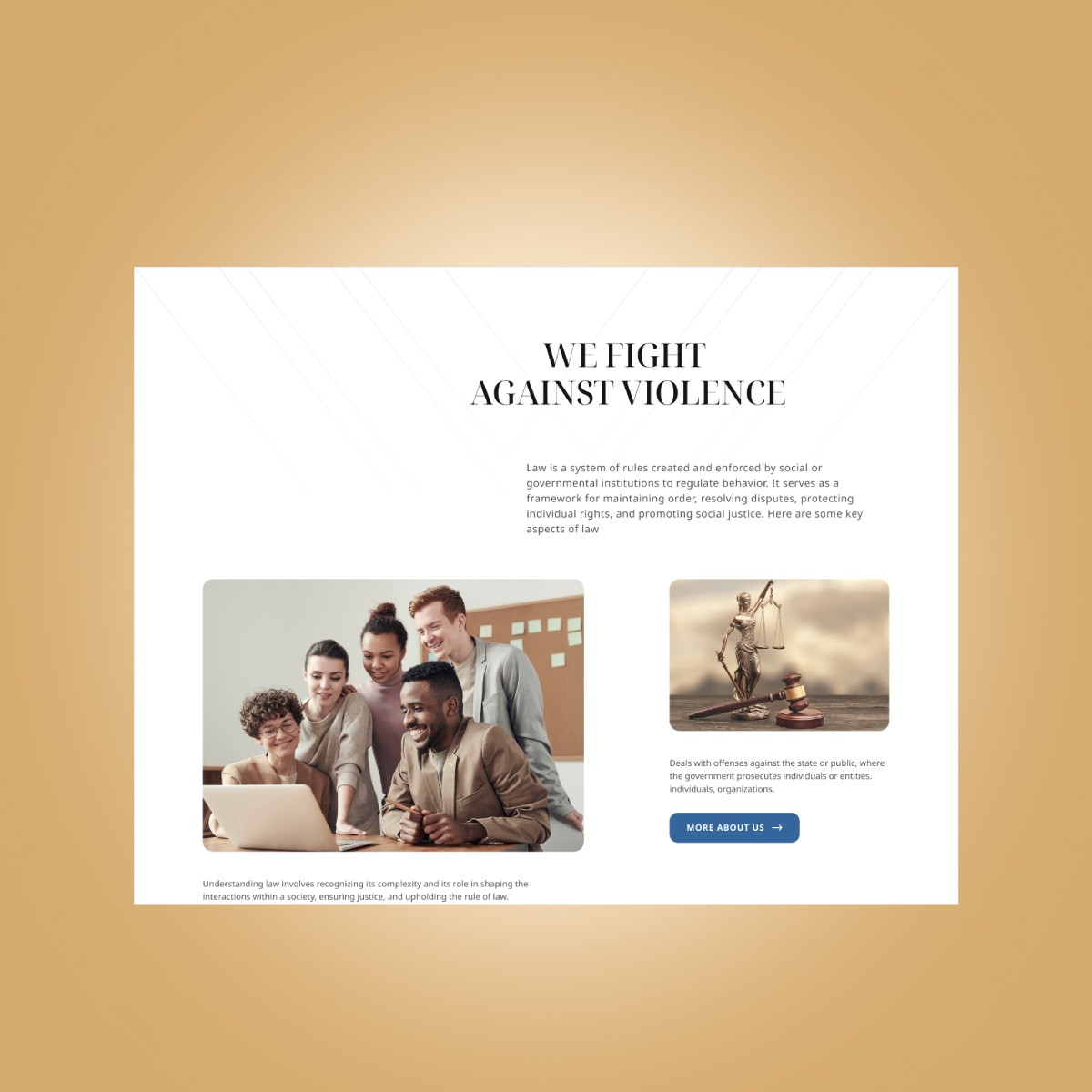
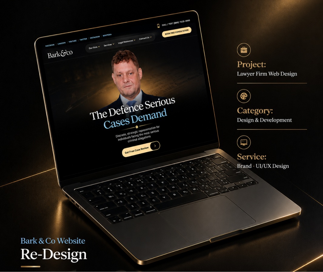
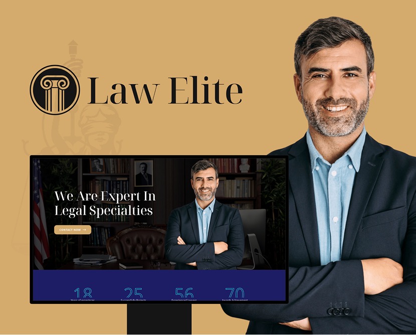
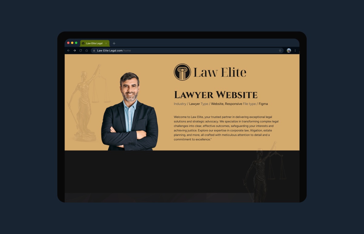
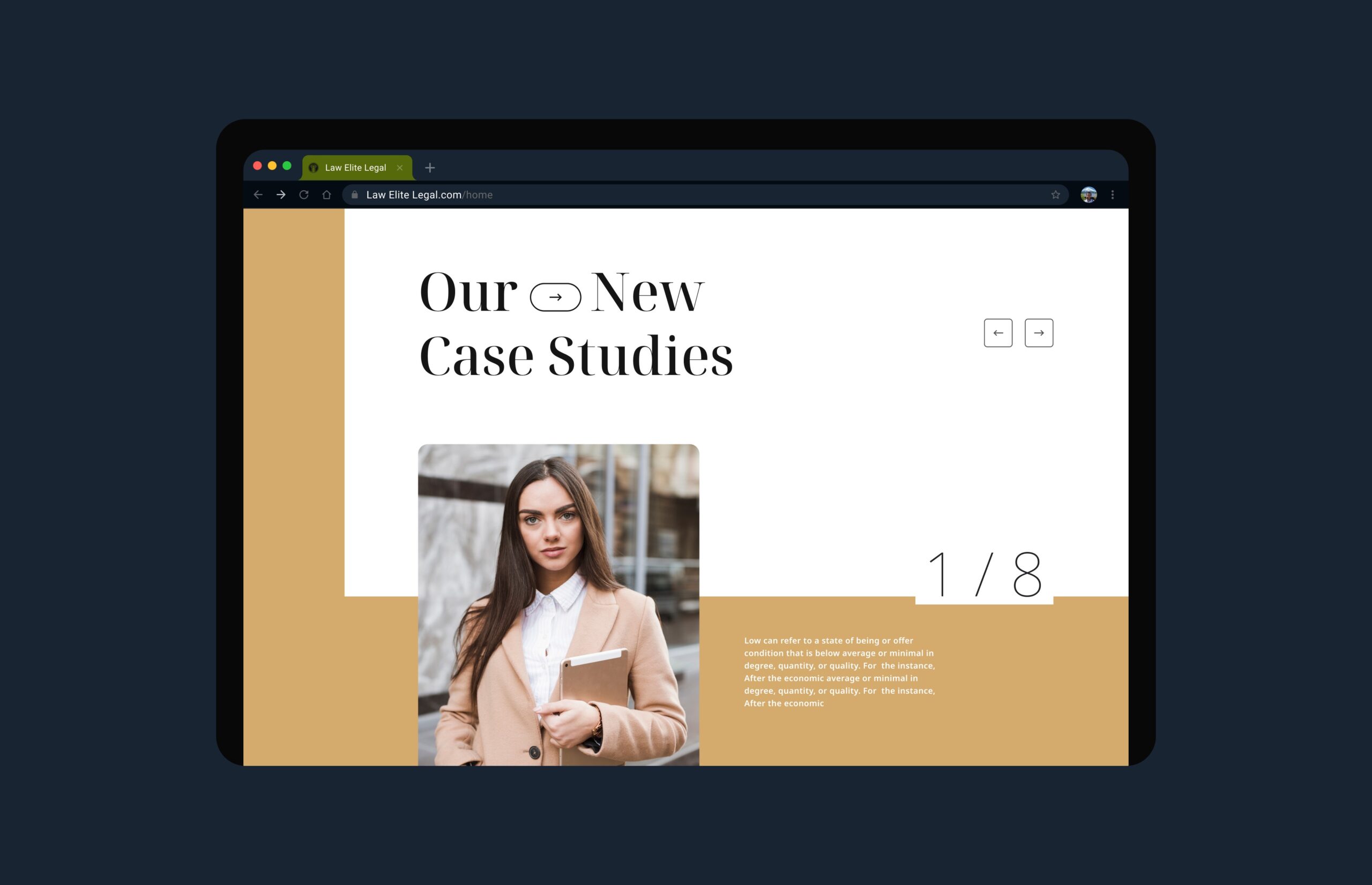
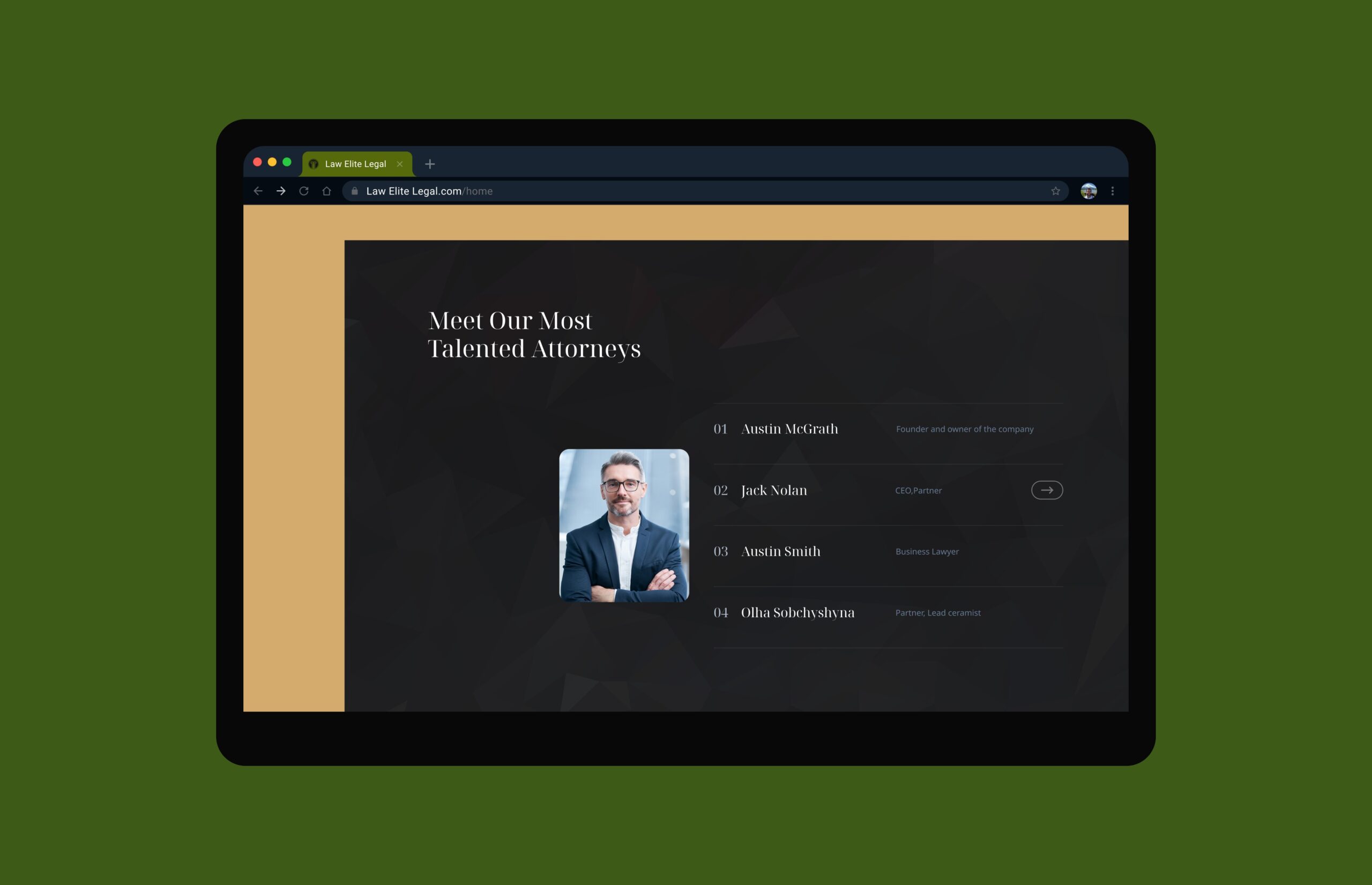
Key screens showcase a structured homepage, clear service pages, and easy access to contact points. Both desktop and mobile presentations were designed to feel balanced and considerate, ensuring that content remains accessible and visually strong on all devices.

“The new website communicates our services clearly and professionally. It feels approachable yet confident, and our clients find it easier to explore specialties and reach out for support.”