
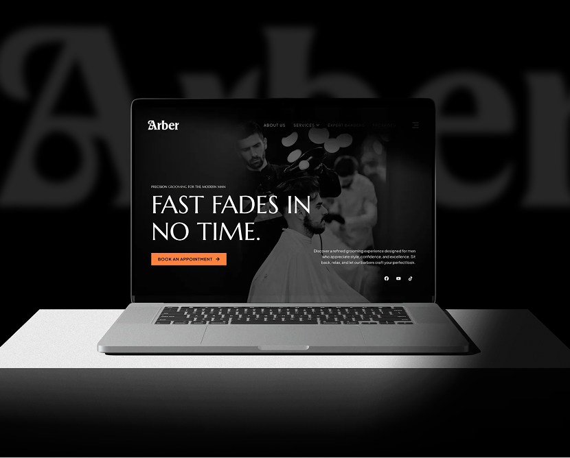
Arber Shop – Men’s Salon Website UI/UX Design
From fragmentation to fusion: Breaking down the complexities of data management
The fitness brand required a website that could stand out in a competitive gym market. Many gym websites feel cluttered, outdated, or confusing, which often leads to poor engagement. Camillion Fitness needed a modern, structured solution that highlights its strengths without overwhelming users.
We designed a bold yet well-structured interface that reflects strength, movement, and motivation. Key programs, benefits, and trainer highlights are clearly organized, allowing users to explore confidently.
Strong typography, balanced layouts, and focused CTAs guide users toward joining, booking sessions, or contacting the gym with minimal friction.
We reviewed modern fitness websites and studied how users explore gym services online. The research focused on motivation triggers, content clarity, and conversion-focused layouts.
High-fidelity UI screens were created using strong contrast, modern typography, and clear section hierarchy. The visual style emphasizes confidence, performance, and progress.
Core user flows—such as browsing programs and membership options—were reviewed for clarity, responsiveness, and ease of interaction across devices.
Iterative feedback helped refine spacing, visual balance, and CTA placement, ensuring the final design remained energetic yet easy to use.
Consistency: Typography, colors, spacing, and UI patterns were reused across all screens
Design System: Figma libraries and reusable components kept the design aligned and efficient
Updates: Component-based structure allowed quick updates without affecting the overall layout
Collaboration: Designs were prepared with development in mind, enabling smooth handoff and implementation
The project includes polished mockups showcasing the homepage, program sections, trainer highlights, and call-to-action areas. Desktop and mobile views demonstrate a fully responsive layout that maintains impact across all screen sizes.
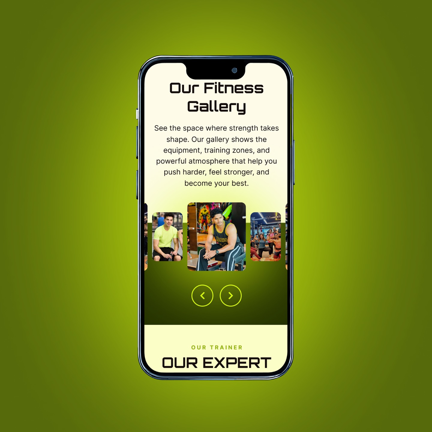
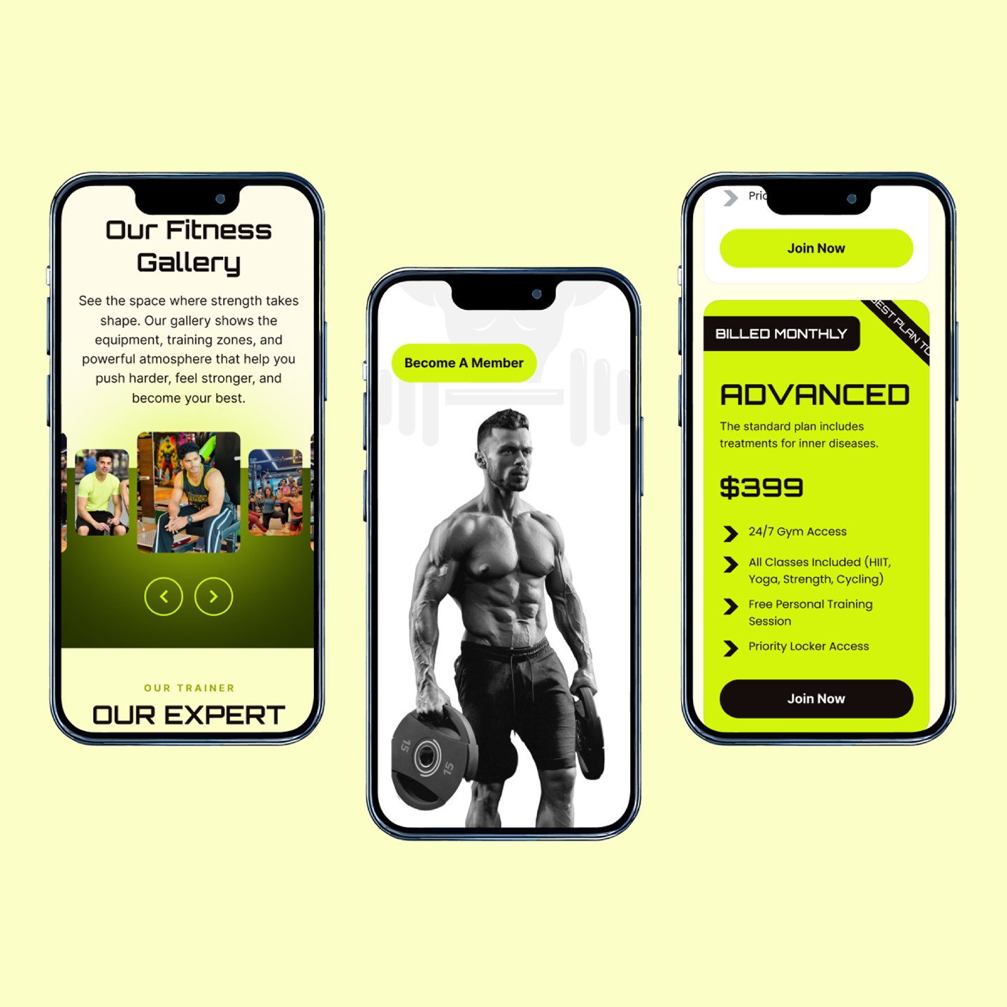
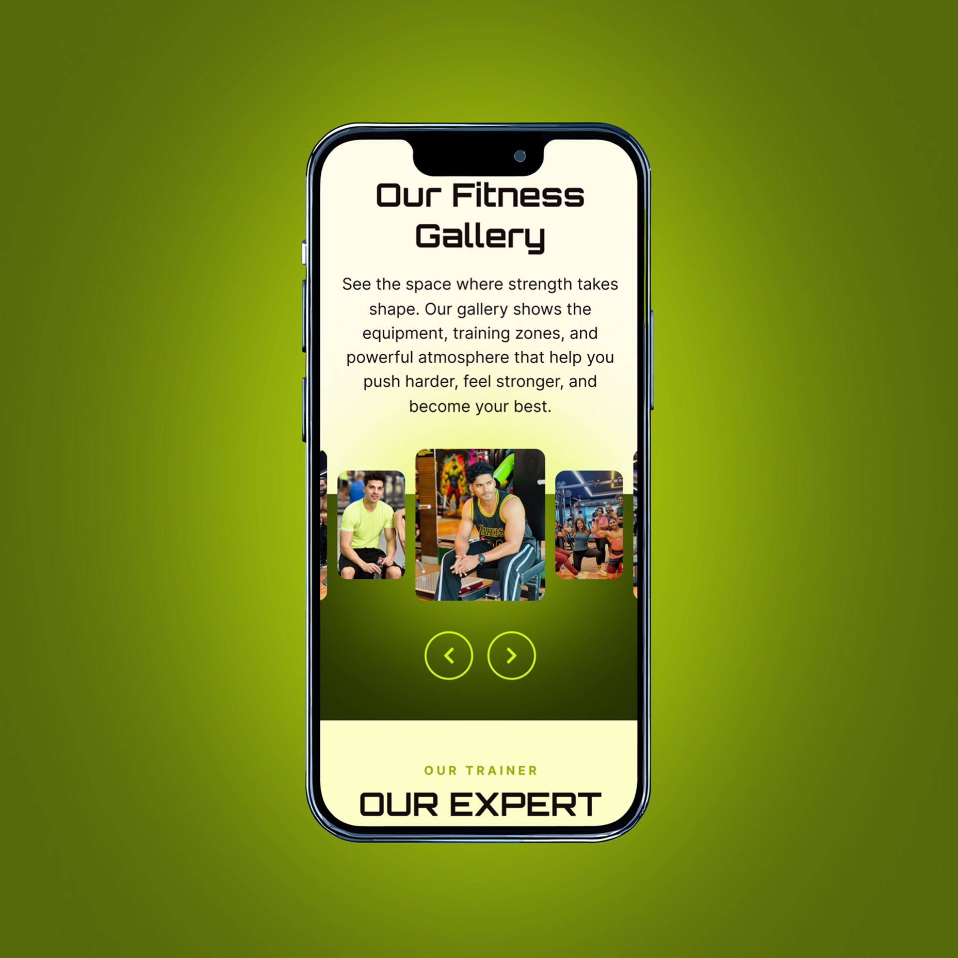
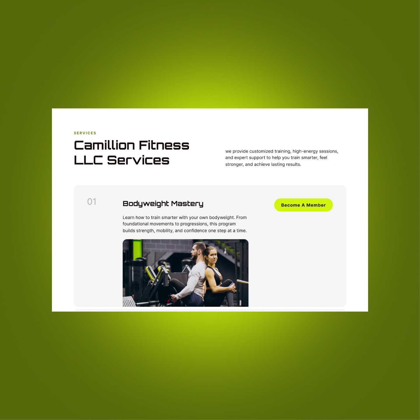
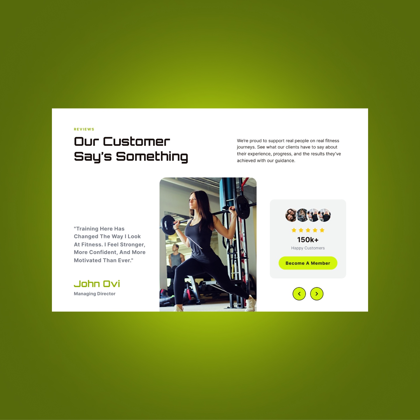
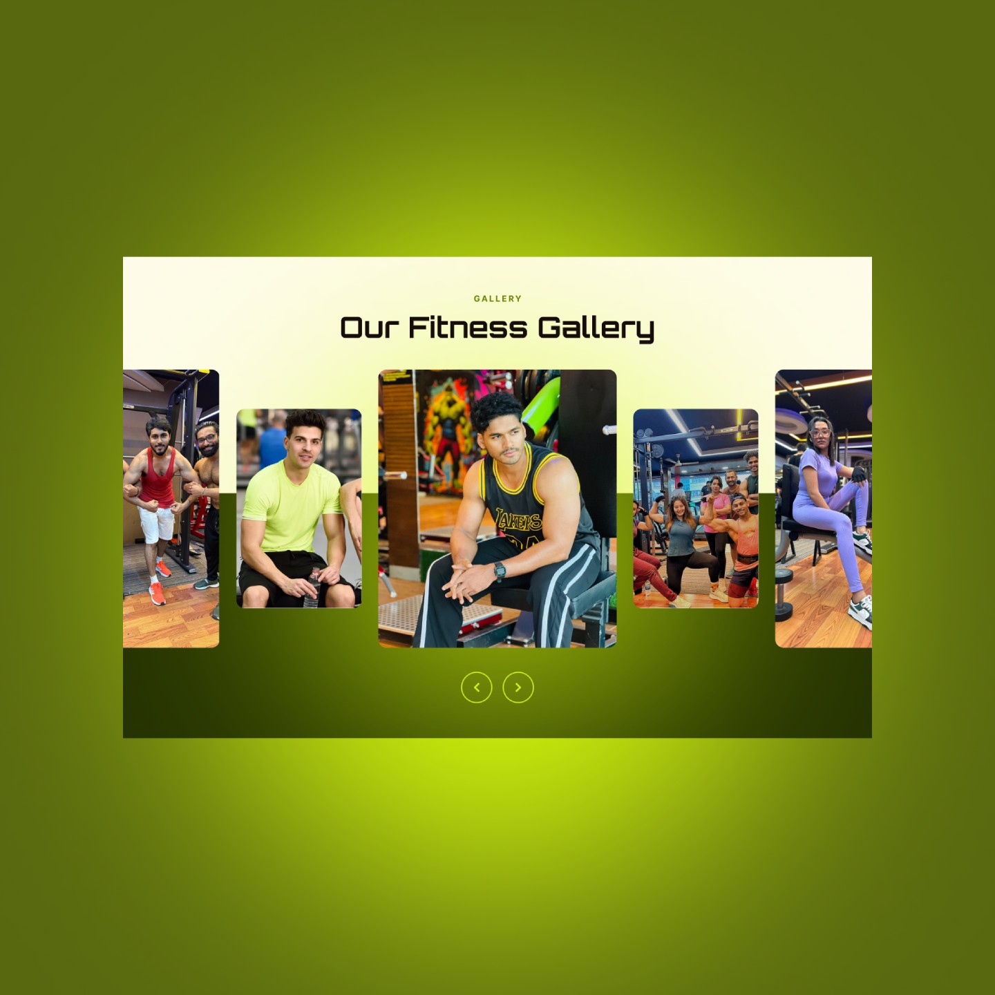
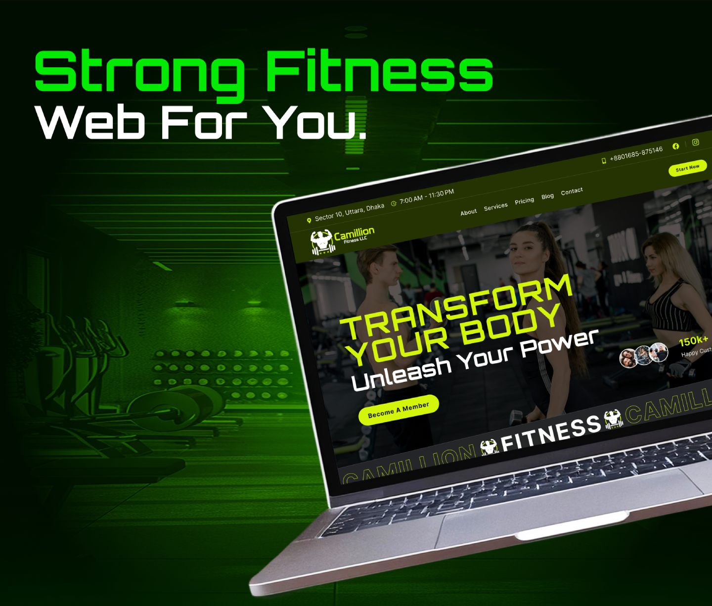
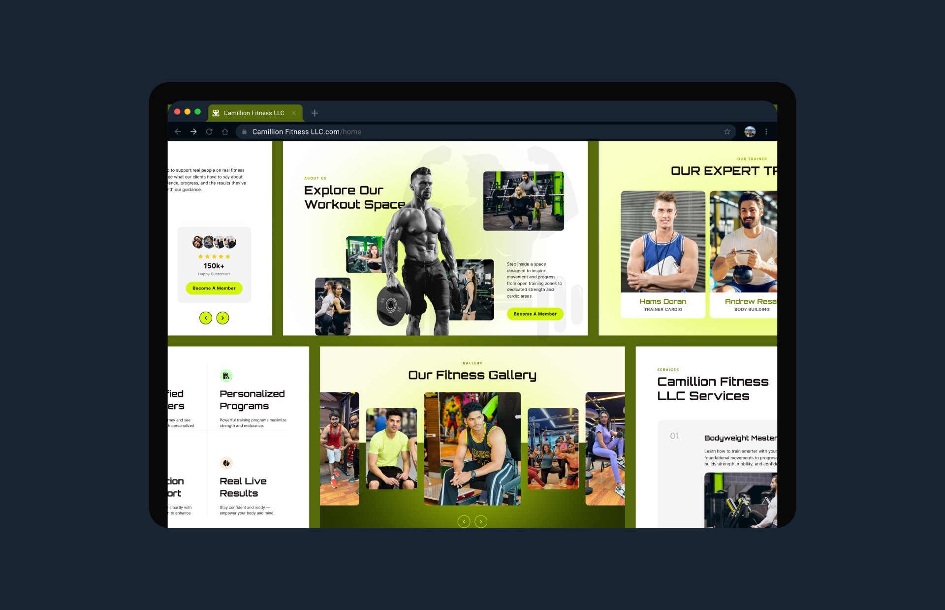
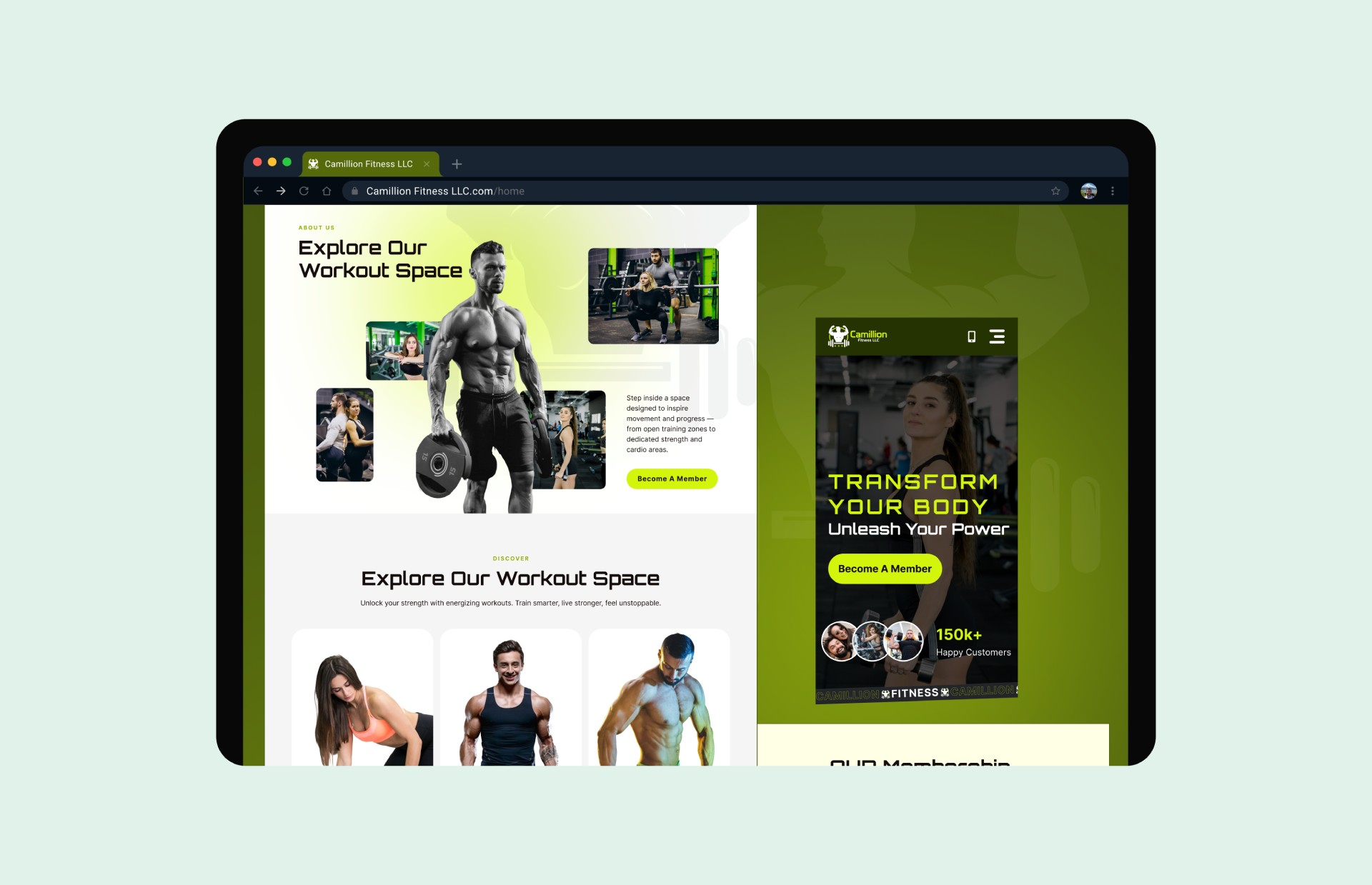
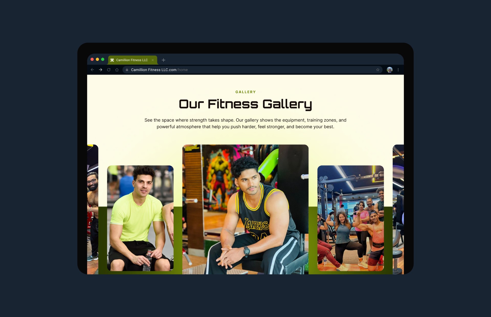
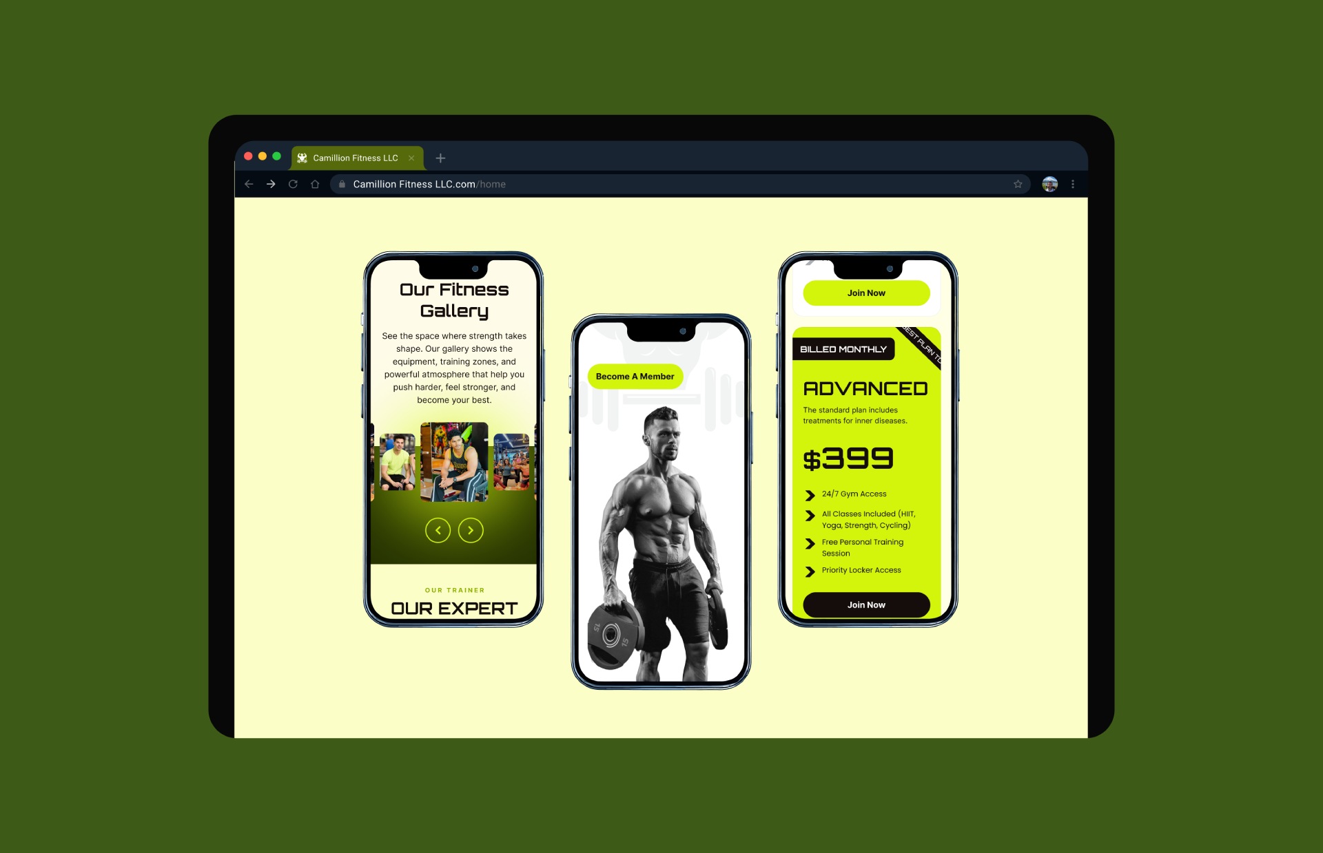
"The website perfectly captures our brand’s energy and professionalism. It feels modern, motivating, and makes it much easier for potential members to explore our programs and take action."

From fragmentation to fusion: Breaking down the complexities of data management

