Eddy is an EdTech platform which makes online learning engrossing.
Here students can find courses perfectly match their interests and preferences since Eddy offers a significantly large choice of different topics and courses.
PROBLEM
From the survey we found user struggles, which are long checkout lines, inconvenience of visiting multiple stores for unavailable products, and missing sale updates.
CHALLENGES
We faced various design challenges, including creating effective filters for accurate results, optimizing thumb patterns for ease of use, and ensuring that the app is visually appealing while providing detailed information.
OUR SOLUTION
We designed a reliable delivery system to boost transactions, accurate product descriptions, sale updates, and user-selected stores so that users can find this app more reliable for purchases.
Design Process
Research
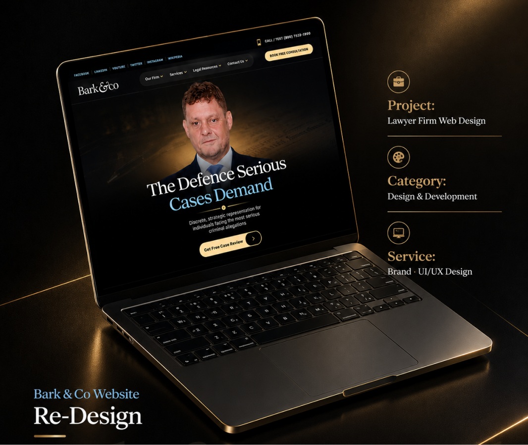
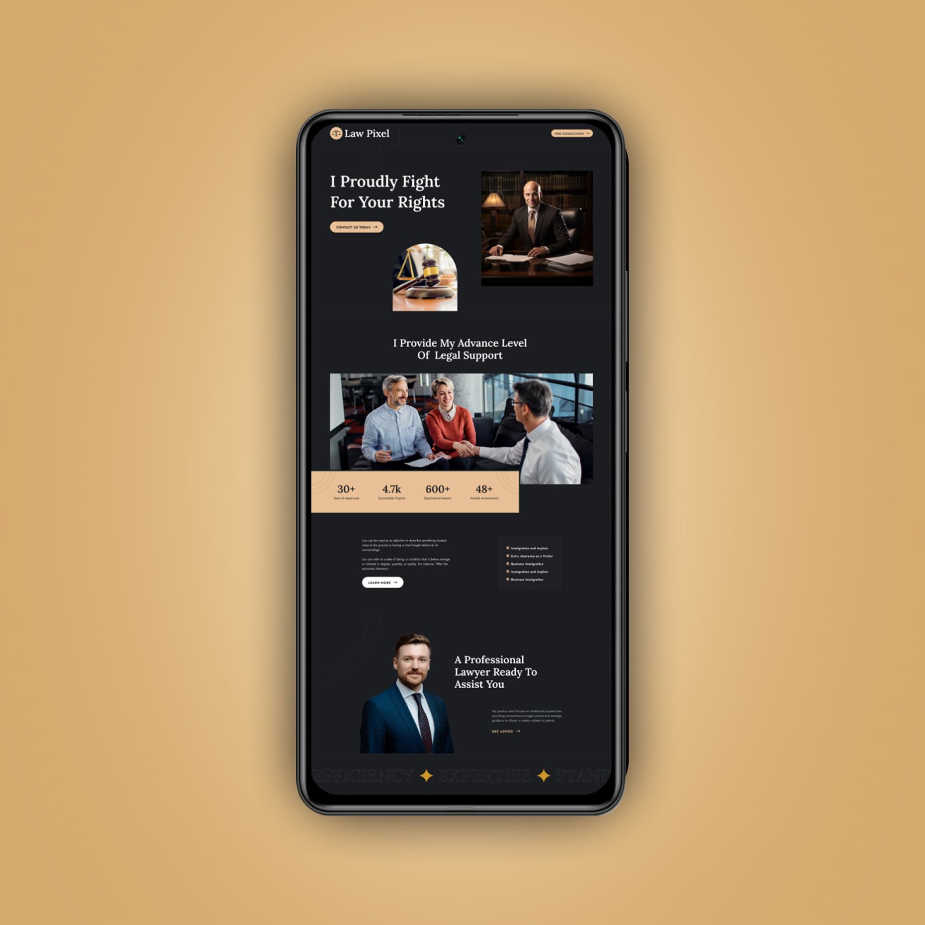
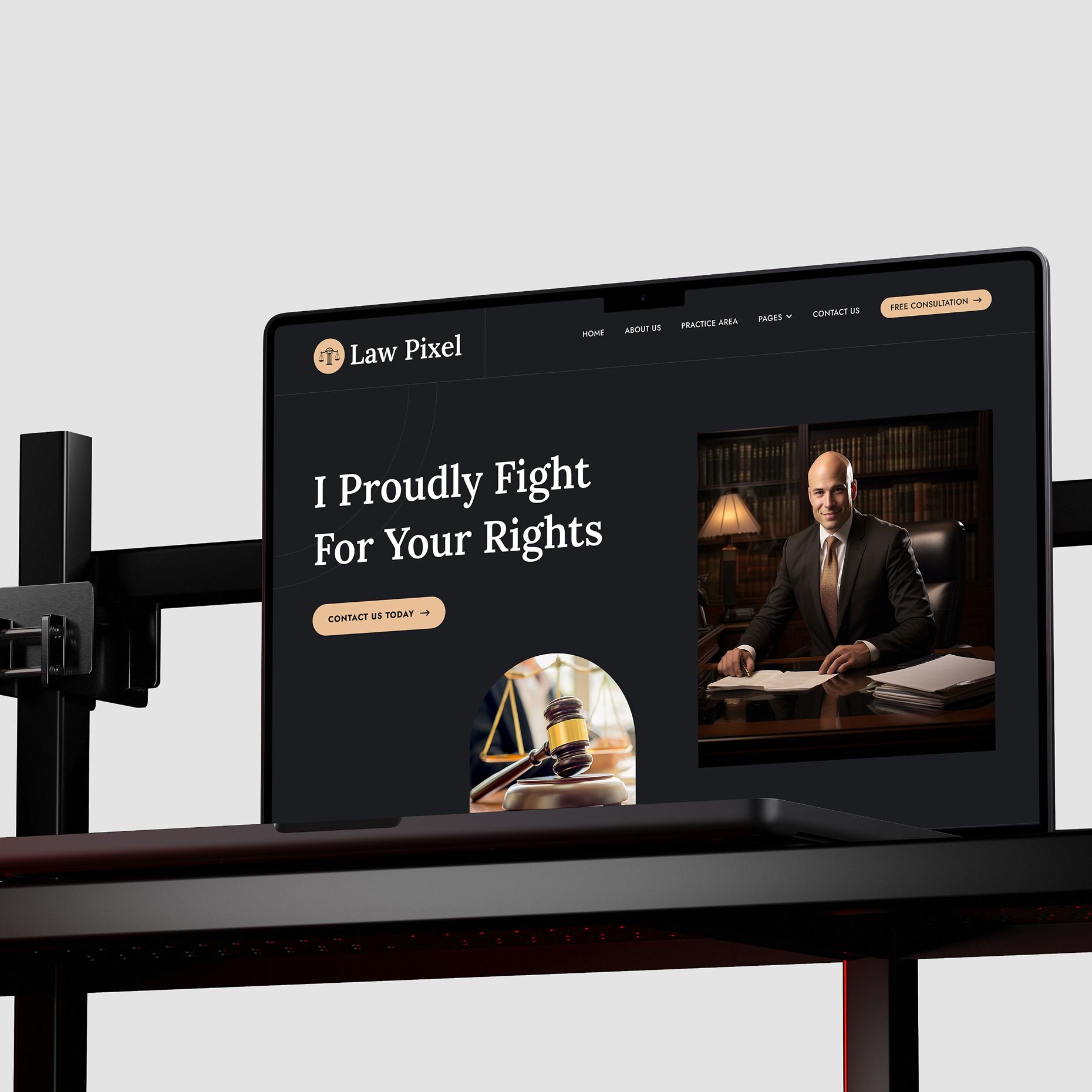
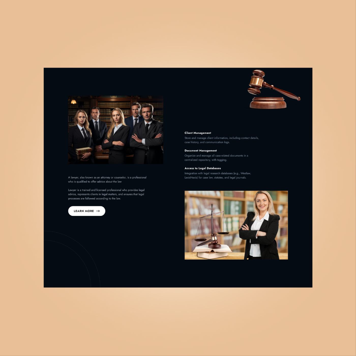
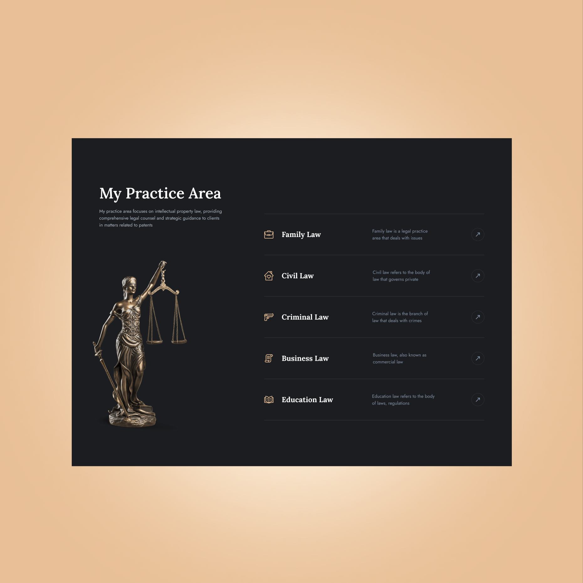
We began by studying current legal website trends and user expectations in the legal services space. This helped us understand how users typically explore attorney specialties and what trust elements are most effective.
Design
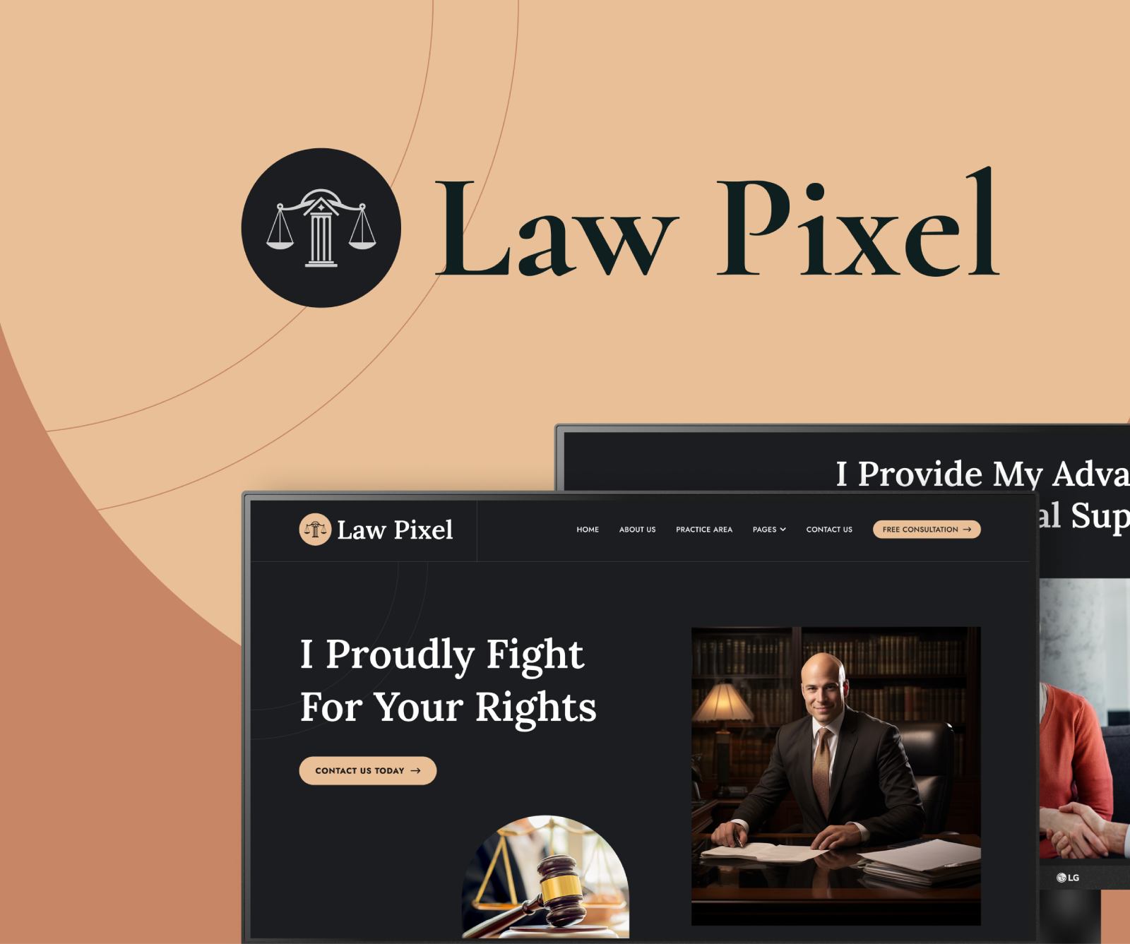
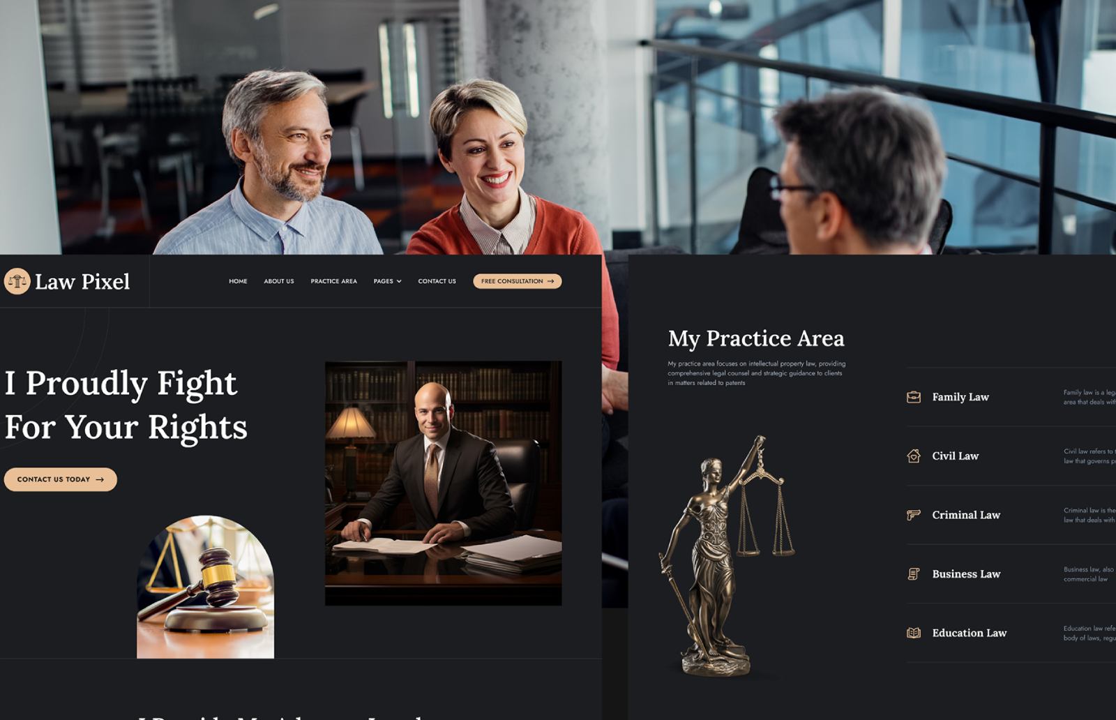
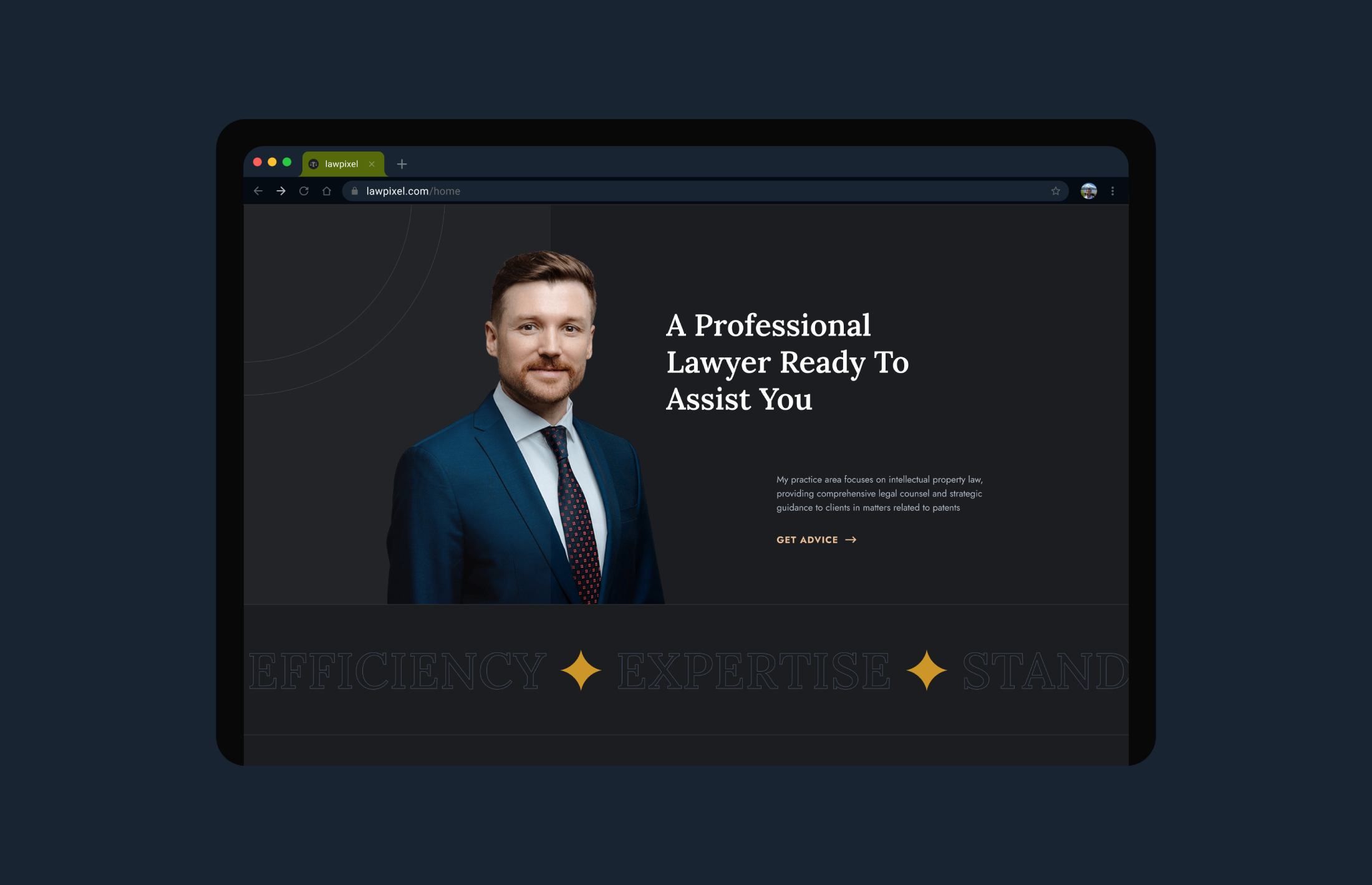
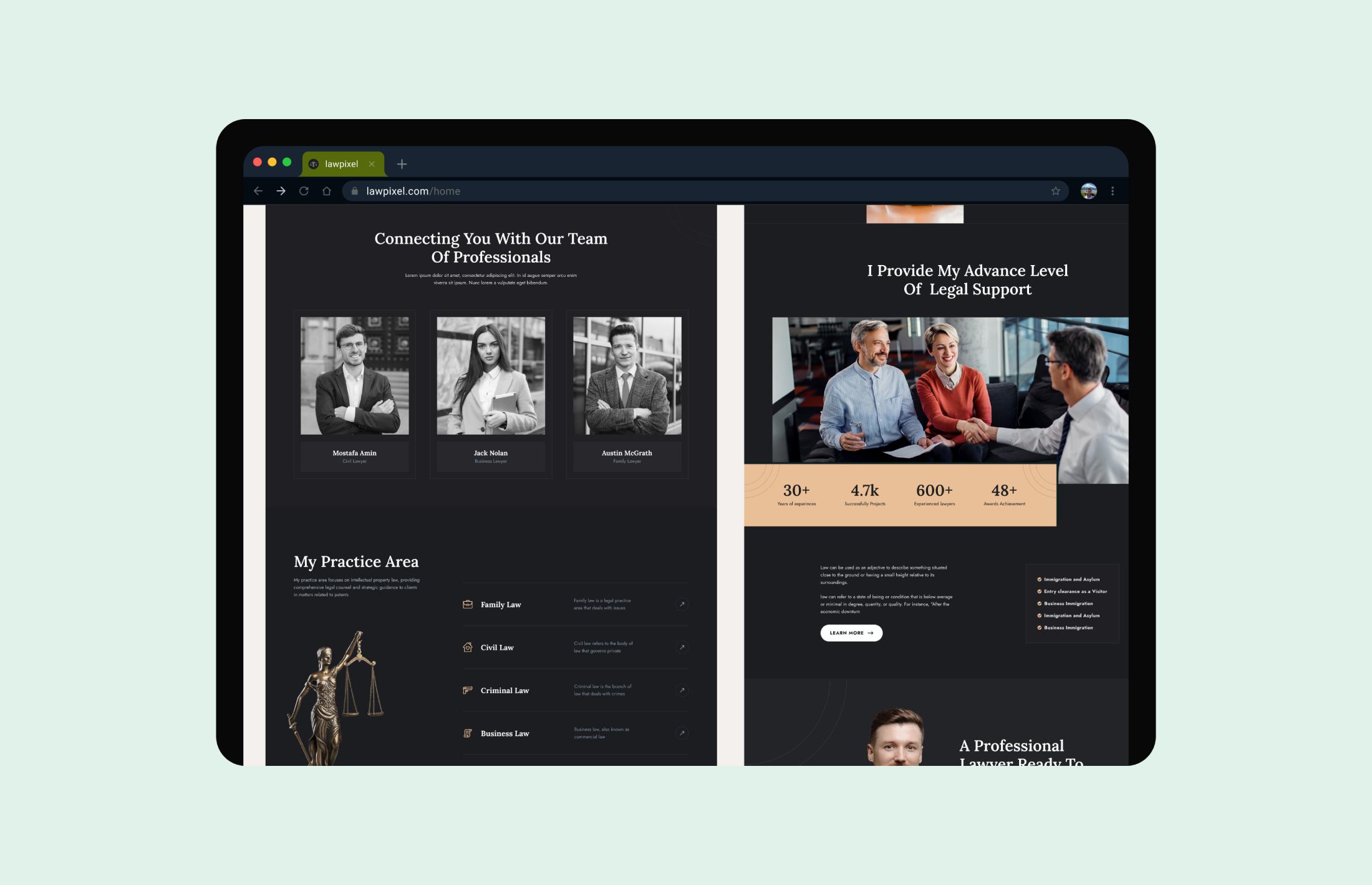
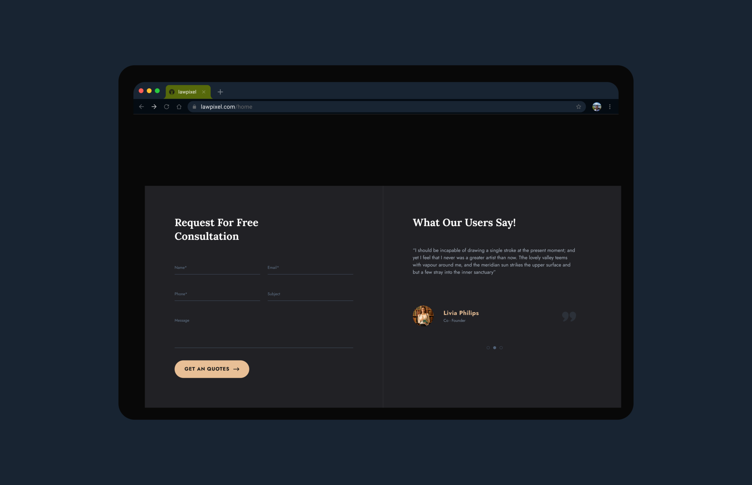
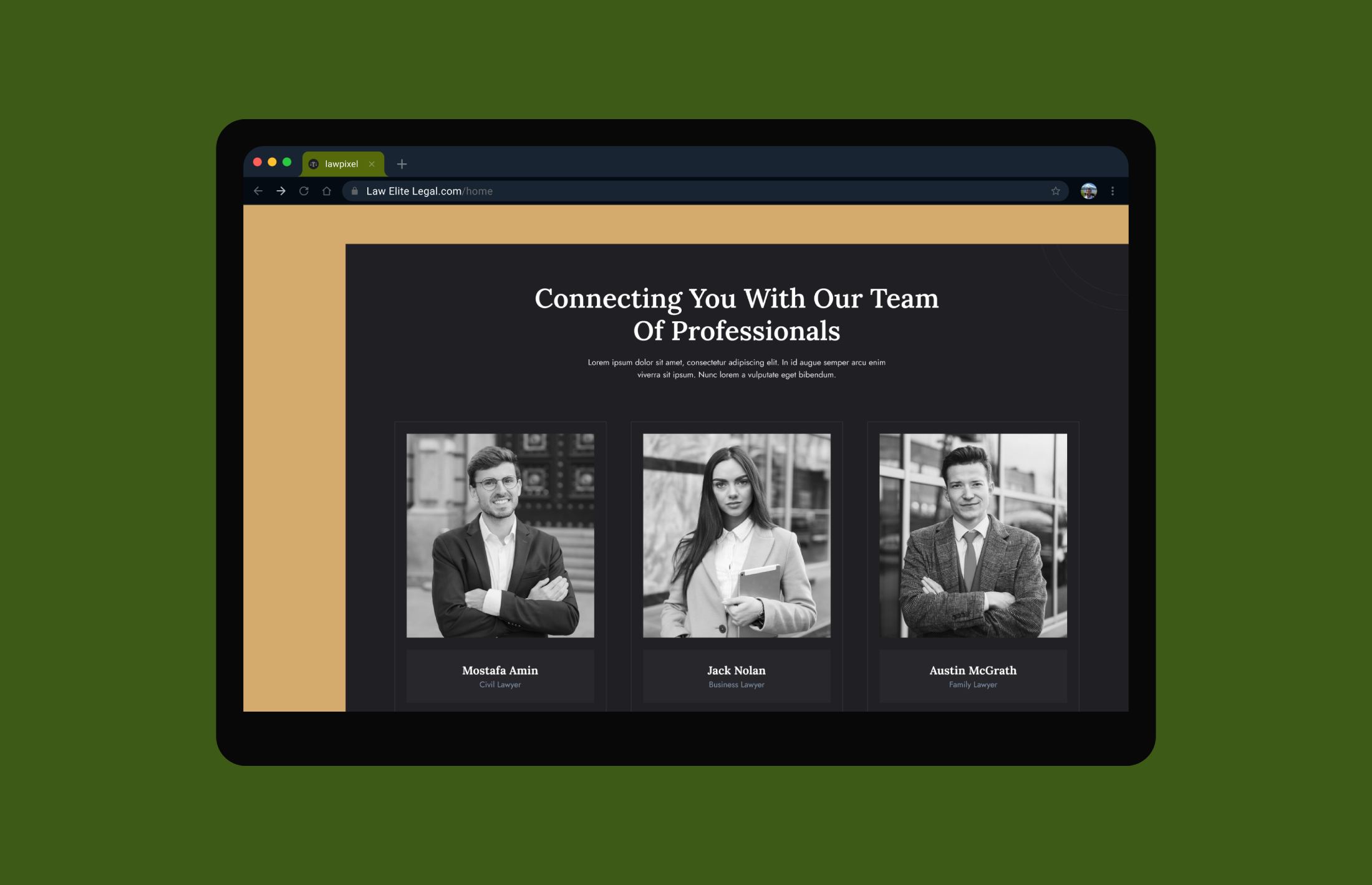
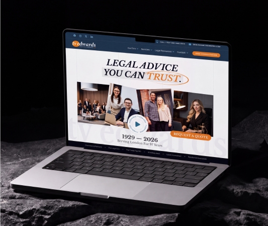
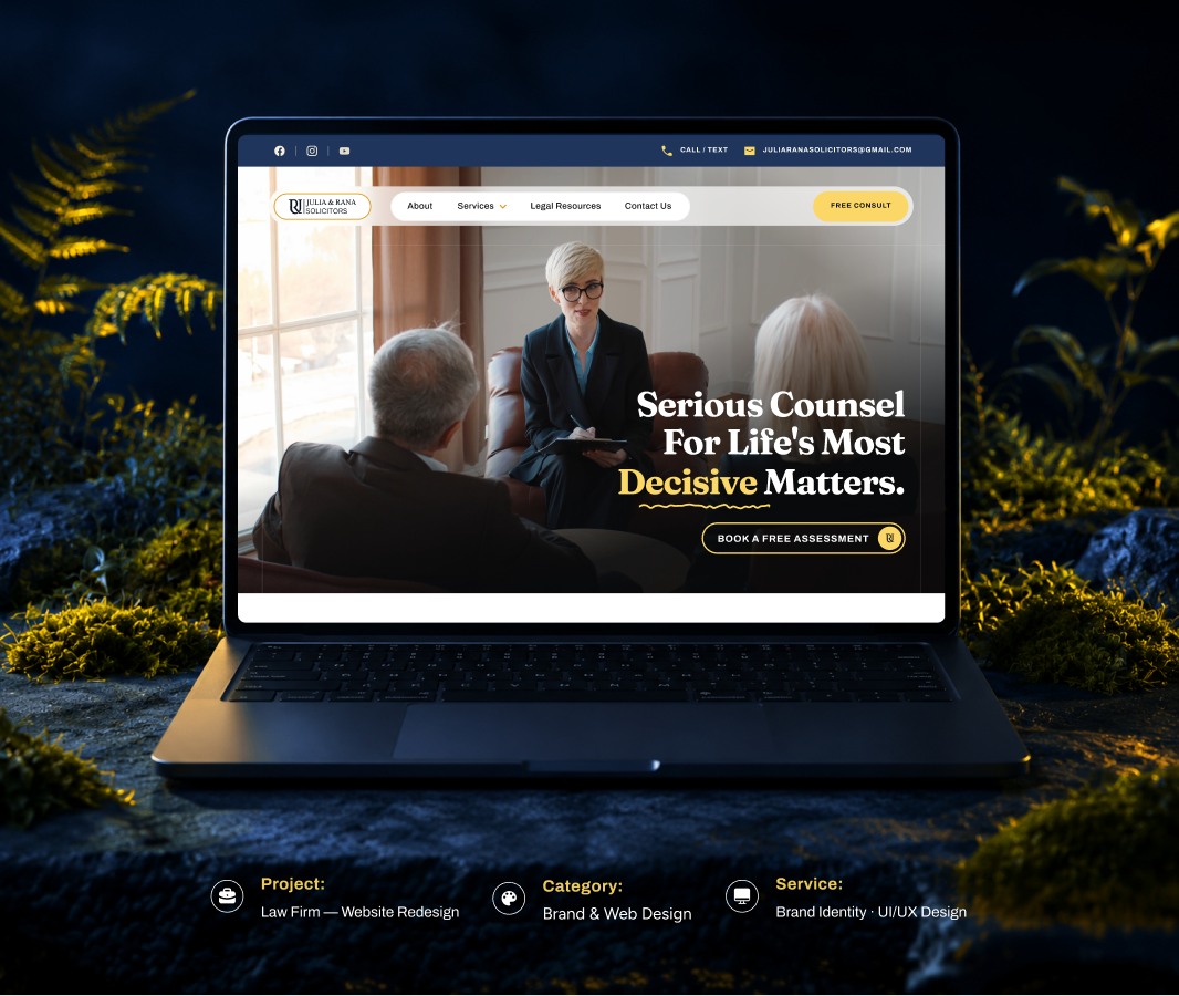
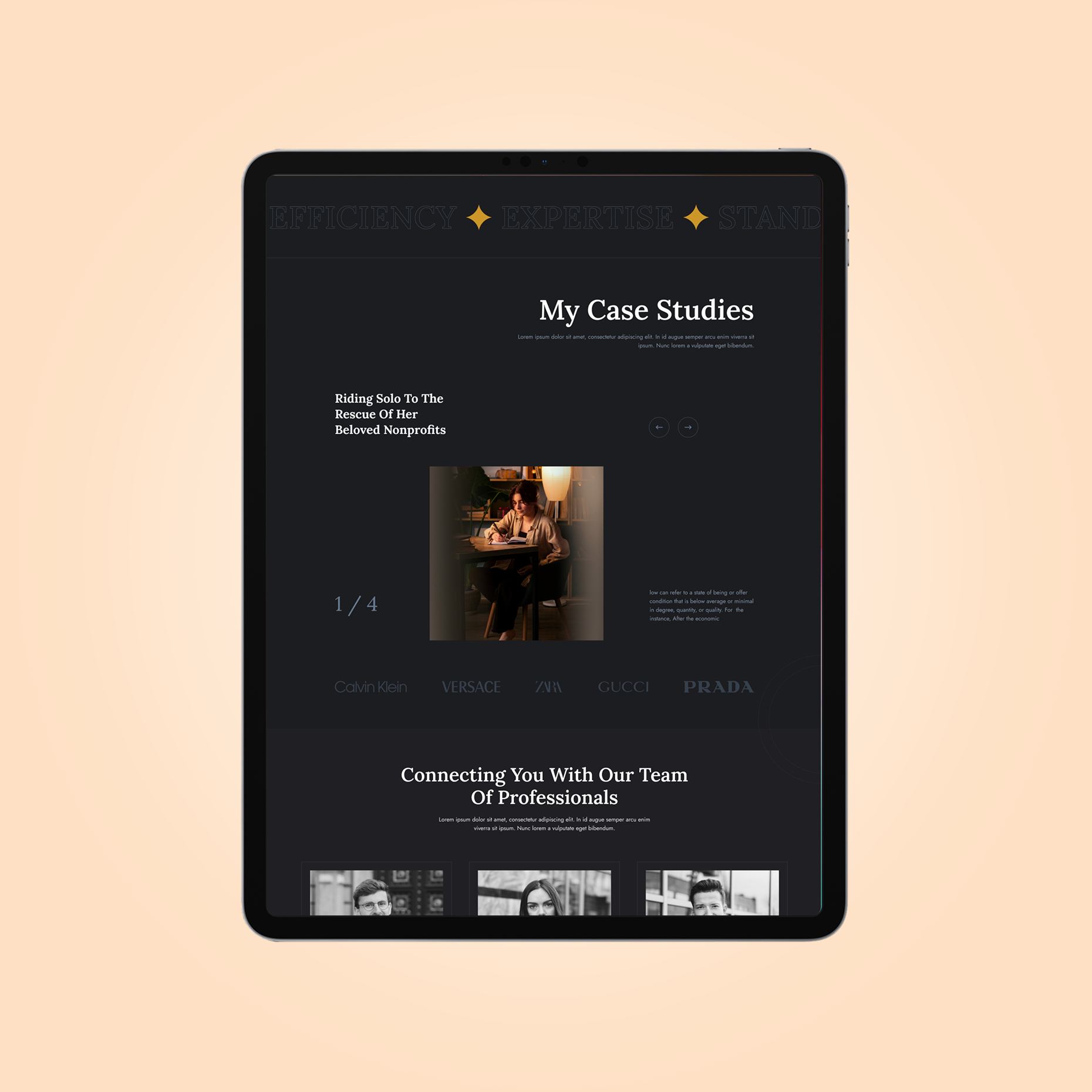
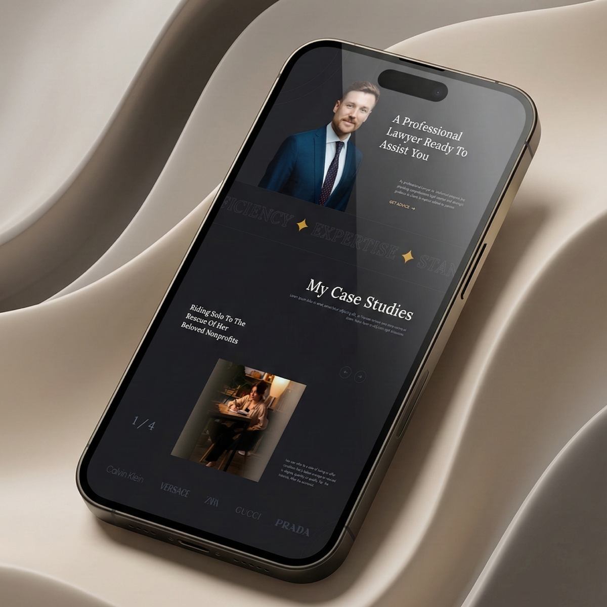
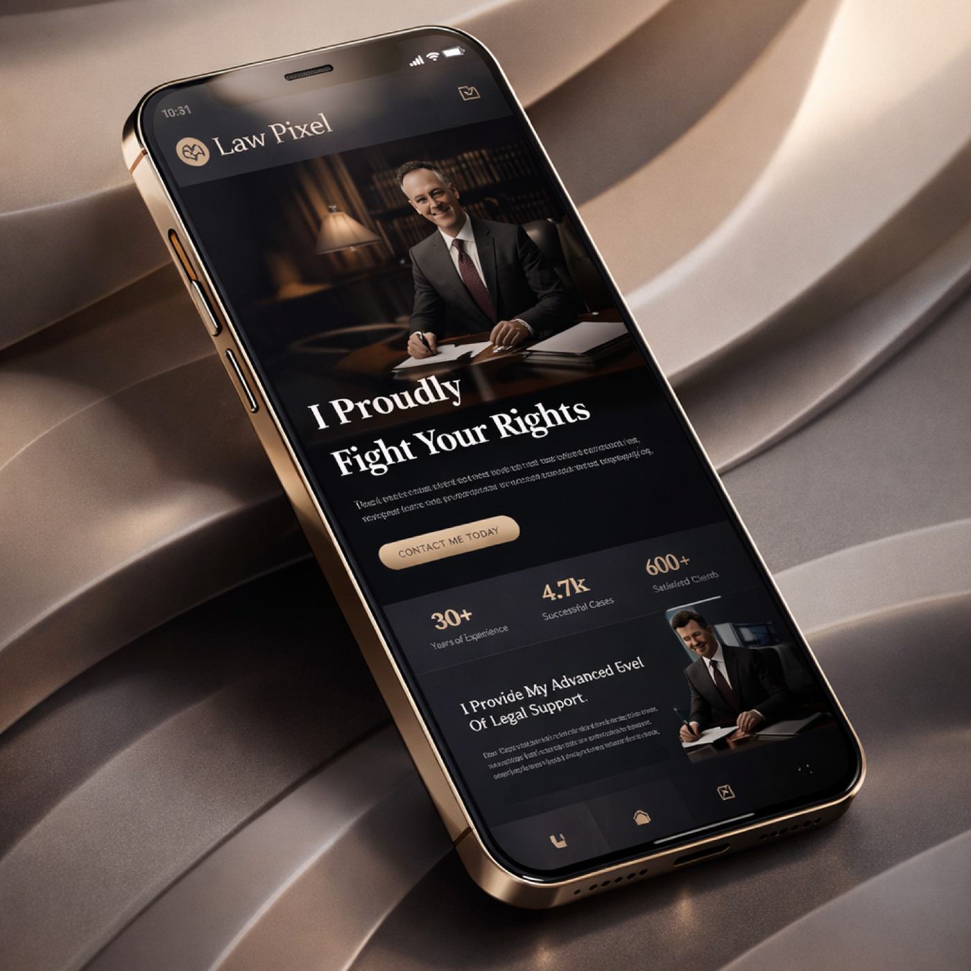
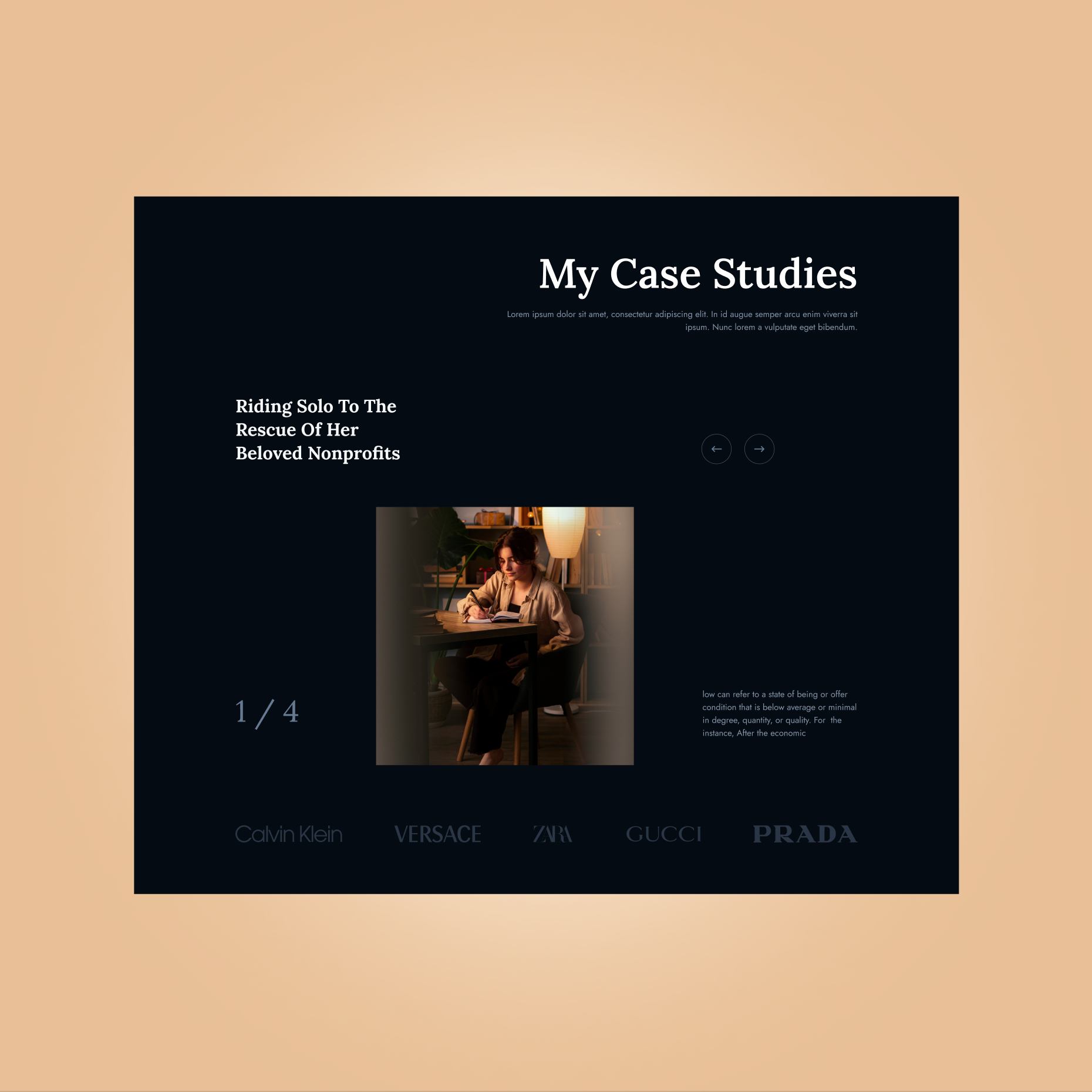
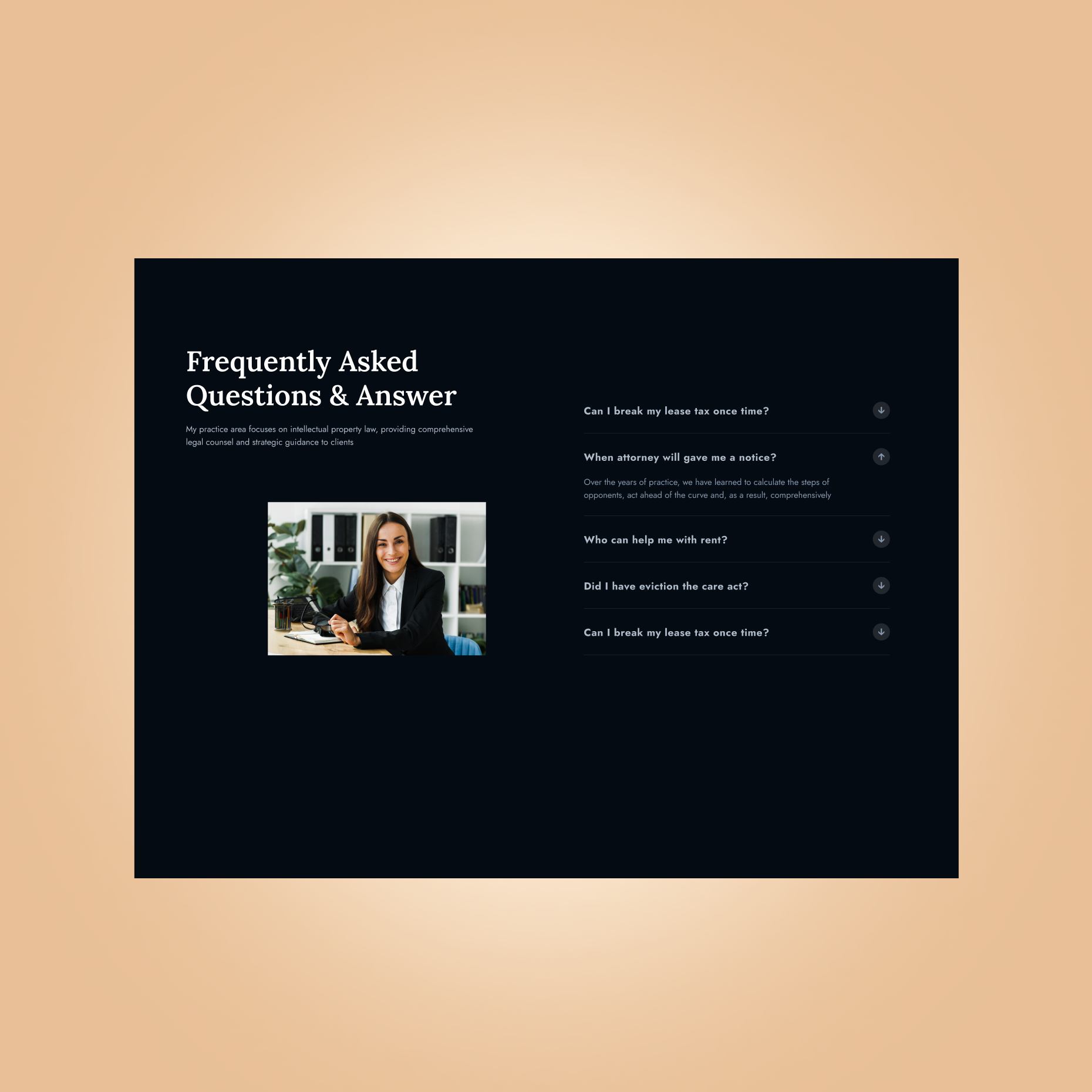
High-fidelity mockups were created with a clean grid layout, classic typography, and a balanced use of white space. Each section was designed to reinforce clarity and focus on the user’s goal.
Testing
We reviewed key flows such as service exploration and contact initiation to ensure they were intuitive and accessible. Particular attention was given to responsiveness across different screen sizes.
Feedback
Iterative refinements were made to improve spacing, content visibility, and the overall visual balance based on review input.
Style guide & components
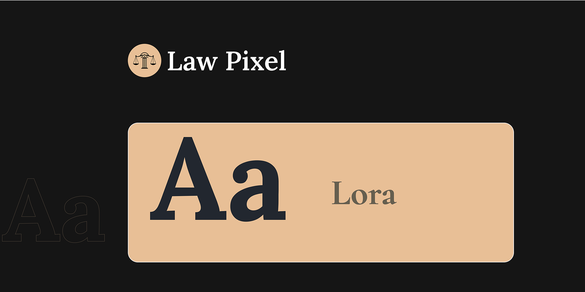
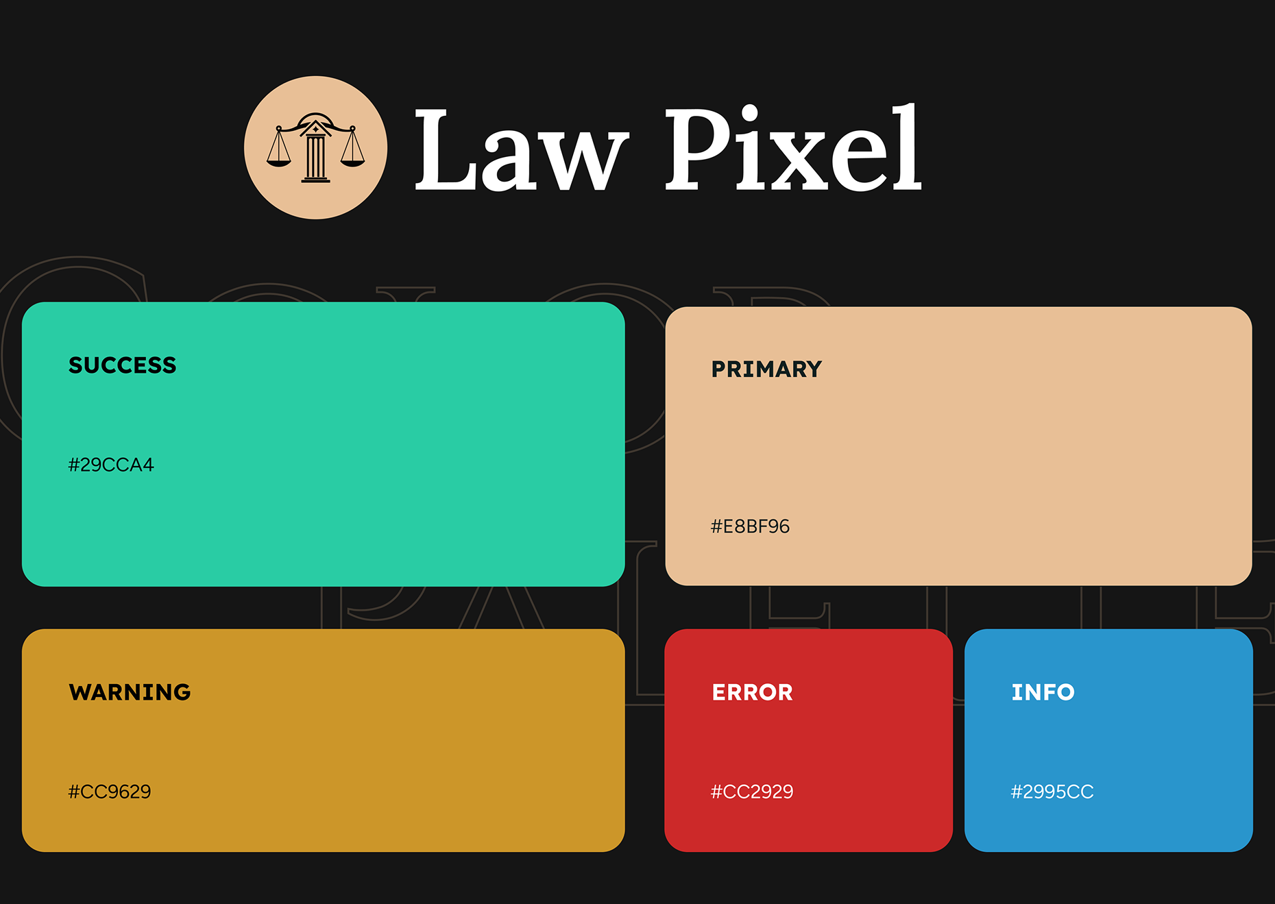
Visual Consistency: Standardized typography, spacing, and color usage across headers, service cards, and information blocks
Reusable Components: Buttons, forms, and service layouts were built as modular components for easy updating
System Updates: Centralized component control allowed design changes to propagate quickly and consistently
Team Collaboration: Organized design assets made handoff to developers smooth and implementation more efficient
Visual presentation
Visual Consistency: Standardized typography, spacing, and color usage across headers, service cards, and information blocks
Reusable Components: Buttons, forms, and service layouts were built as modular components for easy updating
System Updates: Centralized component control allowed design changes to propagate quickly and consistently
Team Collaboration: Organized design assets made handoff to developers smooth and implementation more efficient
user experience
Our style guide was thoughtfully created to uphold a unified visual identity. We embraced a clean and modern design, emphasizing user-friendly elements.
what the client said about the project
“The new website communicates our services clearly and professionally. It feels approachable yet confident, and our clients find it easier to explore specialties and reach out for support.”