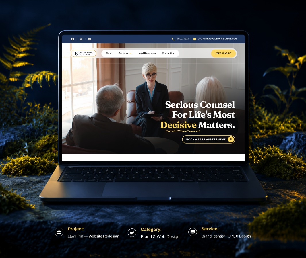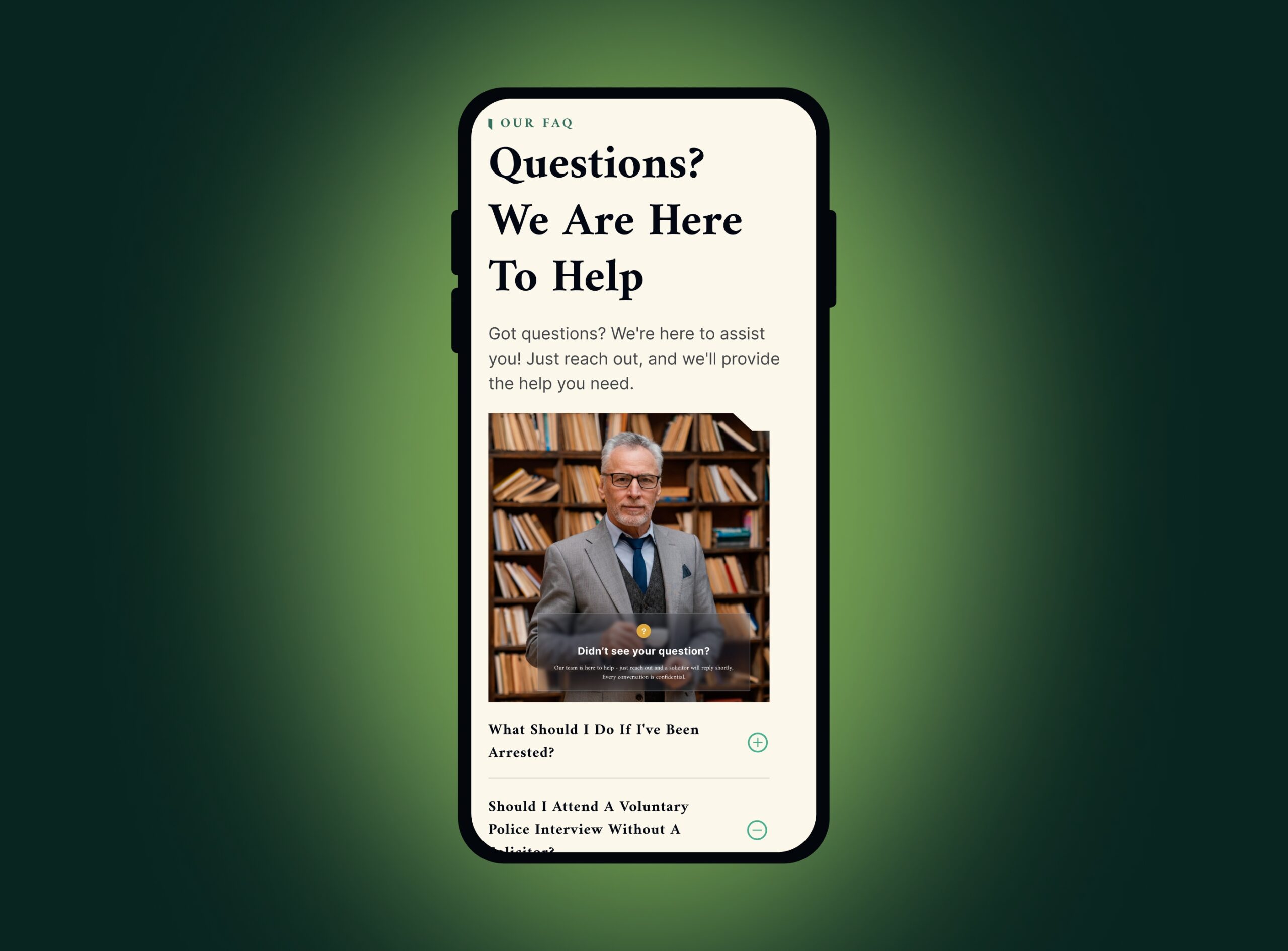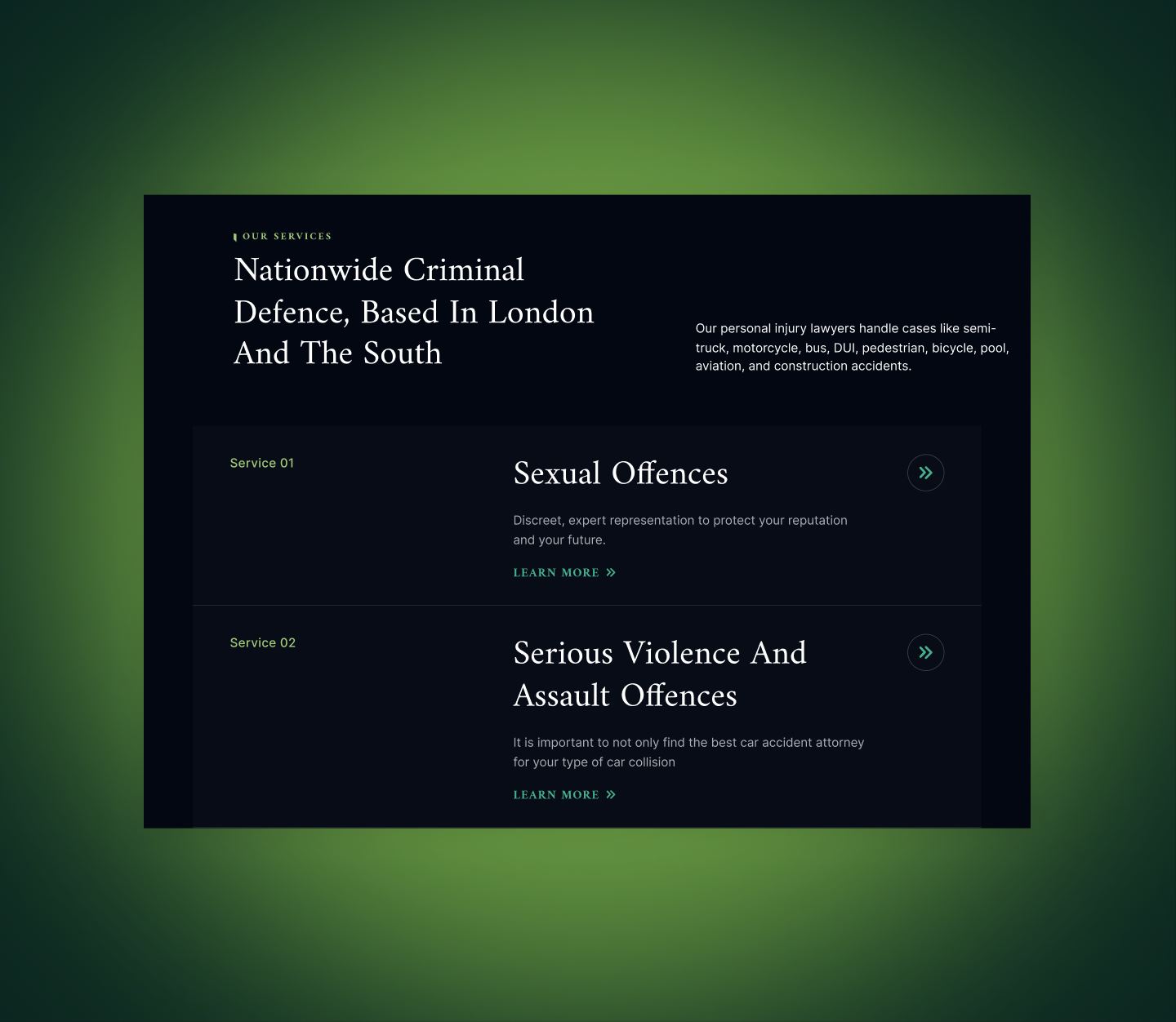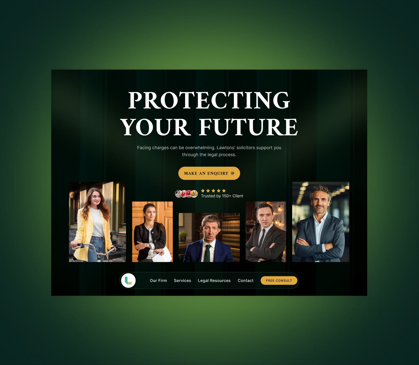
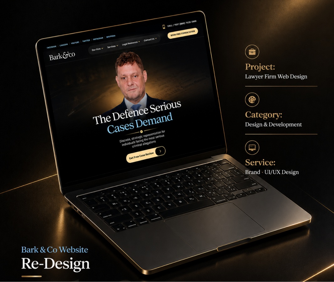
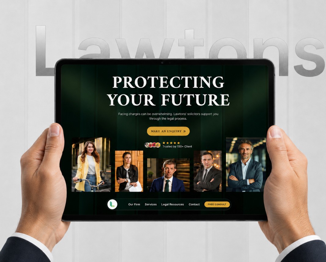
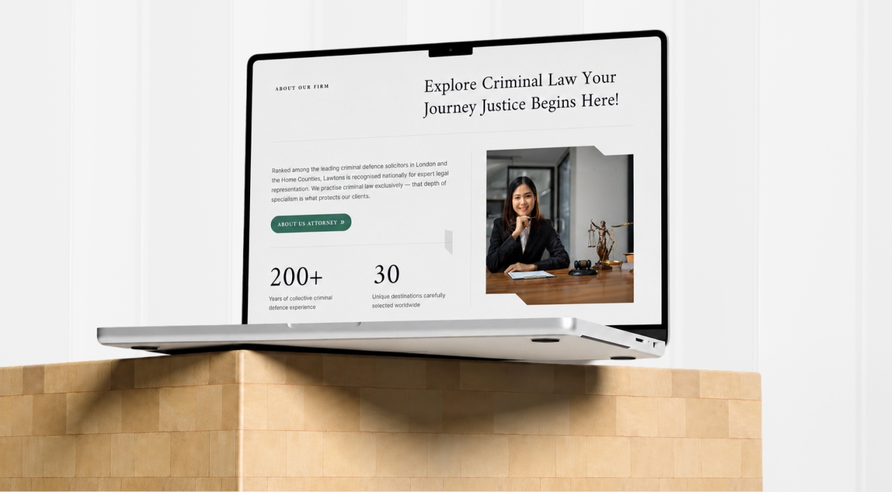
Lawtons needed a site that could serve clients under pressure — people facing criminal charges who needed immediate clarity, not a corporate brochure. The existing site felt cold and hard to navigate.
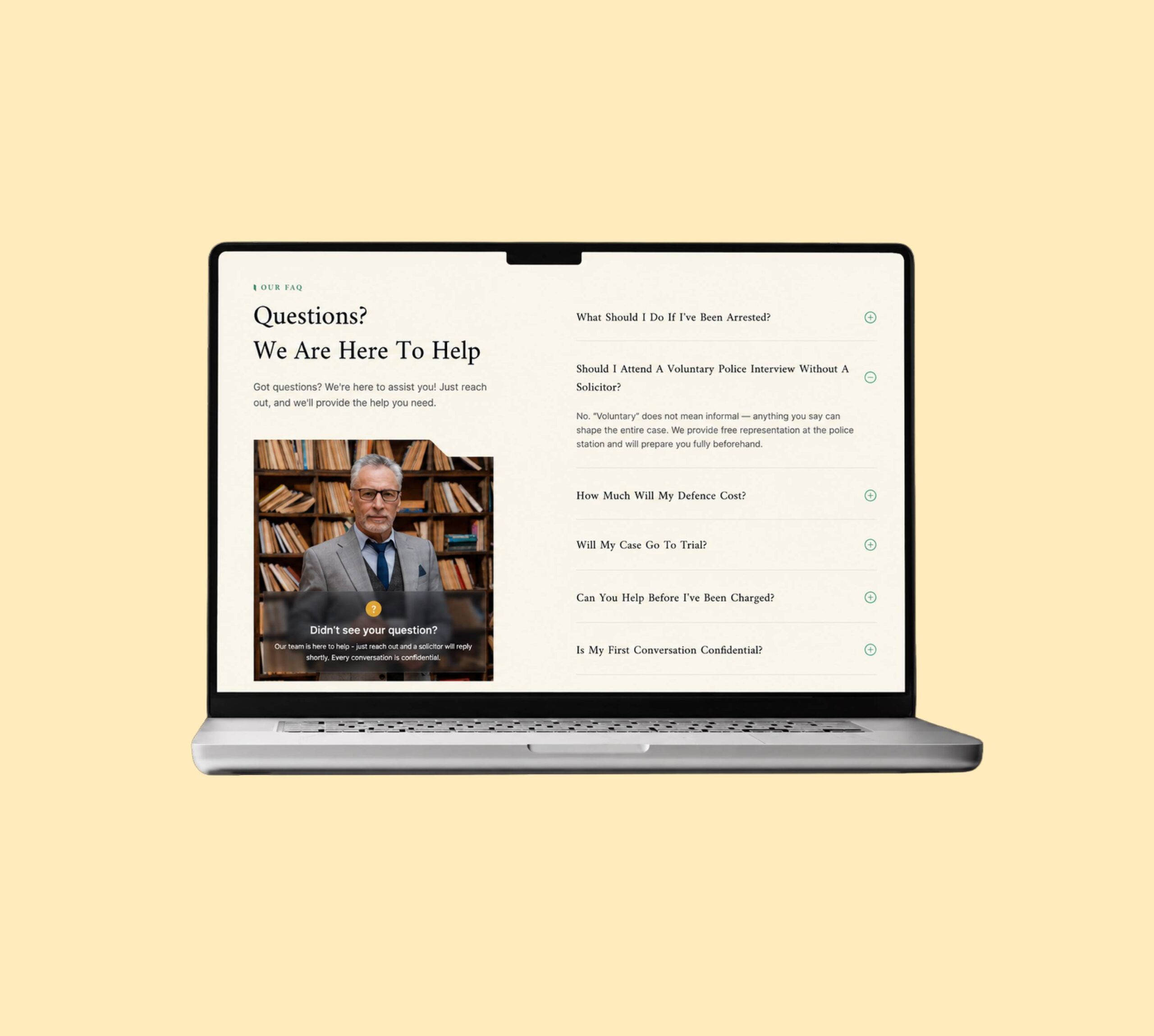
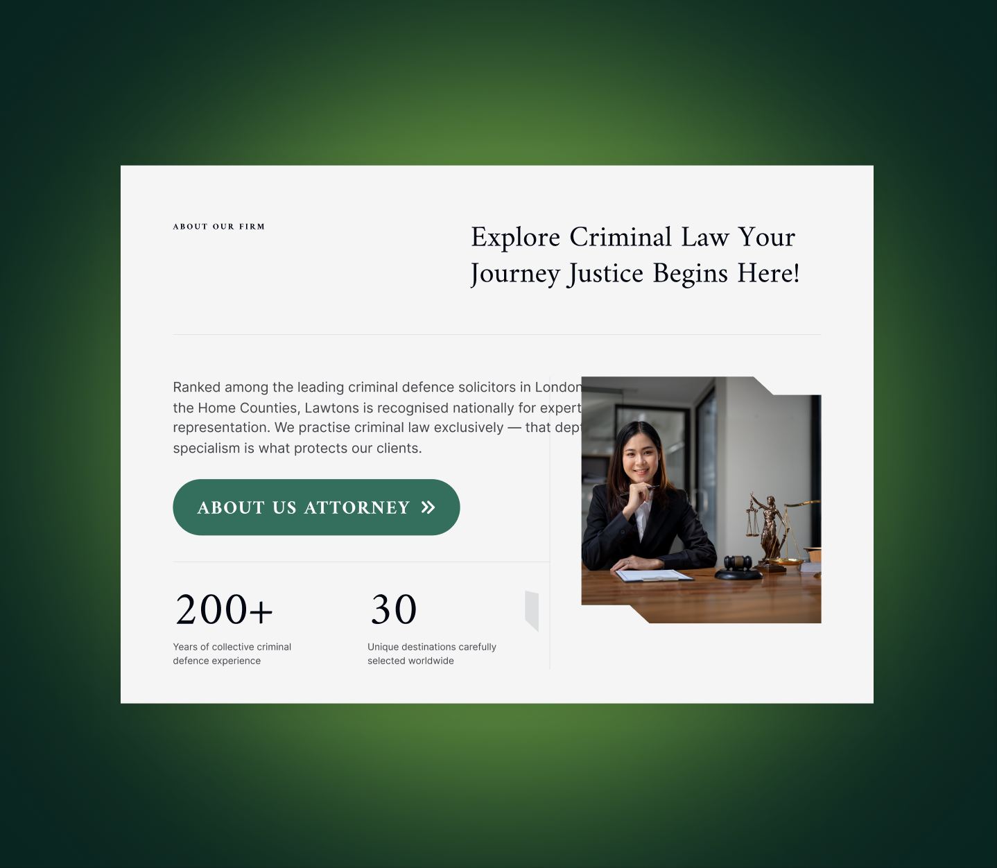
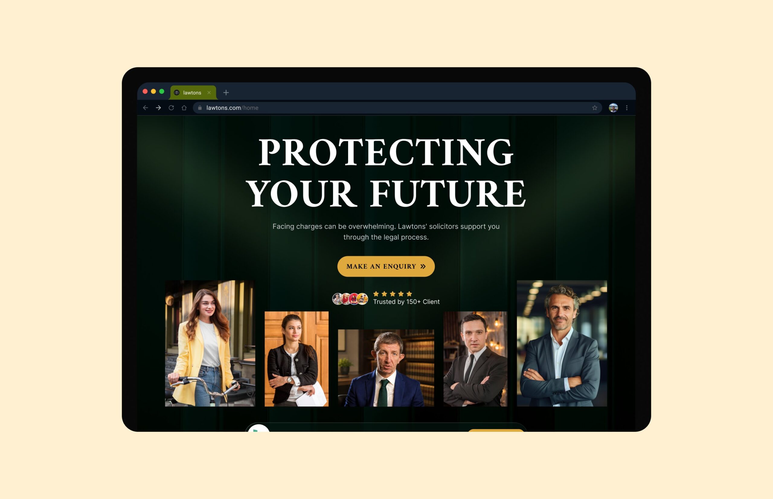
We built a conversion-focused redesign rooted in clarity and calm. Strong typographic hierarchy, high-contrast layouts, and clear CTAs guide users from landing to enquiry — while the brand voice stays measured and authoritative throughout.
Every section earns its place by moving the visitor closer to making contact.
We mapped how criminal defence clients search for help — by offence type, urgency, and geography. Lawtons’ seven specialist practice areas, 11 regional offices, and 24/7 availability shaped a content architecture built around how people actually arrive in crisis.
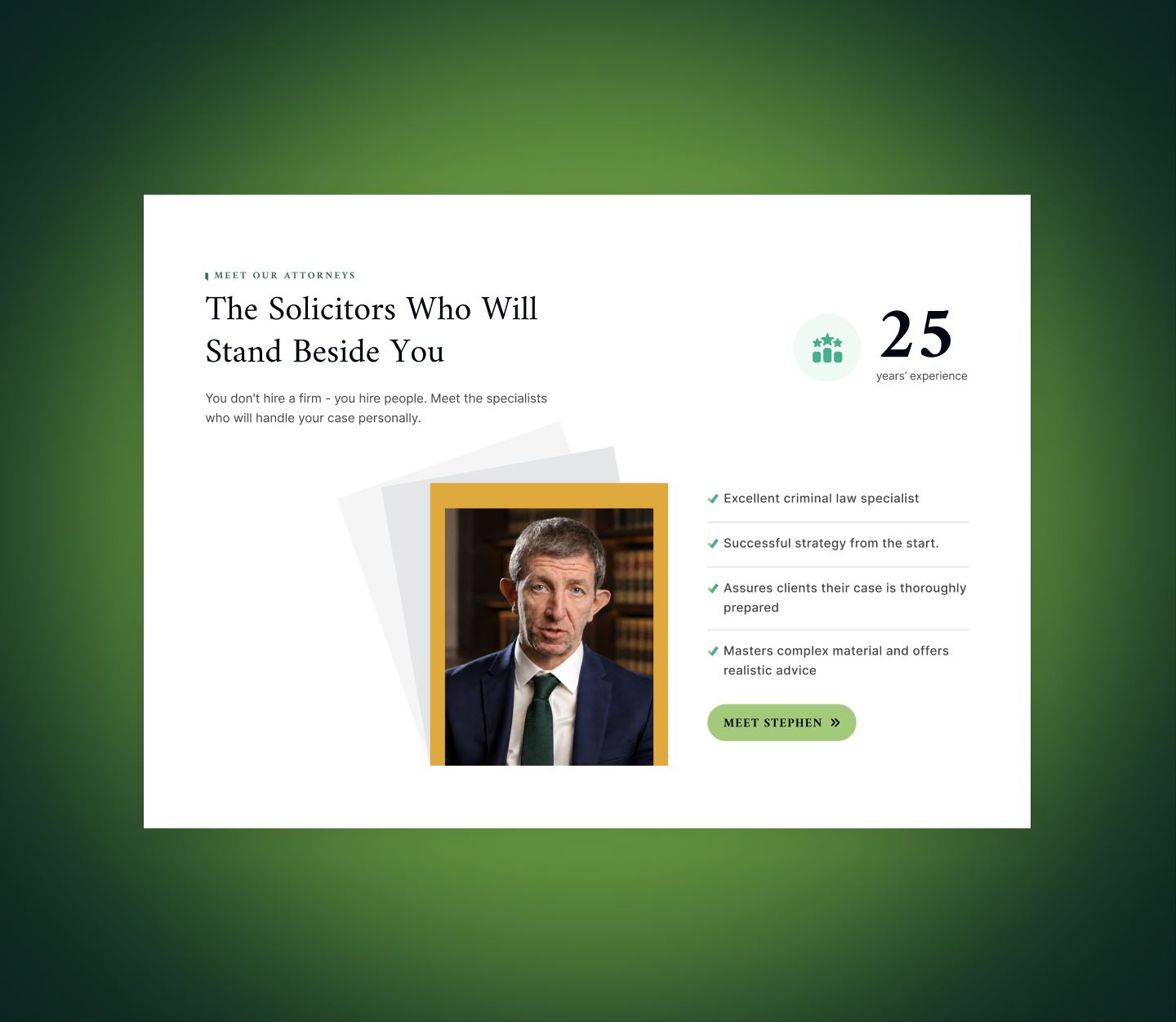
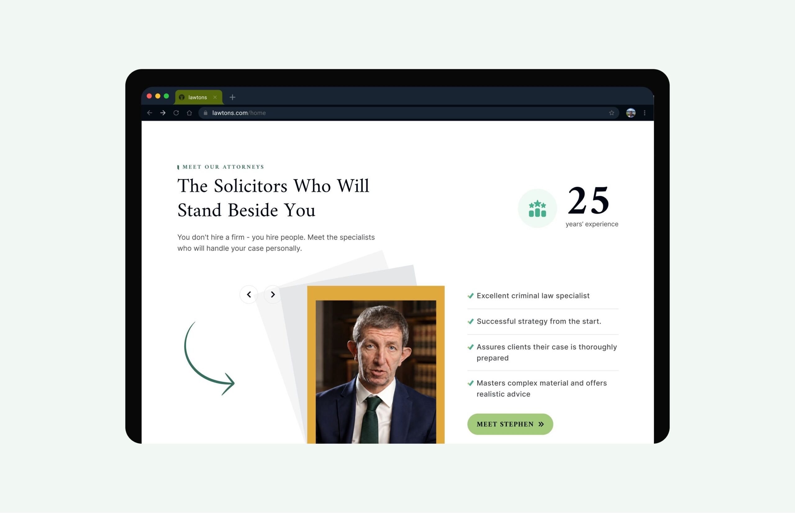
High-fidelity layouts were developed with a dark, considered palette that communicates authority without intimidation. Specialist area pages, solicitor profiles, and enquiry pathways were prototyped to support fast, confident decision-making.
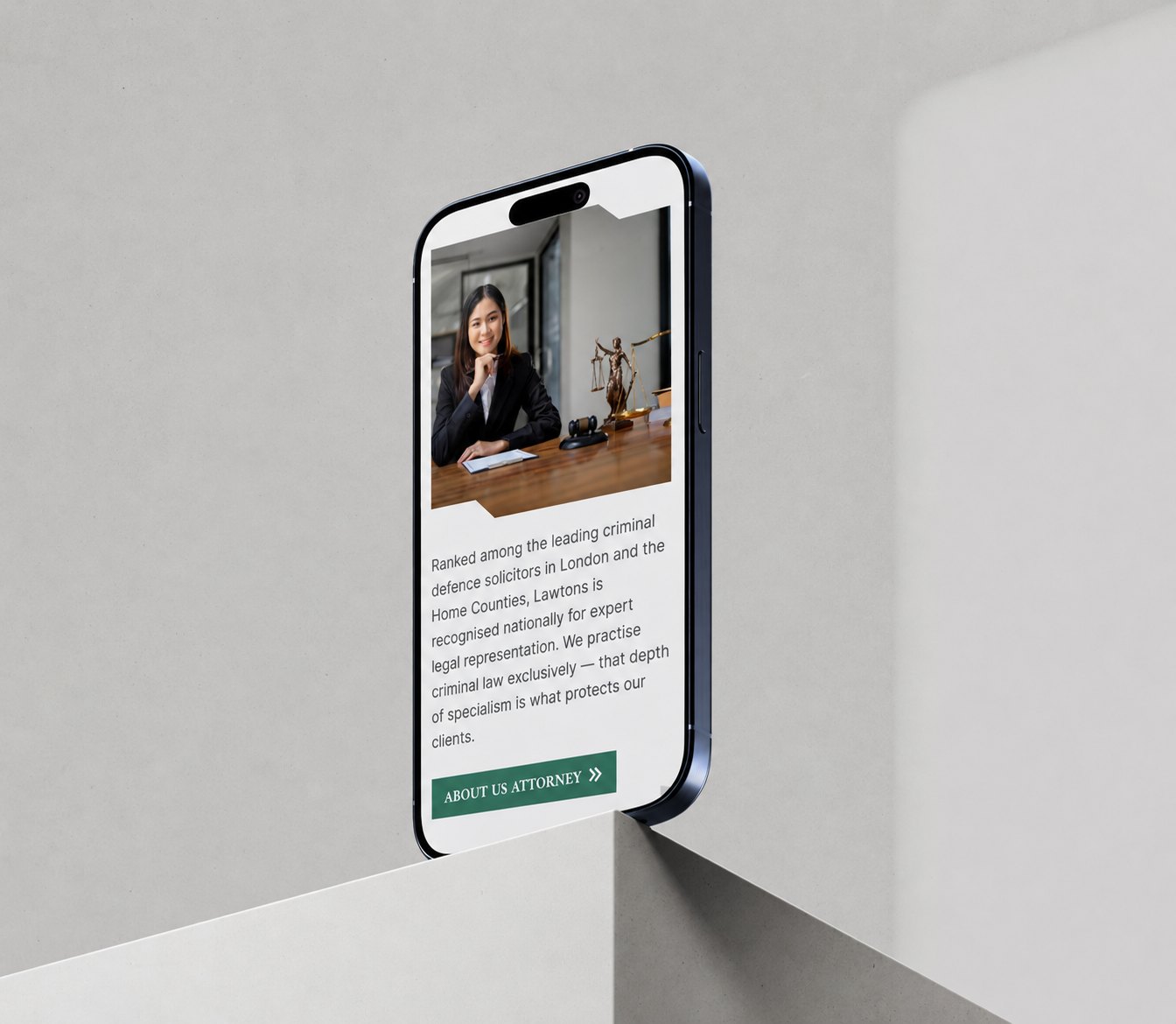
We tested core flows — from landing on a specialist area page to completing an enquiry — across mobile and desktop. Given Lawtons’ 24/7 phone line, click-to-call placement was validated at every key touchpoint to ensure no lead was lost.
Final refinements tightened CTA hierarchy, sharpened mobile navigation, and ensured every solicitor profile and practice area page felt consistent, authoritative, and easy to act on.
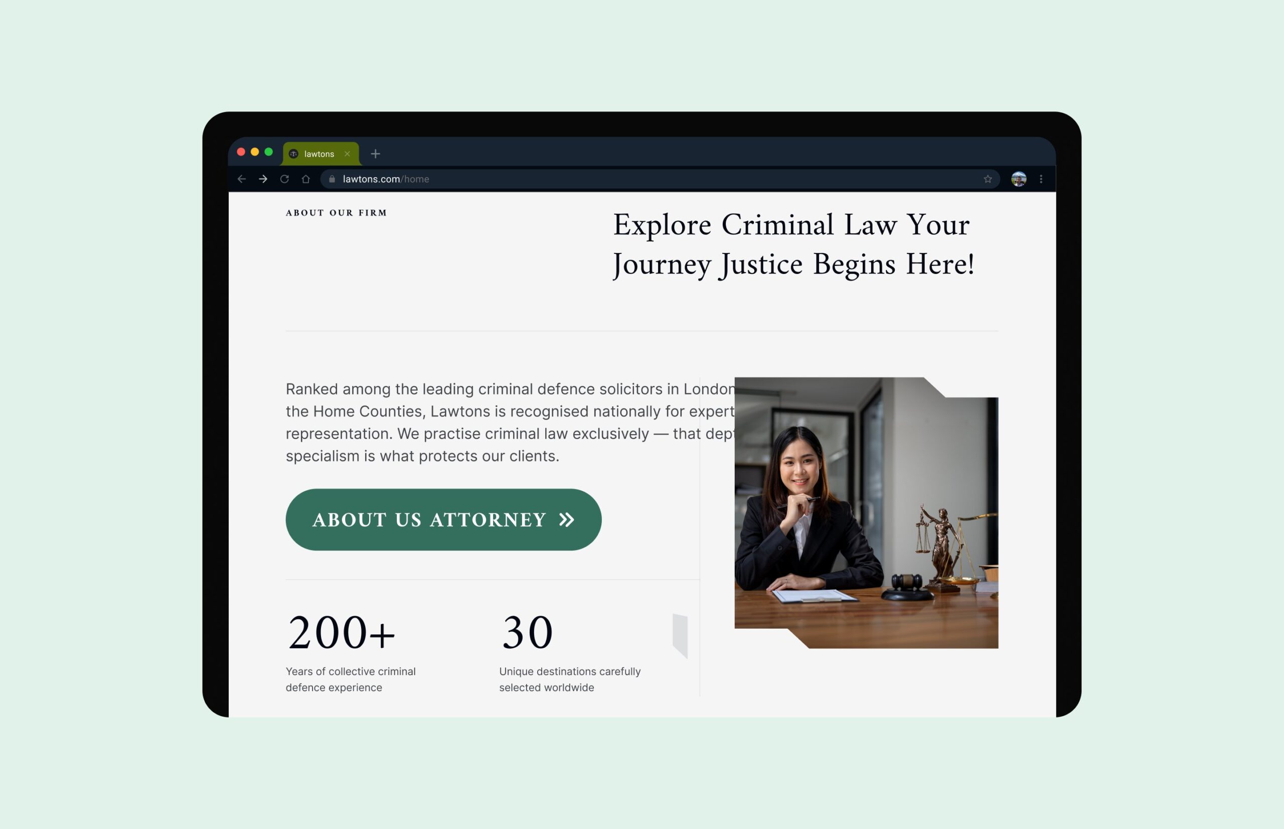
Consistency: Typography, colour, spacing and UI patterns unified across all pages
Design System: Figma libraries and reusable components ensured visual alignment
Updates: Centralised components allowed quick changes without breaking layouts
Collaboration: Designs structured for smooth developer handoff and accurate implementation
Consistency: Typography, colour, spacing and UI patterns unified across all pages
Design System: Figma libraries and reusable components ensured visual alignment
Updates: Centralised components allowed quick changes without breaking layouts
Collaboration: Designs structured for smooth developer handoff and accurate implementation
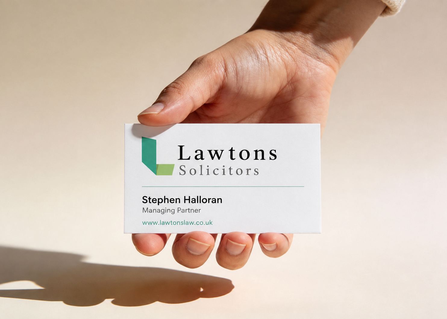
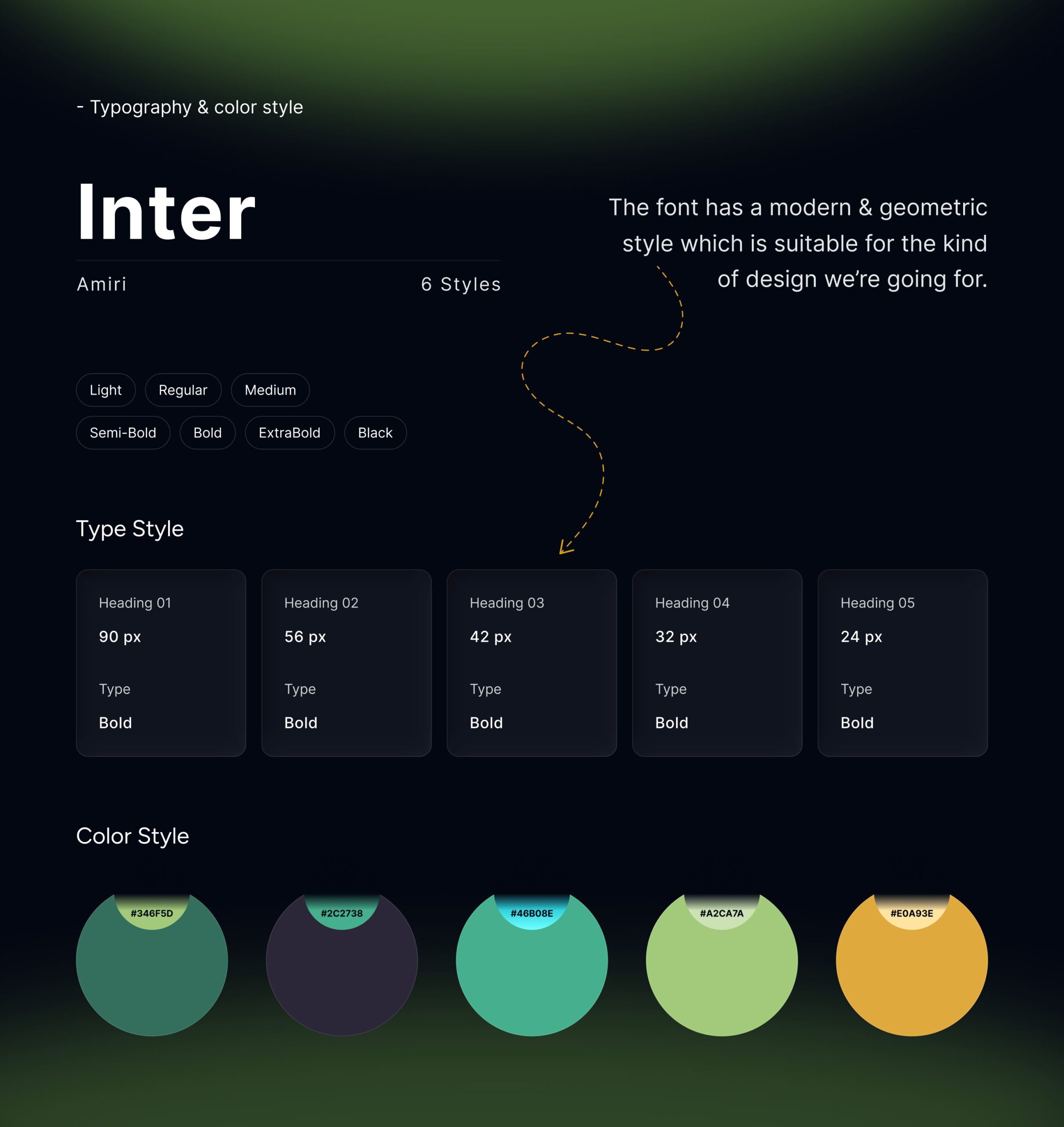
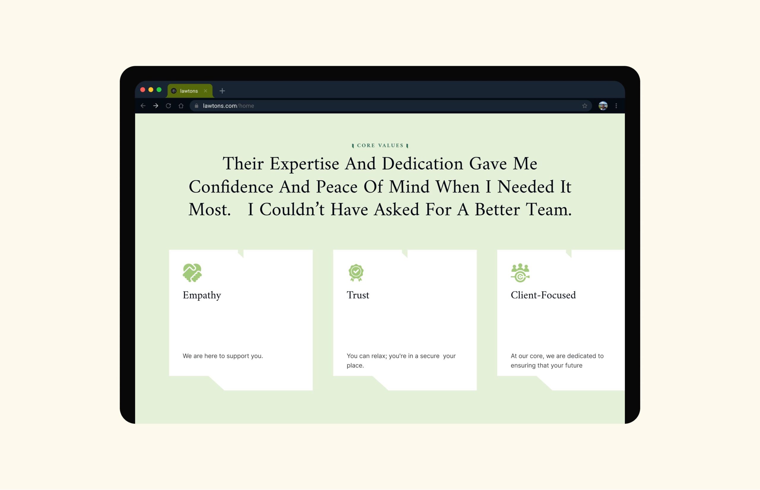
A confident, restrained visual identity built for a firm with Chambers & Partners Tier 1 recognition. Precise typography, structured layouts, and a palette rooted in authority and trust — consistent across every page and every office location.

“The website perfectly captures our brand’s identity. It feels classic yet modern, and our clients can now find services and book appointments with ease.”